Probability and Statistics > Descriptive Statistics
Contents:
- Definition
- Difference Between Descriptive and Inferential
- Excel Instructions
- Graphs, Charts and Plots
See Also: Basic Statistics Terms
1. Definition of Descriptive Statistics
Descriptive statistics are one of the fundamental “must knows” with any set of data. It gives you a general idea of trends in your data including:
- The mean, mode, median and range .
- Variance and standard deviation.
- Skewness.
- Count, maximum and minimum.
Descriptive statistics is useful because it allows you to take a large amount of data and summarize it. For example, let’s say you had data on the incomes of one million people. No one is going to want to read a million pieces of data; if they did, they wouldn’t be able to glean any useful information from it. On the other hand, if you summarize it, it becomes useful: an average wage, or a median income, is much easier to understand than reams of data.
Sub-Areas
Descriptive statistics can be further broken down into several sub-areas, like:
- Measures of central tendency.
- measures of dispersion.
- Charts & graphs.
- Shapes of Distributions.
The charts, graphs and plots site index is below. For definitions and information on how to find measures of spread and central tendency, see: Basic statistics (which covers the basic terms you’ll find in descriptive statistics like interquartile range, outliers and standard deviation).
2. Difference Between Descriptive and Inferential Statistics
Statistics can be broken down into two areas:
- Descriptive statistics: describes and summarizes data. You are just describing what the data shows: a trend, a specific feature, or a certain statistic (like a mean or median).
- Inferential statistics: uses statistics to make predictions.
Descriptive statistics just describes data. For example, descriptive statistics about a college could include: the average SAT score for incoming freshmen; the median income of parents; racial makeup of the student body. It says nothing about why the data might exist, or what trends you might be able to see from the data. When you take your data and start to make predictions about future behavior or trends, that’s inferential statistics. Inferential statistics also allows you to take sample data (e.g. from one university) and apply it to a larger population (e.g. all universities in the country).
3. Excel Descriptive Statistics

Using the descriptive statistics feature in Excel means that you won’t have to type in individual functions like MEAN or MODE. One button click will return a dozen different stats for your data set. If you want to calculate Excel descriptive statistics, you must have the Data Analysis Toolpak loaded in Excel. Click the “Data” tab in Excel. If you don’t see “Data analysis” on the right of the toolbar, you need to load the Toolpak first. See: Load the Excel Data Analysis Toolpak.
How to Calculate Excel Descriptive Statistics: Steps
Step 1: Type your data into Excel, in a single column. For example, if you have ten items in your data set, type them into cells A1 through A10.
Step 2: Click the “Data” tab and then click “Data Analysis” in the Analysis group.
Step 3: Highlight “Descriptive Statistics” in the pop-up Data Analysis window.
Step 4: Type an input range into the “Input Range” text box. For this example, type “A1:A10” into the box.
Step 5: Check the “Labels in first row” check box if you have titled the column in row 1, otherwise leave the box unchecked.
Step 6: Type a cell location into the “Output Range” box. For example, type “C1.” Make sure that two adjacent columns do not have data in them.
Step 7: Click the “Summary Statistics” check box and then click “OK” to display Excel descriptive statistics. A list of descriptive statistics will be returned in the column you selected as the Output Range.
4. Descriptive Statistics: Charts, Graphs and Plots
There are literally dozens of charts and graphs you can make from data. which one you choose depends upon what kind of data you have and what you want to display. For example, if you wanted to display relationships between data in categories, you could make a bar graph.

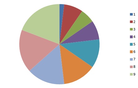
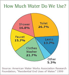
A pie chart would show you how categories in your data relate to the whole set.
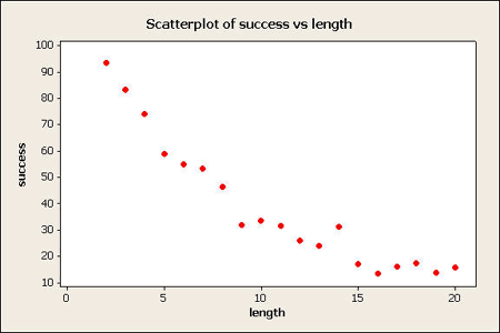
Scatter plots are a good way to display data points.
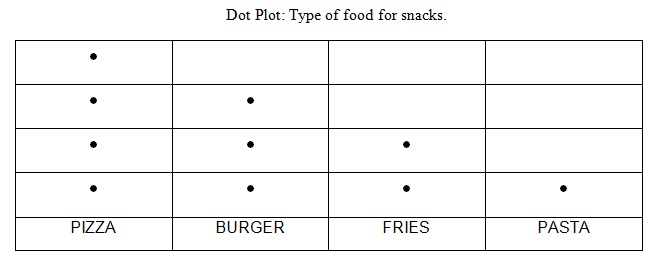
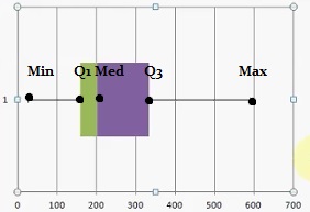
Less common, but useful in some cases, include dot plots and box and whisker charts:
How To Articles for Descriptive Statistics
- Causal Graph
- Absolute Frequency: Definition, Examples
- Make a Histogram.
- Make a Relative Frequency Histogram.
- How to Make a Frequency Chart and Determine Frequency.
- House Graph
- Choose Bin Sizes.
- How to Make an Ogive Graph.
- Read a Box Plot.
- Find a Box Plot Interquartile Range.
- Draw a Frequency Distribution Table.
- Make a Cumulative Frequency Distribution Table.
- Q Q plots.
- Find a Quadratic Mean.
- Make a Stemplot.
- U Chart: Definition, Example
- Venn Diagram Templates.
Microsoft Excel: Descriptive Statistics
- How to Create a Bar Graph in Excel.
- Create a Histogram in Excel.
- How to Make a Scatter Plot in Microsoft Excel.
- Create a Frequency Distribution Table in Excel.
- How to Make a Pie Chart in Excel.
- Grubb’s Test to Find Outliers.
Minitab for Descriptive Statistics
- How to Make a Scatterplot in Minitab.
- Make a Boxplot in Minitab.
- How to Make a Histogram in Minitab.
- How to Create a Bar Graph in Minitab.
SPSS
- How to Make an SPSS Frequency Table.
- How to Make an SPSS Histogram.
- Make a Bar Chart in SPSS.
- How to Make an SPSS Boxplot.
- How to Make an SPSS Scatterplot.
- Make a Pie Chart in SPSS.
Definitions
- 68-95-99.7 Rule.
- Area Chart
- The Area Principle.
- Attribute Control Chart
- Back-to-Back Stemplot.
- Bar Chart.
- Bimodal Distribution.
- Bland-Altman Plot.
- Collider Variable
- Cumulative Frequency Distribution?
- Directed Acyclic Graph?
- What is a Forest Plot or Blobbogram?
- Frequency Distribution Table.
- What is a Funnel Plot?
- Grouped Data.
- What are upper hinges and lower hinges?
- Interquartile Mean.
- Lag plots.
- Lift Chart
- Mean Plot
- Measures of Position
- Measures of Spread.
- Measures of Variation.
- What is an NP Chart?
- What is a P-Chart?
- Pie Chart.
- What is a Probability Tree?
- What is a Pyramid Graph?
- Ribbon Diagram
- Scatter Plot.
- Radar Charts.
- Run Chart
- What is a Seven Number Summary?
- What is a Skewed Distribution?
- Finding Skewness.
- Scales of Measurement.
- What is a Stemplot?
- Symmetric Distribution.
- What is a Timeplot?
- Uniform Distribution.
- What is a Unimodal Distribution?
- Upper and Lower Fences.
- Variogram.
- Waterfall plot
- X-MR (X-Moving Range) Chart
- Youden Plot
Other
References
Dodge, Y. (2008). The Concise Encyclopedia of Statistics. Springer.
Everitt, B. S.; Skrondal, A. (2010), The Cambridge Dictionary of Statistics, Cambridge University Press.
Gonick, L. (1993). The Cartoon Guide to Statistics. HarperPerennial.
Salkind, N. (2016). Statistics for People Who (Think They) Hate Statistics: Using Microsoft Excel 4th Edition.