Contents (Click to skip to that section)
What is a Pie Chart?
A Pie Chart is a type of graph that displays data in a circular graph. The pieces of the graph are proportional to the fraction of the whole in each category. In other words, each slice of the pie is relative to the size of that category in the group as a whole. The entire “pie” represents 100 percent of a whole, while the pie “slices” represent portions of the whole.
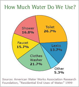
The following chart shows water usage (image courtesy of the EPA). You can see that toilet water usage is greater than shower water usage because the piece of the “pie” is greater:
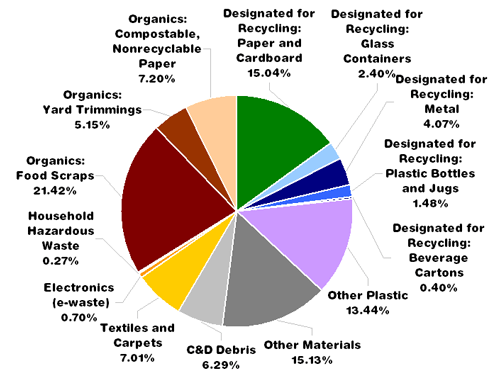
Pie charts give you a snapshot of how a group is broken down into smaller pieces. The following chart shows what New Yorkers throw in their trash cans. You could read that New Yorkers (perhaps surprisingly) throw a lot of recyclables into their trash, but a pie graph gives a clear picture of the large percentage of recyclables that find their way into the trash.
How to Make a Pie Chart
In order to make a pie chart, you must have a list of categorical variables (descriptions of your categories) as well as numeric variables. In the above graph, percentages are the numerical variables and the type of trash are the categorical variables.
Pie charts can be tricky to draw by hand, especially with tricky percentages; the whole of the pie is 360 degrees, so drawing 13.9 percent or 56 percent presents a challenge. It isn’t really necessary with the wide variety of computer programs that can make pie charts for you. Two of the most popular programs for making charts in elementary statistics or AP statistics classes are Microsoft Excel and IBM SPSS Statistics:
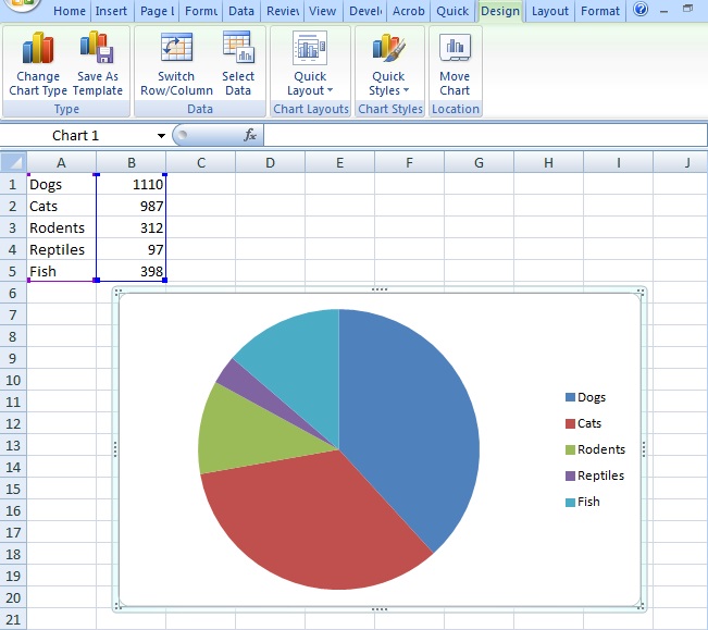
Pie chart in Excel.
Pie chart in IBM SPSS Statistics.
Note: When you make a pie chart, you must make sure that your categories don’t overlap, otherwise you’ll have a meaningless chart. For example, if you have a chart of what breeds of dog U.S. pet owners own, you can’t put a husky-German shepherd mix in two categories, otherwise it will create larger pieces of the “pie” for those categories.
Pie Chart in Excel (updated through Excel 2016)
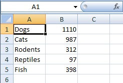
Example question: Make a pie chart in Excel that represents what percentage of people in a certain town own certain types of pets:
- Dogs (1110 people),
- Cats (987 people),
- Rodents (312 people),
- Reptiles (97 people),
- Fish (398 people).
Step 1: Type your data into an Excel worksheet. Type your categories in one column and your numbers into a second column. For this example problem, the categories would be the type of pets, so type those into column A. Type the numbers associated with each category into column B. Do not leave blank rows or columns when typing in the data.
Step 2: Select the data you entered. To select the data, click the top left of your data and then drag the cursor to the bottom right.
Step 3: Click “Insert,” then click “Pie,” then click the type of pie chart you need.
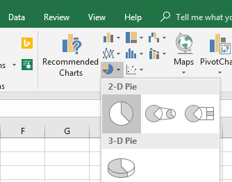
In most cases with simple pie charts like the one in this sample problem, the first selection (2D) will work fine. Once you have clicked the chart icon, Excel will insert the pie chart into your worksheet.
Tip: If you made a mistake in your entries, you don’t have to redo the entire chart; type your correction in the original data that you entered and Excel will automatically make the correction to the chart.
Check out ourYoutube channel for more Excel/Statistics help.
Back to top
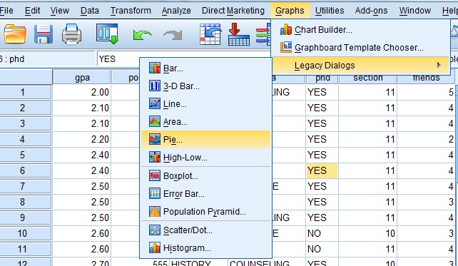
Make a Pie Chart in SPSS
IBM SPSS statistics is software specifically designed for stats, especially in the social sciences. The software is capable of creating a large number of graph types with a huge variety of options. Unlike simpler programs like Excel, SPSS gives you a lot of options for creating pie charts.
Pie Chart in SPSS: Steps
Step 1: Click “Graphs.” Click “Legacy Dialogs,” then click “Pie.”
Step 2: Click a radio button to tell SPSS what kind of data you have in the data sheet: Summaries for groups of cases, summaries of separate variables or values of individual cases. Click “Define” after you have made your selection.
Step 3: Choose which variable you want the chart to represent. Click a variable name in the left window and then click the top arrow to move it into the “Slices Represent” box.
Step 4: Choose other custom options, such as splitting the data into rows and columns. You can also use variable names on the graph instead of case numbers. These other options are all optional; You do not have to define them to create a basic pie chart.
Step 5: Click “OK” .
Tip: To edit a SPSS pie chart, double-click on the graph. A Chart Editor window appears. You can also right-click on the chart, then select “Edit Content” and then select “In separate window”.
Tip: Depending on the speed of your computer, SPSS may take a few moments to create the graph. You will see “Running Graph” in the bottom right of the window as SPSS works to create the graph.
Back to top
References
Gonick, L. (1993). The Cartoon Guide to Statistics. HarperPerennial.
Kotz, S.; et al., eds. (2006), Encyclopedia of Statistical Sciences, Wiley.
Lindstrom, D. (2010). Schaum’s Easy Outline of Statistics, Second Edition (Schaum’s Easy Outlines) 2nd Edition. McGraw-Hill Education
Vogt, W.P. (2005). Dictionary of Statistics & Methodology: A Nontechnical Guide for the Social Sciences. SAGE.