Descriptive Statistics > Q Q plots
What is a Q Q Plot?
Q Q Plots (Quantile-Quantile plots) are plots of two quantiles against each other. A quantile is a fraction where certain values fall below that quantile. For example, the median is a quantile where 50% of the data fall below that point and 50% lie above it. The purpose of Q Q plots is to find out if two sets of data come from the same distribution. A 45 degree angle is plotted on the Q Q plot; if the two data sets come from a common distribution, the points will fall on that reference line.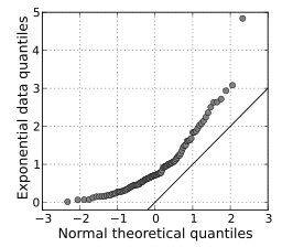
The image above shows quantiles from a theoretical normal distribution on the horizontal axis. It’s being compared to a set of data on the y-axis. This particular type of Q Q plot is called a normal quantile-quantile (QQ) plot. The points are not clustered on the 45 degree line, and in fact follow a curve, suggesting that the sample data is not normally distributed.
How to Make a Q Q Plot
Sample question: Do the following values come from a normal distribution?
7.19, 6.31, 5.89, 4.5, 3.77, 4.25, 5.19, 5.79, 6.79.
Step 1: Order the items from smallest to largest.
- 3.77
- 4.25
- 4.50
- 5.19
- 5.79
- 5.89
- 6.31
- 6.79
- 7.19
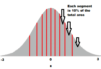
Step 2: Draw a normal distribution curve. Divide the curve into n+1 segments. We have 9 values, so divide the curve into 10 equally-sized areas. For this example, each segment is 10% of the area (because 100% / 10 = 10%).
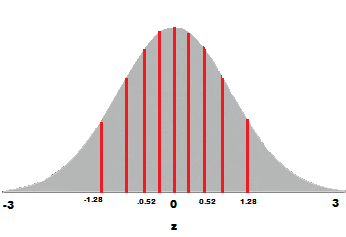
Step 3: Find the z-value (cut-off point) for each segment in Step 3. These segments are areas, so refer to a z-table (or use software) to get a z-value for each segment.
The z-values are:
- 10% = -1.28
- 20% = -0.84
- 30% = -0.52
- 40% = -0.25
- 50% = 0
- 60% = 0.25
- 70% = 0.52
- 80% = 0.84
- 90% = 1.28
- 100% = 3.0
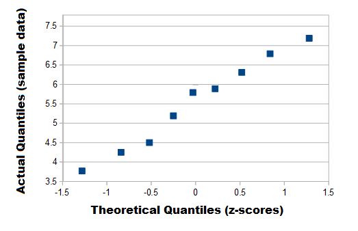
Step 4: Plot your data set values (Step 1) against your normal distribution cut-off points (Step 3). I used Open Office for this chart:
Note: This example used the standard normal distribution, but if think your data could have come from a different normal distribution (i.e. one with a different mean and standard deviation) then you could use that instead.
Q Q Plots and the Assumption of Normality
The assumption of normality is an important assumption for many statistical tests; you assume you are sampling from a normally distributed population. The normal Q Q plot is one way to assess normality. However, you don’t have to use the normal distribution as a comparison for your data; you can use any continuous distribution as a comparison (for example a Weibull distribution or a uniform distribution), as long as you can calculate the quantiles. In fact, a common procedure is to test out several different distributions with the Q Q plot to see if one fits your data well.
Check out our YouTube channel for hundreds of elementary stats and probability videos!
References
Agresti A. (1990) Categorical Data Analysis. John Wiley and Sons, New York.
Gonick, L. (1993). The Cartoon Guide to Statistics. HarperPerennial.
Vogt, W.P. (2005). Dictionary of Statistics & Methodology: A Nontechnical Guide for the Social Sciences. SAGE.
Wheelan, C. (2014). Naked Statistics. W. W. Norton & Company