Descriptive Statistics > How to Make a Relative Frequency Histogram
Contents (click to skip to that section):
- What is Relative Frequency?
- Making a Table
- Relative Frequency Histogram
- How to Make a Relative Frequency Histogram: Steps
What is Relative Frequency?
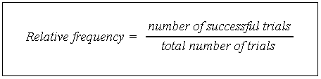
Relative frequency is how often something happens divided by all the possible outcomes. The relative frequency formula is:
Watch the video to find how to make a relative frequency histogram:
Can’t see the video? Click here to watch it on YouTube.
Example
As an example, you play a computer game 50 times with your friend, Sol.
You have won 15 times, Sol has won 30 times, and you have drawn 5 times.
So far, Sol has won 30 out of the 50 games. You can write this as a fraction, which is 30/50 = 3/5. The relative frequency of Sol winning is 3/5.
You can use the relative frequency as an estimate for the probability of Sol winning in the future (the probability is 3/5).
Back to Top
Making a Table
A relative frequency table shows how often something happens compared to other things. For example, the following table shows the frequency that books are sold at a particular book store. In other words, it shows you how many books were sold:
| Price | Frequency |
| $1 to $10 | 100 |
| $11 to $20 | 160 |
| $21 to $30 | 100 |
| Over $30 | 40 |
This table shows the same data. A second column has been added for relative frequency. For example, books priced $1 to $10 represent .25(25%) of total sales.
| Price | Frequency | Relative Frequency |
| $1 to $10 | 100 | .25 |
| $11 to $20 | 160 | .40 |
| $21 to $30 | 100 | .25 |
| Over $30 | 40 | .1 |
Relative Frequency Histogram
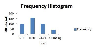
A regular histogram for the above data would show the number of books sold. For example, the first column shows that 100 books were sold in the lowest price group (up to $10).
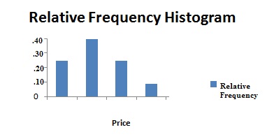
The relative frequency histogram would show the relative frequency of the books sold. For example, this histogram shows the first category as making up 25% of the total book sales.
What Exactly is a Relative Frequency Histogram?
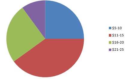
A relative frequency histogram is a type of graph that shows how often something happens, in percentages. The following relative frequency histogram shows book sales for a certain day. The price of the categories (“bins“) are on the horizontal axis (the x-axis) and the relative frequencies (percentages of the whole) are shown in the vertical column (the y-axis).
Relative frequency histograms are similar to pie charts, in that they show percentages of a whole. The total number of book sales in the above chart = .25 (25%) + .4 (40%) + .25 (25%) + .10 (10%) = 1 (100%). Here’s the pie chart that corresponds to the relative frequency histogram above:
How to Make a Relative Frequency Histogram: Steps
In these steps I’m going to show you by using a frequency chart to summarize your data. This is optional but it will really help you keep track of your data so that your chart is correct!
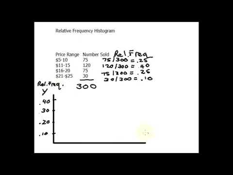
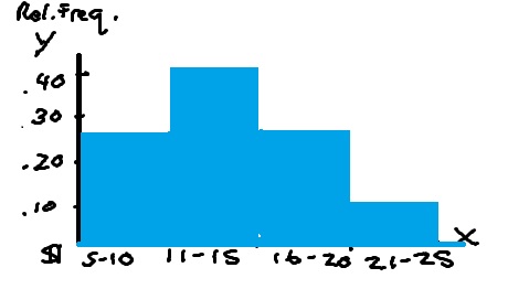
Step 1: Make a frequency chart of your data. A frequency chart is just a list of the amount of times something happened. For the relative frequency histogram above, that would be the number of books sold for each price:
| Price Range | Number Sold | |
| $5-10 | 75 | |
| $11-15 | 120 | |
| $16-20 | 75 | |
| $21-$25 | 30 |
Step 2: Count the total number of items. For the sample problem, there were 75 + 120 + 75 + 30 = 300 books sold.
Step 3: Figure out the relative frequency by dividing the count in each category by the total.
75/300 = .25
120/300 = .40
75/300 = .25
30/300 = .10
Add this information to a new column in your relative frequency chart.
| Price Range | Number Sold | ||
| $5-10 | 75 | .25 | |
| $11-15 | 120 | .40 | |
| $16-20 | 75 | .25 | |
| $21-$25 | 30 | .10 |
Step 4: Make a histogram with the information from your frequency chart. You could just sketch it by hand — putting the relative frequencies on the vertical axis and the prices on the horizontal axis (See: How to make a histogram). However, you can also use technology. See: How to make a histogram in Excel.
That’s it!
Back to Top
Check out our YouTube channel for more stats help and tips!