Descriptive Statistics > Timeplot
Contents:
- What is a Timeplot?
- Timeplot in Minitab
- What is Smoothing?
- What is Seasonality?
- Filtering
- Time Series Transformation
- Related Articles
1. What is a Timeplot?
A timeplot (sometimes called a time series graph) displays values against time. They are similar to Cartesian plane x-y graphs, but while an x-y graph can plot a variety of “x” variables (for example, height, weight, age), timeplots can only display time on the x-axis. Unlike pie charts and bar charts, these plots do not have categories. Timeplots are good for showing how data changes over time. For example, this type of chart would work well if you were sampling data at random times.
Time Series Analysis
The goal of time series analysis is to find patterns in the data and use the data for predictions. For example, if your data is affected by past data, one way to model that behavior is through the AR process.
Timeplot Example
The following graph shows a physics-related timeplot with the position vs. time for two spark tapes pulled through a spark timer at different constant speeds.
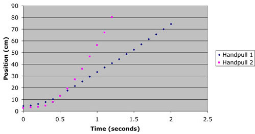
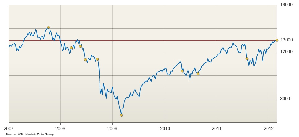
While a timeplot can resemble a scatter plot, with a series of dots, you will often see these plots with the dots connected, especially in financial publications like The Wall Street Journal.
2. Time Plot in Minitab
Watch the video to learn how to make a time plot in Minitab.
A Time plot in Minitab can be created in a few short steps.
Step 1: Type your data into two columns in Minitab. If you don’t have the specific time (i.e. years or days) then enter your data into a single column.
Step 2: Click “Graph” and then click “Time Series Plot.”
Step 3: Click “Simple” and then click “OK.”
Step 4: Click the variable names you want to graph from the left window and then click “Select” to move the variables over to the Variables window.
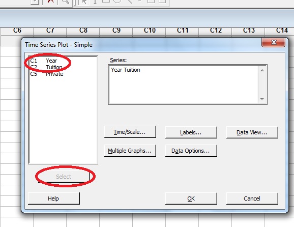
Step 5: Click “Time/Scale” and then choose a radio button to tell Minitab what time scale you are graphing. For example, click the “Calendar” radio button and then choose “Years.”
Step 5: Click “OK.” The time plot will appear in a separate window.
Tip: If you have a list of values but no years or other time data associated with the number (for example, days), click “Index” in Step 5. Minitab will create a time plot with an index starting at zero.
3. What is Smoothing?
Time series patterns can be difficult to analyze because of noise (messy patterns). Analysis is based on the assumption that the data has equal intervals (for example, by month, year, or decade). In order to see underlying trends, sometimes a technique called smoothing is used to create a line graph (a single line on the x-y axis instead of a series of dots). Smoothing is especially important for predicting future events, like seeing if the stock market is trending up, or down.
Smoothing can be done by hand. You basically draw a single, “best fit” line, or a computer can do the smoothing for you. The following graph shows the original timeplot (pink for women and blue for men) along with a line of best fit (green) showing smoothing.
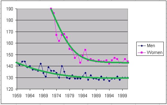
Timeplot smoothing allows you to see the overall trend and also makes it easier to spot outliers. A simple way to smooth timeplots is with a moving average.
Common smoothing techniques:
- Bicubic splines: used for time series with relatively few points that are systematically distributed.
- Distance weighted least squares smoothing or negative exponentially weighted smoothing: used when measurement errors are very large.
- Exponential Smoothing: assigns exponentially decreasing weights from newest to oldest observations.
- Moving average smoothing: reduces noise by replacing elements of the series by an average, or weighted average.
- Simple linear regression: gives a linear function to approximate the line. If you have some obviously nonlinear components, you may need to transform the data first with a logarithmic function, exponential function or polynomial function.
Seasonality in Time Series
Seasonality refers to periodic fluctuations in time series data that happens at regular periods. While traditionally used to literally mean seasons (e.g. Spring, Summer, Autumn, Winter), it can occur during any time period, like hours, days, or weeks.
Examples:
- Sales data tends to increase before the December holidays and then decreases into the new year.
- Monthly temperatures in any city tend to rise and fall predictably from year to year.
- Hourly sales data for “big box” stores open 24 hours will rise and fall predictably at certain times of the day, with peaks at dinnertime/after work and lows at 3-4 a.m..
Detection
Seasonality can cause issues with interpreting time series data and so must be included in any model. While seasonal variations—changes that occur in a particular season of the year—are fairly easy to detect in data (a simple scatter plot can often show the trends), seasonality is harder to detect because you don’t know what time periods are fluctuating. Various techniques are available to detect these fluctuations including:
- A run sequence plot or multiple box and whiskers charts. Easy to read, but assumes you know the seasonal periods.
- A >seasonal subseries plot. Assumes you already know the seasonal periods. Good for small data sets; Plots for larger data sets can be hard to read.
- A correlogram (or autocorrelation function plot). Useful if you don’t know the seasonal period. Seasonal periods usually show up as spiked at seasonal intervals.
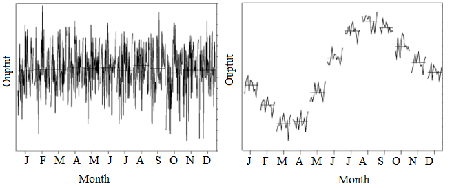
The above image of two subseries plots demonstrates the obvious seasonal trend in the right-hand plot: the data decreases to March, increases towards August and then decreases again. the plot on the left shows no obvious pattern. If you plotted a series of box plots (one for each month), the results would be similar.
Other Factors that Cause Fluctuations
Seasonality is just one component that can cause fluctuations in time series data. For example, graphs can have trend components (an overall increase or decrease), cyclical components (wave like patterns) and irregular components (unpredictable, random fluctuations). Cyclical components are very similar to seasonality. However, while seasonality follows a regular pattern (e.g. monthly or quarterly), the time intervals between cyclical components vary.
Filtering
Filtering is where a time series is converted into another time series by a linear operation. Different signals can be filtered using low-pass, band-pass or high-pass filters.
1. Time Series Transformation

Some models can’t be easily transformed—like models with seasonality, which refers to regular, periodic fluctuations in time series data. These can sometimes be broken down into smaller pieces (a process called stratification) and individually transformed. Another way to deal with seasonality is to subtract the mean value of the periodic function from the data.
References
Chatfield, C, 1995, The analysis of Time Series, 4th edition. Chapman & Hall