- What is a Bar Chart?
- Bar Chart vs. Histogram
- Bar Graph Examples (Different Types)
- How to Make a Bar Chart:
What is a Bar Chart?
A bar chart is a graph with rectangular bars. The graph usually compares different categories. Although the graphs can be plotted vertically (bars standing up) or horizontally (bars laying flat from left to right), the most usual type of bar graph is vertical.
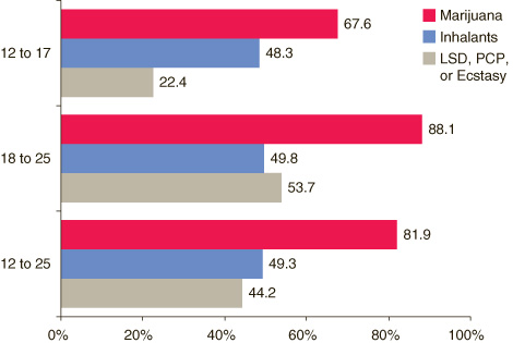
The horizontal (x) axis represents the categories; The vertical (y) axis represents a value for those categories. In the graph below, the values are percentages.

A bar graph is useful for looking at a set of data and making comparisons. For example, it’s easier to see which items are taking the largest chunk of your budget by glancing at the above chart rather than looking at a string of numbers. They can also shows trends over time, or reveal patterns in periodic sequences.
Bar charts can also represent more complex categories with stacked bar charts or grouped bar charts. For example, if you had two houses and needed budgets for each, you could plot them on the same x-axis with a grouped bar chart, using different colors to represent each house. See types of bar graphs below.
Difference Between a Histogram and a Bar Chart
Although they look the same, bar charts and histograms have one important difference: they plot different types of data. Plot discrete data on a bar chart, and plot continuous data on a histogram What’s the difference between discrete and continuous data?).
A bar chart is used for when you have categories of data: Types of movies, music genres, or dog breeds. It’s also a good choice when you want to compare things between different groups. You could use a bar graph if you want to track change over time as long as the changes are significant (for example, decades or centuries). If you have continuous data, like people’s weights or IQ scores, a histogram is best.
Bar Graph Examples (Different Types)
A bar graph compares different categories. The bars can be vertical or horizontal. It doesn’t matter which type you use—it’s a matter of choice (and perhaps how much room you have on your paper!).
List of Types
1. Grouped Bar Graph
A grouped bar graph is a way to show information about sub-groups of the main categories.
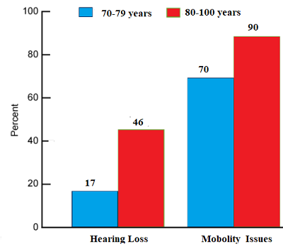
In the above image, the categories are issues that senior citizens face (hearing loss and mobility issues); the sub-groups are age. A separate colored bar represents each sub-group: blue for age 70-79 and red for age 80-100.
A key or legend is usually included to let you know what each sub-category is. Like regular bar charts, grouped bar charts can also be drawn with horizontal bars.
When there are only two sub-groups (as in the above image), the graph is called a double bar graph. It’s possible to have as many sub-groups as you like, although too many can make the graph look cluttered.
2. Stacked Bar Chart
A stacked bar chart also shows sub-groups, but the sub-groups are stacked on the same bar.
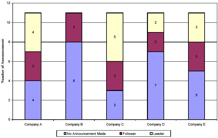
Each bar shows the total for sub-groups within each individual category.
Like the double bar chart, different colors represent different sub-groups. This type of chart is a good choice if you:
- Want to show the total size of groups.
- Are interested in showing how the proportions between groups related to each other, in addition to the total of each group.
- Have data that naturally falls into components, like:
- Sales by district.
- Book sales by type of book.
Stacked bar charts can also show negative values; negative values are displayed below the x-axis.
Back to Top
3. Segmented Bar Graph.
A type of stacked bar chart where each bar shows 100% of the discrete value. They should represent 100% on each of the bars or else it’s going to be an ordinary stacked bar chart. For more on this particular type of graph, see: Segmented Bar Charts.

How to Make a Bar Chart
Need help with a homework question? Check out our tutoring page!
By Hand
If you’re just starting to learn how to make a bar graph, you’ll probably be asked to draw one by hand on graph paper at first. Here’s how to do it.
Example problem: Make a bar graph that represents exotic pet ownership in the United States. There are:
- 8,000,000 fish,
- 1,500,000 rabbits,
- 1,300,000 turtles,
- 1,000,000 poultry
- 900,000 hamsters.
Step 1: Number the Y-axis with the dependent variable. The dependent variable is the one being tested in an experiment. In this example question, the study wanted to know how many pets were in U.S. households. So the number of pets is the dependent variable. The highest number in the study is 8,000,000 and the lowest is 1,000,000 so it makes sense to label the Y-axis from 0 to 8.
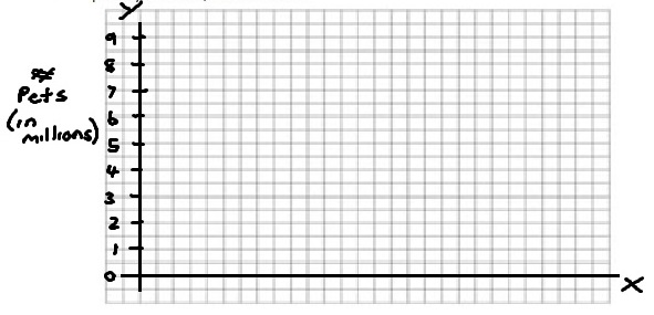
Step 2: Draw your bars. The height of the bar should be even with the correct number on the Y-axis. Don’t forget to label each bar under the x-axis.
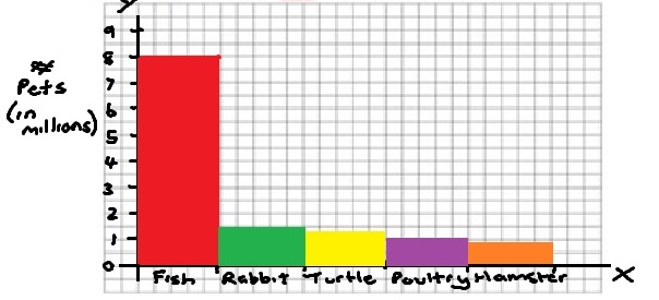
Step 3: Label the X-axis with what the bars represent. For this example problem, label the x-axis “Pet Types” and then label the Y-axis with what the Y-axis represents: “Number of pets (per 1,000 households).” Finally, give your graph a name. For this example, call the graph “Pet ownership (per 1,000 households).
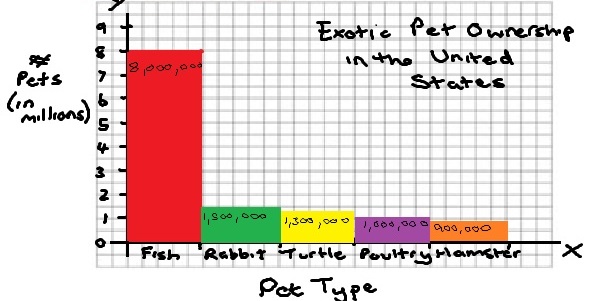
Optional: In the above graph, I chose to write the actual numbers on the bars themselves. You don’t have to do this, but if you have numbers than don’t fall on a line (i.e. 900,000), then it can help make the graph clearer for a viewer.
Tips:
- Line the numbers up on the lines of the graph paper, not the spaces.
- Make all your bars the same width.
How to Make a Bar Chart in Excel
A small quirk with Excel: Excel calls vertical graphs column charts and horizontal graphs bar charts.
Watch the video below to learn more.
Can’t watch the video? Click here.
Excel 2007-2010
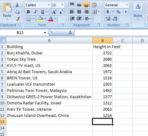
Example problem: Create a bar chart in Excel that illustrates the following data for the tallest man-made structures in the world (as of January, 2013):
| Building | Height in feet |
| Burj Khalifa, Dubai | 2,722 |
| Tokyo Sky Tree | 2,080 |
| KVLY-TV mast, US | 2,063 |
| Abraj Al Bait Towers, Saudi Arabia | 1,972 |
| BREN Tower, US | 1,516 |
| Lualualei VLF transmitter | 1,503 |
| Petronas Twin Tower, Malaysia | 1,482 |
| Ekibastuz GRES-2 Power Station, Kazakhstan | 1,377 |
| Dimona Radar Facility, Israel | 1,312 |
| Kiev TV Tower, Ukraine | 1,263 |
| Zhoushan Island Overhead Powerline Tie, China | 1,214 |
Step 1: Type your data into a new Excel worksheet. Place one set of values in column A and the next set of values in column B. For this example problem, place the building names in column A and the heights of the towers in column B.
Step 2: Highlight your data: Click in the top left (cell A1 in this example) and then hold and drag to the bottom right.
Step 3: Click the “Insert” tab and then click on the arrow below “Column.” Click the type of chart you would like (for example, click “2D column).
That’s it!
Tip: To widen the columns in Excel, mouse over the column divider, click and drag the divider to the width you want.
Back to Top
Excel 2016-2013
A bar graph in statistics is usually a graph with vertical bars. However, Excel calls a bar graph with vertical bars a column graph.
Step 1: Click the “Insert” tab on the ribbon.
Step 2: Click the down arrow next to the bar chart icon.
Step 3: Select a chart icon. For example, select a simple bar chart.
That’s it!
How to make a bar graph in Excel 2016/2013: Formatting tips
- Change the width of the bars: Click on a bar so that handles appear around the bars. Right click, then choose Format Data Series. Under Format Data Series, click the down arrow and choose “Series Options.” Click the last choice (“Series…”). Then move the “Gap Width” slider to change the bar width.
- If you want to remove the title or the data labels, select the “Chart Elements icon.” The Chart Elements icon is the first icon showing at the upper right of the graph area (the + symbol).
- Change the style or color theme for your chart by selecting the Chart Styles icon. The Chart Styles icon is the second icon showing at the upper right of the graph (the pencil).
- Edit what names or data points are visible on the chart by selecting the filter icon. The filter icon is the third icon at the top right of the chart area.
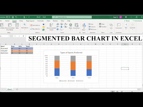
How to Make a Stacked Bar Chart in Excel
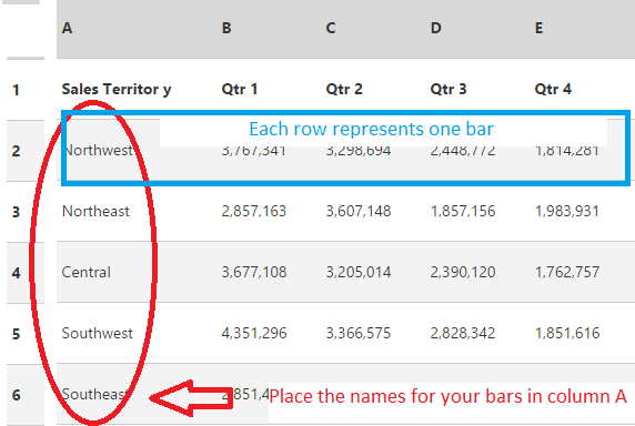
Step 1:Select the data in your worksheet. The names for each bar are in column A. The “stacked” portion of each bar are in the rows.
Step 2: Click the “Insert” tab, then click “Column.”
Step 3: Choose a stacked chart from the given options. For example, the second chart listed (under 2-D column) is a good choice.
If you want to modify the layout of your chart, click the chart area of the chart to display the Chart Tools in the ribbon. Then click the “Design” tab for options.
Back to Top
Make a Bar Graph in Minitab
Watch the video below for an overview on making a bar graph in Minitab:

Can’t see the video? Click here to watch it on YouTube.
Minitab is a statistical software package distributed by Minitab, Inc. The software is used extensively, especially in in education. It has a spreadsheet format, similar in feel to Microsoft Excel. However, where it differs from Excel is that the toolbar is set up specifically for creating statistical graphs and distributions. Creating a bar graph in Minitab is as simple as entering your data into the spreadsheets and performing a couple of button clicks.
Step 1: Type your data into columns in a Minitab worksheet. For most bar graphs, you’ll probably enter your data into two columns (x-variables in one column and y-variables in another). Make sure you give your data a meaningful name in the top (unnumbered) row, because your variables will be easier to recognize in Step 5, where you build the bar graph.
Step 2: Click “Graph,” then click “Bar Chart.”
Step 3: Select your variable type from the Bars Represent drop down menu. For most charts, you’ll probably select “Counts of Unique Variables” unless your data is in groups or from a function.
Step 4: Click “OK.”
Step 5: Select a variable from the left window, then click the “Select” button to move your variable over to the Variables window.
Step 6: Click “OK.” A bar graph in Mintab appears in a separate window.
Tip:If you want to label your graph, click the “Label” button at the bottom of the window in Step 5.
Check out our YouTube channel for more stats tips!
How to Make a Bar Chart in SPSS
Watch the video for an overview:

Can’t see the video? Click here to watch it on YouTube.
When you make a bar chart in SPSS, the x-axis is a categorical variable and the y-axis represents summary statistics such as means, summations or counts. Bar charts are accessed in SPSS through the Legacy dialogs command or through the Chart Builder.
How to Make a Bar Chart in SPSS: Steps
Step 1: Open the file you want to work with in SPSS or type the data into a new worksheet.
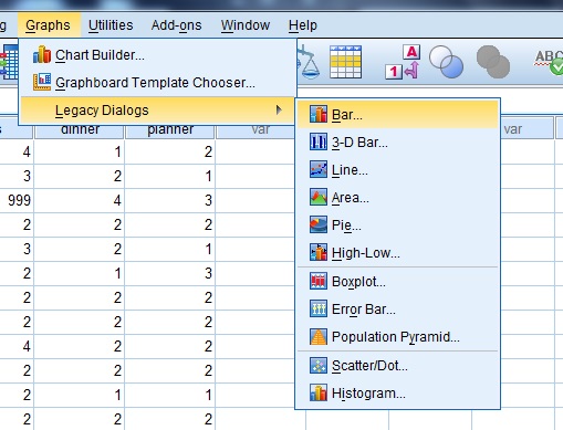
Step 2: Click “Graphs,” then click “Legacy Dialogs” and then click “Bar” to open the Bar Charts dialog box.
Step 3: Click on an image for the type of bar graph you want (Simple, Clustered (a.k.a. grouped), or Stacked) and then click the appropriate radio button to tell SPSS what type of data is in your variables lists:
- Summaries for groups of cases,
- Summaries of separate variables, or
- Values of individual cases.
When you have made your selections, click the “Define” button.
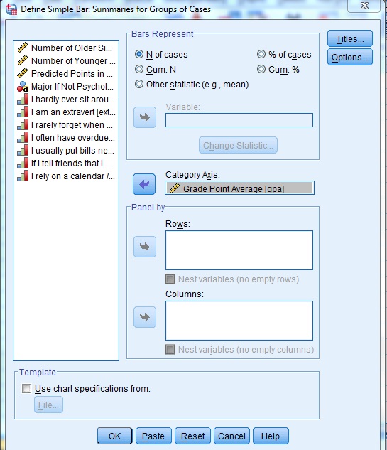
Step 4: Click a radio button in the Bars Represent area to choose what you would like the bars to represent. For example, if you want the bars to represent the number of cases, click the “N of cases” radio button.
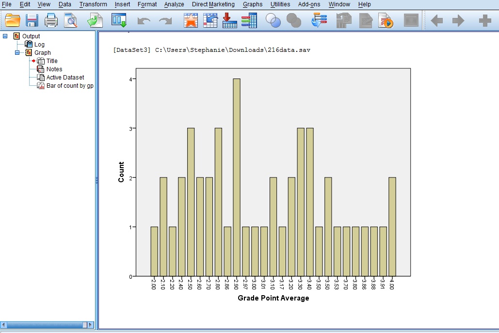
Step 5: Click a variable in the left-hand window in the “Define Simple Bar” pop-up window and then transfer those variables by clicking the appropriate center arrow. For this simple example, click “Grade Point Average” and then click the arrow to the left of “Category Axis.” When you have made your selections, click “OK.” This will produce a graph of the number (counts) of each grade point average.
References
Dodge, Y. (2008). The Concise Encyclopedia of Statistics. Springer.
Gonick, L. (1993). The Cartoon Guide to Statistics. HarperPerennial.
Wheelan, C. (2014). Naked Statistics. W. W. Norton & Company