Descriptive Statistics > Ogive Graph
What is an Ogive Graph?
 An ogive (oh-jive), sometimes called a cumulative frequency polygon, is a type of frequency polygon that shows cumulative frequencies. In other words, the cumulative percents are added on the graph from left to right.
An ogive graph plots cumulative frequency on the y-axis and class boundaries along the x-axis. It’s very similar to a histogram, only instead of rectangles, an ogive has a single point marking where the top right of the rectangle would be. It is usually easier to create this kind of graph from a frequency table.
How to Draw an Ogive Graph
Example question: Draw an Ogive graph for the following set of data:
2, 7, 3, 8, 3, 15, 19, 16, 17, 13, 29, 20, 21, 21, 22, 25, 31, 51, 55, 55, 57, 58, 56, 57, 58.
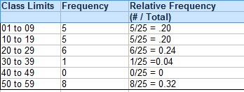
Step 1: Make a relative frequency table from the data. The first column has the class limits, the second column has the frequency (the count) and the third column has the relative frequency (class frequency / total number of items):
If you aren’t sure how to create your class limits(also called bins), watch the video at the bottom of this article or see: What is a Bin in Statistics?
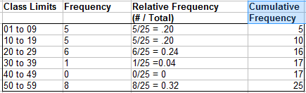
Step 2: Add a fourth column and cumulate (add up) the frequencies in column 2, going down from top to bottom. For example, the second entry is the sum of the first row and the second row in the frequency column (5 + 5 = 10), and the third entry is the sum of the first, second, and third rows in the frequency column (5 + 5 + 6 = 16):
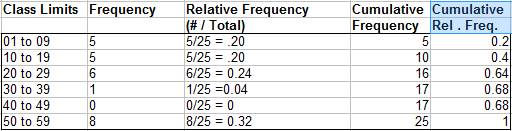
Step 3: Add a fifth column and cumulate the relative frequencies from column 3. If you do this step correctly, your values should add up to 100% (or 1 as a decimal):
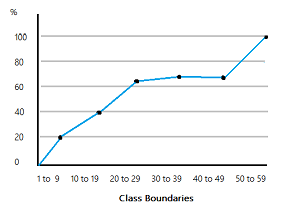
Step 4: Draw an Cartesian plane (x-y graph) with percent cumulative relative frequency on the y-axis (from 0 to 100%, or as a decimal, 0 to 1). Mark the x-axis with the class boundaries.
Step 5: Plot your points. Note: Each point should be plotted on the upper limit of the class boundary. For example, if your first class boundary is 0 to 10, the point should be plotted at 10.
Step 6: Connect the dots with straight lines. the ogive is one continuous line, made up of several smaller lines that connect pairs of dots, moving from left to right.
The finished graph for this sample data:
References
Agresti A. (1990) Categorical Data Analysis. John Wiley and Sons, New York.
Levine, D. (2014). Even You Can Learn Statistics and Analytics: An Easy to Understand Guide to Statistics and Analytics 3rd Edition. Pearson FT Press