 A radar chart is a 2D chart presenting multivariate data by giving each variable an axis and plotting the data as a polygonal shape over all axes. All axes have the same origin, and the relative position and angle of the axes are usually not informative. The equi-angular spokes, from the origin to the point on each axis represented by the variable, are called radii.
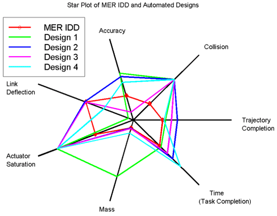
Typically a radar chart looks like an irregular polygon, or like several irregular polygons stacked on top of each other, all with the same center.
Radar charts are also called spider charts, web charts, cobweb charts, star plots, polar charts, or Kiviat charts.
When a Radar Chart is a Good Choice
A radar chart is often a good choice if you need to plot a series of observations or cases with multivariate data. Each observation or case is represented by a polygon; and if they are shaded opaquely it is easy to see how they overlap and in which direction.
A radar chart is especially useful if:
- You want to compare the general shape, reach and symmetry of the distribution of variables rather than specific quantities among observations,
- You are working with a large number of variables,
- You want a quick visual way of viewing quality data.
Even working with one observation, you may choose to use a radar chart if different scales of measurement make plotting your data on a bar graph difficult, or if your many variables make a bar graph look cluttered.
Problems with Radar Charts
One major benefit of radar charts—the ability to plot variables with disparate, non-matching scales—turns out to be a weak point as well, since the relative scaling may be arbitrary.
Graphing multiple observations can also become messy, as it can be hard to visually distinguish more than three or four stacked polygons. Using opaque colored layers helps in this, but there is still a limit in how many observations can be reasonably included in one graph.
References
Nowicki & Merenstein. CS 465: Information Visualization: Radar Chart
Retrieved from http://www.cs.middlebury.edu/~candrews/showcase/infovis_techniques_s16/radar_chart/ on January 30, 2017
Saary, M. Joan. Radar plots: a useful way for presenting multivariate health care data
Journal of Clinical Epidemiology 60 (2008) 311-317 Retrieved from https://pdfs.semanticscholar.org/bf91/af43cf7fe191f707c4c874dd68af1eec558a.pdf on January 30, 2017