A gain and lift chart is a visual way to evaluate different the effectiveness of different models. As well as helping you to evaluate how good your predictive model might be, it can also show visually how the response rate of a targeted group might differ from that of a randomly selected group.
A lift chart shows the actual lift, which is the ratio between results with an without the model. In data mining, you can think of it as measuring “…the change in concentration of a particular class when the model is used to select a group from the general population.” The higher the lift (i.e. the further up it is from the baseline), the better the model.
Lift charts are often shown as a cumulative lift chart, which is also known as a gains chart. Therefore, gains charts are sometimes (perhaps confusingly) called “lift charts”, but they are more accurately cumulative lift charts.
Example
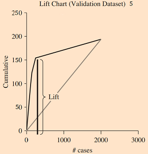
The following lift chart (from here) is a cumulative gains chart. Records are arranged on the x-axis from left to right in decreasing probability of loan acceptance.
Lift Chart Usage
Lift charts are especially popular in data mining for marketing and sales applications.
References
Berry, M.J.A. and Linoff, G. (1999): Data Mining Techniques: For Marketing, Sales, and Customer Support. Morgan Kaufmann Publishers.
Chapter 9: Data Mining
Cumulative Gain and Lift Chart. Retrieved July 23, 2019 from: http://www2.cs.uregina.ca/~dbd/cs831/notes/lift_chart/lift_chart.html
Lift Charts. Retrieved July 23, 2019 from: https://www3.nd.edu/~busiforc/handouts/DataMining/Lift%20Charts.html
Larose, D. (2015). Data Mining and Predictive Analytics. John Wiley and Sons.
Understanding and Interpreting Gain and Lift Charts. Retrieved January 1, 2022 from: https://www.datasciencecentral.com/profiles/blogs/understanding-and-interpreting-gain-and-lift-charts