Descriptive Statistics > Run Chart
What is a run chart?
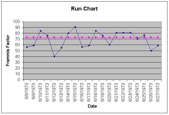
A run chart, also called a run-sequence plot, is a type of line graph that displays observed data in a time sequence. It can help detect changes in data, or anomalies, over time. Run charts have many applications in medical research, as well as in performance control and engineering. The observed data can represent performance of a business or manufacturing process [1]. For example, the data could the number of defects produced per day, measurements of products filled in a bottling plant, the air temperature of an air conditioning unit each time it is run, or the number of customer complaints received.
Typically, a run chart has two axes. Time is plotted on the horizontal axis; the vertical axis represents the value of the data point at a time of interest. A second horizontal line is drawn at the median; half of the points are above and half of the points are below this line. This line is drawn from baseline data, which should be free of shifts, trends, runs, or astronomical data points. Run charts are widely used in medical research, as well as in performance control and engineering applications.
Run chart components
Most run charts consists of two axes, with time on the horizontal axis and the value of the data point on the vertical axis. Occasionally, a run chart might not have time on the horizontal axis. For example a run chart being used to track a process over time may have the order in which the data points were collected.
A common way to plot data points on a run chart is to plot each data values against its index number. For example, if x1, x2, … , xt is the data, then plot x1, x2, … , xt against their index 1, 2, … , t [2].
A median or mean line — from baseline data — is sometimes drawn horizontally, representing the midpoint of the data. This line should be based on data that is free from shifts, trends, runs, or outliers.
How to create a run chart
-
- A degrading process may have data series constantly above the median, gradually descending.
-
- An improving process may show a series that starts below the median with a consistent upward trend.
-
- A shift refers to eight or more consecutive points, all above or below the centerline, that jump up or down suddenly. They are indicative that a process has permanently changed [3]. If a value falls exactly on the median, it neither breaks nor contributes to a shift. For example, if there are 30 consecutive points with a value of “3,” it would not be considered a shift. During analysis, such points should be skipped and the next points evaluated.
-
- A trend is identified when six or more values align in the same direction [3]. Two consecutive points with the same value count as a single point in determining trends. Random variations would result in scattered data points above and below the median.
-
- A run consists of five or more points on one side of the median, either ascending, descending, or a combination of both, as long as they remain on one side of the median line. In general, a run could be considered “too long” if it contains 7 data points (with less than observations) or 8 data points (more than 20 observations).
- Astronomical points are outliers that significantly differ from the rest of the data in the run chart. They are distinct anomalies and should not be confused with the minimum and maximum values that appear on every chart.
Advantages and disadvantages
While run charts are relatively simple to make, they are of limited analytic value beyond identifying tends and flagging processes for improvement. Further analysis, such as a hypothesis test, can be performed on run chart data to help you to determine whether the data is consistent with a particular hypothesis.
Run charts vs. Pareto charts
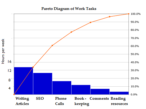
Run charts are a straightforward line graph illustrating the values of a variable over time. On the other hands, Pareto charts are bar graphs that display the frequency of various values of a variable and are valuable for pinpointing the most important issues that require attention.
References
- NC-NET Employability Skills Resource Toolkit [PDF]
- Tattar, P. et al. A Course in Statistics with R. Wiley. [PDF]
- Aartsengel, A. & Kurtoglu, S. (2013) Handbook on Continuous Improvement Transformation. Springer.
- Select the data that you will measure and track. Generally, around 20-25 data points will enable you to identify significant patterns over time.
- Draw two axes: the vertical line (y-axis) representing the observed data and the horizontal axis (x axis) representing time.
- Plot the collected data on the graph.
- Analyze the chart, paying attention to important changes or significant trends and patterns, rather than every single data variation.
Interpreting a run chart
A run chart is a relatively simple way to identify any overall degradation or improvement in the data series over time. It also helps you to see if values are unrelated to time.
-
- A degrading process may have data series constantly above the median, gradually descending.
-
- An improving process may show a series that starts below the median with a consistent upward trend.
-
- A shift refers to eight or more consecutive points, all above or below the centerline, that jump up or down suddenly. They are indicative that a process has permanently changed [3]. If a value falls exactly on the median, it neither breaks nor contributes to a shift. For example, if there are 30 consecutive points with a value of “3,” it would not be considered a shift. During analysis, such points should be skipped and the next points evaluated.
-
- A trend is identified when six or more values align in the same direction [3]. Two consecutive points with the same value count as a single point in determining trends. Random variations would result in scattered data points above and below the median.
-
- A run consists of five or more points on one side of the median, either ascending, descending, or a combination of both, as long as they remain on one side of the median line. In general, a run could be considered “too long” if it contains 7 data points (with less than observations) or 8 data points (more than 20 observations).
- Astronomical points are outliers that significantly differ from the rest of the data in the run chart. They are distinct anomalies and should not be confused with the minimum and maximum values that appear on every chart.
Advantages and disadvantages
While run charts are relatively simple to make, they are of limited analytic value beyond identifying tends and flagging processes for improvement. Further analysis, such as a hypothesis test, can be performed on run chart data to help you to determine whether the data is consistent with a particular hypothesis.
Run charts vs. Pareto charts
Run charts are a straightforward line graph illustrating the values of a variable over time. On the other hands, Pareto charts are bar graphs that display the frequency of various values of a variable and are valuable for pinpointing the most important issues that require attention.