Contents (Click to skip to that section):
- What is a Frequency Distribution Table?
- How to make a Frequency Distribution Table Examples:
- Using Tally Marks
- Including Classes
- Types of Frequency Distribution
See also: Frequency Distribution Table in Excel
What is a Frequency Distribution Table?
Watch the video for an example of how to make a frequency distribution table with classes:
Can’t see the video? Click here to watch it on YouTube.
Frequency tells you how often something happened. The frequency of an observation tells you the number of times the observation occurs in the data. For example, in the following list of numbers, the frequency of the number 9 is 5 (because it occurs 5 times):
1, 2, 3, 4, 6, 9, 9, 8, 5, 1, 1, 9, 9, 0, 6, 9.
A frequency distribution is a summary of this type of data [1]. It gives us the number of observations within a specific interval, shown either graphically (usually with a bar chart or a histogram) or as a frequency distribution table. Frequency in this context indicates the occurrence of a value within a specified interval, while distribution refers to the pattern of the variable’s frequency.
Tables can show either categorical variables (sometimes called qualitative variables) or quantitative variables (sometimes called numeric variables). You can think of categorical variables as categories (like eye color or brand of dog food) and quantitative variables as numbers.
The following table shows what family planning methods were used by teens in Kweneng, West Botswana. The left column shows the categorical variable (Method) and the right column is the frequency — the number of teens using that particular method.
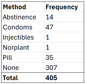
Frequency distribution tables give you a snapshot of the data to allow you to find patterns. A quick look at the above frequency distribution table tells you the majority of teens don’t use any birth control at all.
How to make a Frequency Distribution Table: Examples
Example 1: Tally marks are often used to make a frequency distribution table. For example, let’s say you survey a number of households and find out how many pets they own. The results are 3, 0, 1, 4, 4, 1, 2, 0, 2, 2, 0, 2, 0, 1, 3, 1, 2, 1, 1, 3. Looking at that string of numbers boggles the eye; a frequency distribution table will make the data easier to understand.
Steps
To make the frequency distribution table, first write the categories in one column (number of pets): 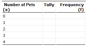
Next, tally the numbers in each category (from the results above). For example, the number zero appears four times in the list, so put four tally marks “||||”: 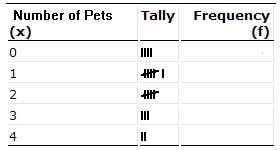
Finally, count up the tally marks and write the frequency in the final column. The frequency is just the total. You have four tally marks for “0”, so put 4 in the last column: 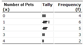
Back to Top
How to Draw a Frequency Distribution Table (Slightly More Complicated Example)
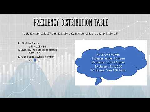
A frequency distribution table is one way you can organize data so that it makes more sense. For example, let’s say you have a list of IQ scores for a gifted classroom in a particular elementary school. The IQ scores are: 118, 123, 124, 125, 127, 128, 129, 130, 130, 133, 136, 138, 141, 142, 149, 150, 154. That list doesn’t tell you much about anything. You could draw a frequency distribution table, which will give a better picture of your data than a simple list.
How to Draw a Frequency Distribution Table: Steps.
Part 1: Choosing Classes
Step 1: Figure out how many classes (categories) you need. There are no hard rules about how many classes to pick, but there are a couple of general guidelines:
- Pick between 5 and 20 classes. For the list of IQs above, we picked 5 classes.
- Make sure you have a few items in each category. For example, if you have 20 items, choose 5 classes (4 items per category), not 20 classes (which would give you only 1 item per category).
Note: There is a more mathematical way to choose classes. The formula is log(observations)\ log(2). You would round up the answer to the next integer. For example, log17\log2 = 4.1 will be rounded up to become 5. Another way to do this is with Sturges formula: Number of classes = 1 + 3.322 logN, where N is the number of items in the set.
Part 2: Sorting the Data
Step 2: Subtract the minimum data value from the maximum data value. For example, our IQ list above had a minimum value of 118 and a maximum value of 154, so:
154 – 118 = 36
Step 3: Divide your answer in Step 2 by the number of classes you chose in Step 1.
36 / 5 = 7.2
Step 4: Round the number from Step 3 up to a whole number to get the class width. Rounded up, 7.2 becomes 8.
Step 5: Write down your lowest value for your first minimum data value:
The lowest value is 118
Step 6: Add the class width from Step 4 to Step 5 to get the next lower class limit:
118 + 8 = 126
Step 7: Repeat Step 6 for the other minimum data values (in other words, keep on adding your class width to your minimum data values) until you have created the number of classes you chose in Step 1. We chose 5 classes, so our 5 minimum data values are:
- 118 126 (118 + 8)
- 134 (126 + 8)
- 142 (134 + 8)
- 150 (142 + 8)
Step 8: Write down the upper class limits. These are the highest values that can be in the category, so in most cases you can subtract 1 from the class width and add that to the minimum data value. For example:
- 118 + (8 – 1) = 125
- 118 – 125
- 126 – 133
- 134 – 141
- 142 – 149 1
- 50 – 157
3. Finishing the Table Up
Step 9: Add a second column for the number of items in each class, and label the columns with appropriate headings:
| IQ | Number |
|---|---|
| 118-125 | |
| 126-133 | |
| 134-141 | |
| 142-149 | |
| 150-157 |
Step 10: Count the number of items in each class, and put the total in the second column. The list of IQ scores are: 118, 123, 124, 125, 127, 128, 129, 130, 130, 133, 136, 138, 141, 142, 149, 150, 154.
| IQ | Number |
|---|---|
| 118-125 | 4 |
| 126-133 | 6 |
| 134-141 | 3 |
| 142-149 | 2 |
| 150-157 | 2 |
That’s How to Draw a Frequency Distribution Table, the easy way!
Tip: If you are working with large numbers (like hundreds or thousands), round Step 4 up to a large whole number that’s easy to make into classes, like 100, 1000, or 10,000. Likewise with very small numbers — you may want to round to 0.1, 0.001 or a similar division.
Types of Frequency Distribution
There are a few variations of frequency distributions:
- Ungrouped frequency distribution: a table that shows the number of data points for each individual value. This is sometimes called just a “frequency distribution.” This is the type shown in example 1 above.
- Grouped frequency distribution: a table that shows the number of data points that fall within a range of values, called a class interval. This type is shown in example 2 above.
- Cumulative frequency distribution: shows the sum of all values up to the current class.
- Relative frequency distribution: shows the proportion of all values that fall within a particular class.
- Relative cumulative frequency distribution: shows the proportion of all values that are less than or equal to a particular value in a frequency distribution.
We can also create a relative frequency marginal distribution, which, shows relative frequencies rather than frequencies for marginal probability distributions [2].
References
- Blank, B. (2016). Elementary Statistics.
- Section 4.4: Contingency Tables and Association.