Descriptive Statistics > P-chart / P-Control Chart
What is a P-Chart?
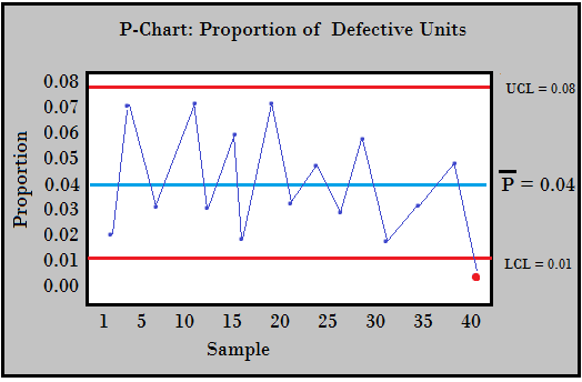
A p-chart (sometimes called a p-control chart) is used in statistical quality control to graph proportions of defective items. The chart is based on the binomial distribution; each item on the chart has only two possibilities: pass or fail. An “item” could be anything you’re interested in charting, including: gadgets from a production line, wait times, or delivery times.
Groups of different sizes are charted together. Proportions make more sense than individual counts, which would give too much weight to larger samples. The proportions are shown on the y-axis. The x-axis shows the size of the sample, which is usually around 20-40 groups. Fewer than 20 groups will not show an accurate picture of the process.
The NP chart is very similar to the p-chart. However, an NP chart plots the number of items while the p-chart plots proportions of items.
Uses
P-charts are used to:
- Detect sudden changes in systems, which can be attributed to a cause.
- Assess the need for stratification into subgroups, like location, employee, or time of day.
- Show whether the system is stable (i.e. in control).
- Compare systems before and after a major change. For example, call center times before and after employee training.
P-charts are not very useful for tracking trends over time, or small shifts in the process.
What Kind of Data is Shown?
Although you can pretty much chart anything, the items should meet these two conditions in order for you to use a p-chart:
- N items are in the set. In other words, you must have a known number of items being counted. You can’t use unknown or unlimited quantities.
- The probability of a failure must be consistent across all items in the sample. For example, call wait times exceed 5 minutes (“fail”) 5% of the time. If you have inconsistent probabilities (e.g. high-dollar customers are prioritized), you can’t use a p-chart.
Before you chart your data, you should establish norms for your system. Use data from a system that is in control; Find the average probability (P̄) and upper/lower control limits for acceptable defects. Once you’ve established these norms (shown as horizontal lines on the chart), you’re ready to plot your new system.