Descriptive Statistics > Lag Plot
What is a Lag Plot?
A lag plot is a special type of scatter plot with the two variables (X,Y) “lagged.”
A “lag” is a fixed amount of passing time; One set of observations in a time series is plotted (lagged) against a second, later set of data. The kth lag is the time period that happened “k” time points before time i. For example:
Lag1(Y2) = Y1 and Lag4(Y9) = Y5.
The most commonly used lag is 1, called a first-order lag plot.
Plots with a single plotted lag are the most common. However, it is possible to create a lag plot with multiple lags with separate groups (typically different colors) representing each lag.
Lag plots allow you to check for:
- Model suitability.
- Outliers (data points with extremely high or low values).
- Randomness (data without a pattern).
- Serial correlation (where error terms in a time series transfer from one period to another).
- Seasonality (periodic fluctuations in time series data that happens at regular periods).
1. Model suitability
The shape of the lag plot can provide clues about the underlying structure of your data. For example:
- A linear shape to the plot suggests that an autoregressive model is probably a better choice.
- An elliptical plot suggests that the data comes from a single-cycle sinusoidal model.
2. Outliers
Outliers are easily discernible on a lag plot. The following plot shows four outliers:

3. Randomness
Creating a lag plot enables you to check for randomness. Random data will spread fairly evenly both horizontally and vertically. If you cannot see a pattern in the graph, your data is most probably random. On the other hand a shape or trend to the graph (like a linear pattern) indicates the data is not random.
The following graph shows a random pattern:
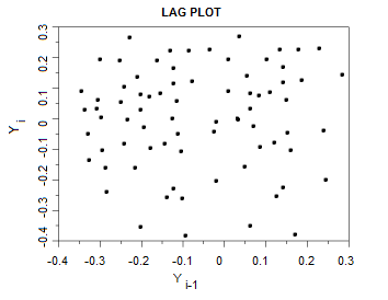
Random plots mean that there is no autocorrelation; if you know Yi, you can’t begin to guess at what Yi-1 will be.
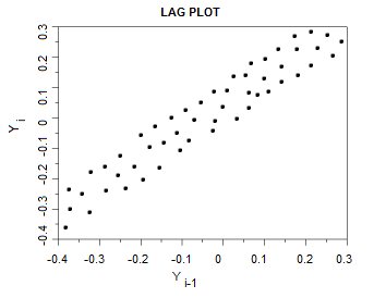
4. Serial Correlation / Autocorrelation
If your data shows a linear pattern, it suggests autocorrelation is present. A positive linear trend (i.e. going upwards from left to right) is suggestive of positive autocorrelation; a negative linear trend (going downwards from left to right) is suggestive of negative autocorrelation. The tighter the data is clustered around the diagonal, the more autocorrelation is present; perfectly autocorrelated data will cluster in a single diagonal line.
5. Seasonality
Data can be checked for seasonality by plotting observations for a greater number of periods (lags). Data with seasonality will repeat itself periodically in a sine or cosine-like wave.