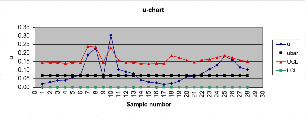
An attribute control chart is a way to track the production of defective items. The chart doesn’t tell you why the defects happened, but it does give you the total or average counts per unit.
An attribute is a count or discrete data like conforming/non-conforming, pass/fail or yes/no. Attributes are qualitative, as opposed to variables (e.g. physical dimensions) which are quantitative.
Types of Attribute Control chart
A P chart or NP Chart tracks the number of defects in the process. The difference between the two is that an NP chart plots actual counts while the p-chart plots proportions. Both of these charts are based on the binomial distribution and track counts of pass/fail or similar attributes.
C Charts and U charts are based on the Poisson distribution. While they also track defects, they are used with constraints. For example, a television screen might be defective if there are more than three non-working pixels. Screens with zero, one, or two pixels are acceptable. The difference between the C and U chart is that a C chart controls counts of defects per unit, while the u chart controls the average number of defects per unit.
Charts based on the Poisson distribution can be better at showing trends. For example, let’s say you are taking your first sample from the production line and find none of the screens have non-working pixels. You would record zero on all chart types. However, on your second sample, let’s say the average number of non-working pixels is one:
- On the P Chart, you would plot 0.
- On the C chart, you would plot 0.
If your third sample shows two non-working pixels:
- On the P you would still plot 0, as two non-working pixels isn’t a defective screen.
- On the C chart, you would plot 1.
Therefore, the C chart will show a rising trend in the average number of defects [1].
References
[1] Lesson 7 Special Variables Control Charts and Attribute Control Charts. Retrieved December 11, 2021 from: https://www.shsu.edu/~mgt_ves/mgt481/lesson7/lesson7.htm