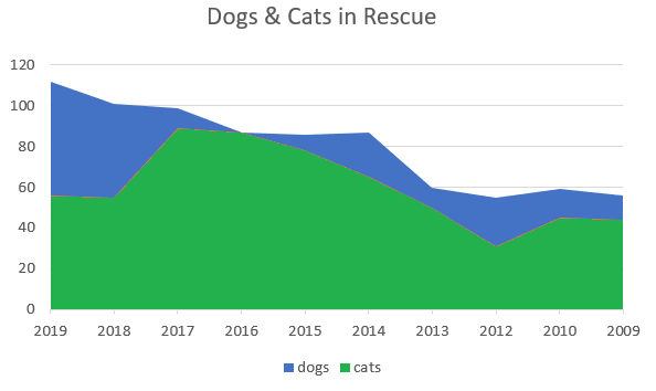
An area chart is an extension of a line graph, where the area under the line is filled in. The “lines” are actually a series of points, connected by line segments. As well as looking slightly different from the run-of-the-mill line graph, area charts have different connotations; While a line graph measures change between points, an area chart emphasizes the data’s volume (Milne, 2003).
Types of Area Chart
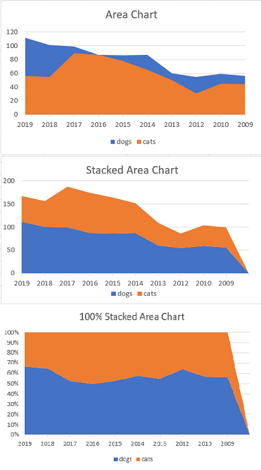
- Cumulative (regular) area chart: Similar to multiple line graphs, the charts share a common baseline (usually the x-axis). This type of chart isn’t suitable if any of the data bleeds into another area. If this is the case, use the stacked type instead.
- Stacked Area Chart: This type doesn’t have a common baseline. Instead, each area is “stacked” on top of each preceding area.
- 100% Stacked area chart: Each area is also “stacked” on top of each preceding area, but each area is a percentage of measurements at a particular data point.
- Stacked area charts aren’t recommended for very jagged areas; Use a bar chart or column chart instead.
References
Milne, P. Presentation Graphics for Engineering, Science and Business. Taylor & Francis. 2003.
Peh, D. et al. BIRT: A Field Guide to Reporting. Pearson Education, 2008.