Probability and Statistics Index > Regression Analysis > Line of best fit
What is the Line of Best Fit?
The line of best fit (or trendline) is an educated guess about where a linear equation might fall in a set of data plotted on a scatter plot. Trend lines are usually plotted with software, as once you’ve got more than a few points on a piece of paper, it can be difficult to figure out where that line of best fit might be.
This handy applet from Illinois State University is free and allows you to plot a series of points (up to 10) and find the line of best fit. This first graph I made was for the points:
- (1, 2)
- (2, 3)
- (3, 4)
- (4, 5)
- (5, 6)
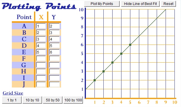
Not surprisingly, the line of best fit traveled through the center of the five dots.
Look what happens when one of the points is moved down:
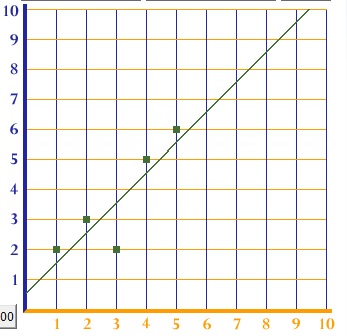
The line of best fit drops slightly lower. That’s because the dropped point acts like gravity, pulling the best fit line downward.
Caution!
Just because you get a line of best fit, doesn’t mean that it makes sense. Take this set of unrelated (scattered) data points. If you look at the points by themselves, there clearly isn’t any kind of trend. But the software will give you a guesstimate anyway.
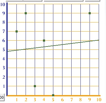
You should always plot your data on a scatter plot before you get your line of best fit, and eyeball your graph to see if a linear equation makes sense for your data. It’s possible to find non-linear lines of best fit (like polynomial functions), but if you’ve got completely random data, it’s possible that the line of best fit is going to be a pretty awful guesstimate.
Equation for the Line of Best Fit
Our online linear regression calculator will give you an equation to go with your data. For example, the first graph above gives the equation y = 1 + 1x. If you graph this equation on a graphing calculator (such as this one), you’ll see that the line matches perfectly with the line in the first image above. You can find a linear regression by hand, but I wouldn’t recommend it as the process is very tedious and it’s easy for errors to slip in.
A line of best fit is usually found through Simple Linear Regression. The following software programs can perform linear regression (and most other types of regression analysis):
Types of Trendline
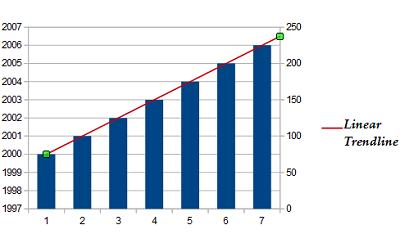
Linear Trendline
This is a good choice when a set of data points appear to be following a straight line. The line is the line of best fit; a straight line that’s a good approximation of the data.
Polynomial Trend line
A polynomial trend line has a series of curves and bumps. In the real world, data usually follows a polynomial trendline (as opposed to a linear trendline, which is rarely seen).
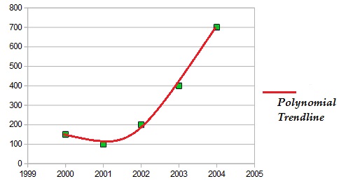
The image above shows a polynomial with one curve (a parabola); this is called a second degree polynomial. Data points with a series of bumps and curves can be fitted to third degree and higher polynomials.
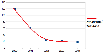
Exponential Trendline
An exponential line can show exponential growth or exponential decay. It’s useful when data points grow (or fall) at extremely fast rates.
Calculating a Trendline
While a linear line is computed by minimizing the squared distances from the line to the points (a method called “least squares” fitting), there are multiple ways to create an exponential line. Trendlines aren’t usually calculated by hand, as the process is tedious and lengthy. Nearly all spreadsheet and statistical programs have an option for trendlines.
Adding a Trendline in Excel
Excel can add a variety of trend lines to your data points including exponential, linear, logarithmic, and polynomial. For instructions on how to create a scatter plot of your data and add a trendline (includes video), see: How to Make a Scatter Plot in Excel
.
References
Beyer, W. H. CRC Standard Mathematical Tables, 31st ed. Boca Raton, FL: CRC Press, pp. 536 and 571, 2002.
Dodge, Y. (2008). The Concise Encyclopedia of Statistics. Springer.
Gonick, L. (1993). The Cartoon Guide to Statistics. HarperPerennial.
Levine, D. (2014). Even You Can Learn Statistics and Analytics: An Easy to Understand Guide to Statistics and Analytics 3rd Edition. Pearson FT Press