Statistics Definitions > Correlogram / Auto Correlation Function ACF Plot / Autocorrelation plot
What is a Correlogram?
A correlogram (also called Auto Correlation Function ACF Plot or Autocorrelation plot) is a visual way to show serial correlation in data that changes over time (i.e. time series data). Serial correlation (also called autocorrelation) is where an error at one point in time travels to a subsequent point in time. For example, you might overestimate the value of your stock market investments for the first quarter, leading to an overestimate of values for following quarters.
Correlograms can give you a good idea of whether or not pairs of data show autocorrelation. They cannot be used for measuring how large that autocorrelation is (for a mathematical way to test for serial correlation, try the Durbin Watson test).
Example
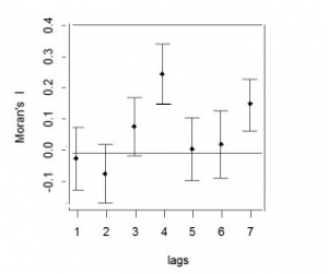
A correlogram gives a summary of correlation at different periods of time. The plot shows the correlation coefficient for the series lagged (in distance) by one delay at a time. For example, at x=1 you might be comparing January to February or February to March. The horizontal scale is the time lag and the vertical axis is the autocorrelation coefficient (ACF). The plot is often combined with a measure of autocorrelation like Moran’s I; Moran’s values close to +1 indicate clustering while values close to -1 indicate dispersion.

The above image shows relatively small Moran’s I (between about -0.2 and 0.35). In addition, there is no pattern in the autocorrelations (i.e. no consistent upward or downward pattern as you travel across the x-axis). This set of data likely has no significant autocorrelation.
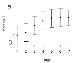
On the other hand, this next image shows fairly high Moran’s I values and an upward trend. This indicates that autocorrelation is highly likely for your set of data.
