Intro To Statistics
Many people find statistical analysis puzzling. Why? Because it demands new ways of thinking. And how do you fathom these new ways of thinking? In order to fathom statistical analysis properly, you need to understand a number of its key foundations. Reading textbooks doesn’t work because textbooks don’t focus on foundations, and they cover so much ground in so much detail that you are bound to lose sight of the forest for the trees.
Even if you’ve taken statistics courses in the past, and even if you know the mechanics of performing statistical analysis, you’ll benefit from understanding these foundations.
- Sampling Distribution Basics
- Standard Errors
- 95 Percent Confidence Interval
- Type I and Type II Errors
- Statistics Case Studies: Decision Errors
- The Central Hypothesis
- The Limited Meaning of Statistical Significance
- Binomial Approximation
- Statistical Assumptions
- Analyzing the Difference Between Two Groups Using Binomial Proportions
- The Rest of the (Frequentist) Iceberg
- Bayesian Analysis
- The False Discovery Rate
1. Sampling Distribution Basics
Part 1 of Intro to Statistics:
The town of Flowing Wells is a community of 80,000 residents. Imagine that you and I serve on the Town Council and that we are members of its public affairs committee. The council has recently drafted a new public health policy and we’re tasked with assessing the public’s opinion about it.
The public opinion statistic we’re interested in is the percentage of residents that are in favor of the proposed policy. We want to find out if a majority of residents are in favor of the policy. You and I realize that asking all 80,000 residents their opinions is next to impossible, so we’ll need to use statistical sampling and analysis. To start with, we decide to survey 100 residents. To avoid inadvertent bias when gathering sample opinions, everyone in the community must have an equal chance of being surveyed. So, we’ll select 100 people at random from the town’s list of residents, giving us a random sample of 100 peoples’ opinion. After contacting the 100 randomly selected residents we find that 55 of the 100 (55%) are in favor of the policy. We next ask ourselves whether the sample percentage of 55% is high enough for us to be confident that a majority of at least 40,001 (over 50%) of the town’s population favors the policy. In other words, is the sample percentage of 55% high enough for us to be confident that the Flowing Wells population percentage exceeds 50%? We need to do some statistical analysis.
I volunteer to simulate the situation on the computer. Since we are interested in whether a majority are in favor, I focus on the majority dividing line of 50% in favor and assume that we’re sampling from a population that is 50% in favor. I use the computer to simulate what occurs when we randomly sample 100 people from a population that is 50% in favor of something. Further, I simulate this random sampling many, many times to show us the range and frequency of sample percentage values to expect when we randomly sample 100 people from a 50%-in-favor population.
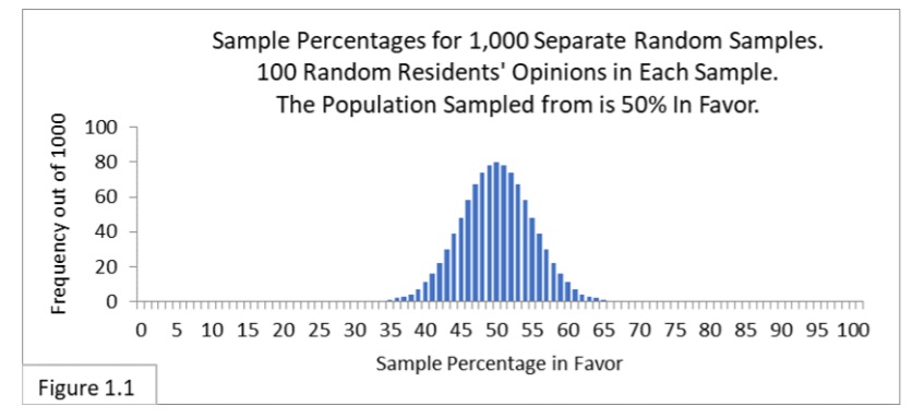
The above figure 1.1 is a chart (a histogram) showing what the simulations reveal. It shows the frequency (out of 1,000) with which we should expect to get random samples that yield the various possible values for the percent-in-favor sample statistic.
Figure 1.1 reflects the following theoretical scenario:
- There is a large population that is 50% in favor of something;
- 1,000 surveyors are hired and each one conducts a separate survey;
- Each of the 1,000 surveyors gathers a separate random sample of 100 people from the population to determine the percent in favor, and
- The 1,000 separate sample percentages are used to make an aggregate chart, giving us Figure 1.1.
This notion of “what to expect when we randomly sample from a population many, many times” forms the basis of the most common approach to statistical analysis—one you’ll come across in an intro to statistics class—Frequentist statistics: When we repeatedly sample from a given population, how frequently do we expect the various possible sample statistic values to arise? The chart in Figure 1.1 shows us what to expect. Charts like this illustrate what are called sampling distributions—the distribution of sample statistic values that occur with repeated random sampling from a population. The concept of sampling distributions is perhaps the most important concept in Frequentist statistics.
Looking at Figure 1.1, notice that the sampling distribution is centered on 50%, that most of the sample percentages we expect to get are relatively close to 50%, and that almost all of the sample percentages we expect to get are contained within the boundary lines of 35% and 65%. The sample percentage of 55% that we actually got is well within the 35%-to-65% boundary lines. What does that tell us? It tells us that getting a sample percentage value of 55% is not particularly unusual when sampling 100 from a 50%-in-favor population. So, we can’t rule out that we might indeed be sampling from a population that is 50% in favor. And since 50% is not a majority, we can’t say that a majority of the Flowing Wells population favors the new policy. This type of logic, or statistical inference, is central to the Frequentist approach to statistical analysis.
Now let’s suppose that our sample percentage is 70% instead of 55%. What would we infer then? Looking at Figure 1.1 (reproduced below) we can see that getting a sample percentage of 70% is highly unusual when randomly sampling 100 from a 50%-in-favor population, and that 70% is clearly to the right of the sampling distribution for 50%.
Because of this, we’ll infer that we are not sampling from a 50%-in-favor population, and that we are instead sampling from a population that is more than 50% in favor. With a sample percentage of 70% we’ll say it seems likely that a majority of the Flowing Wells population favors the new policy.
Next, let’s suppose that our sample percentage is 60% instead of 55% or 70%. What would we infer then? Looking at the sampling distribution in Figure 1.1, reproduced below, we can see that 60% is less clear cut. It does occur sometimes, but not very often.
To make a judgment we’ll need to “split hairs” using what are called confidence intervals.
Sampling Distributions and Their Confidence Intervals
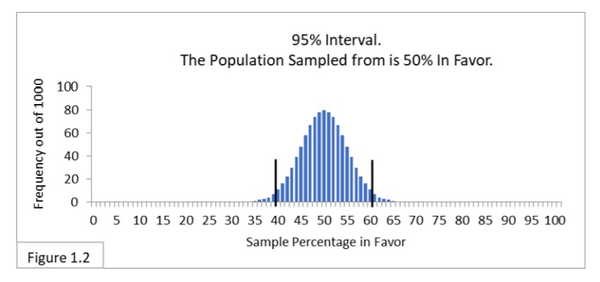
Figure 1.2 shows what is called a 95% confidence interval. It has the same sampling distribution as Figure 1.1, but now with two boundary lines added to indicate the 95% confidence interval spanning from 40% to 60%. That interval contains 95% (950/1,000) of the sample percentage values. That’s what a 95% confidence means in this context: the interval containing 95% of the expected sample statistic values obtained by random sampling from a given population. 95% confidence intervals are widely used in statistical analysis. Some people find the term “confidence” in “confidence interval” to be confusing at first, so I’ll often refer to it simply as the 95% interval.
Recall that the survey sample percentage values we have considered so far are 55%, 60%, and 70%. Relative to the 40%-to-60% boundary lines, 55% and 60% are inside and 70% is outside. Using the 95% interval, we would say that the sample percentage values 55% and 60% don’t allow us to infer that the (unknown) Flowing Wells population percentage value is different from 50%. After all, it is not very unusual to get those sample percentage values when randomly sampling 100 from a 50%-in-favor population. On the other hand, the sample percentage value of 70% is outside the 40%-to-60% boundary lines, which does allow us to infer that the (unknown) Flowing Wells population percentage value is probably different from 50% and, further, is probably greater than 50%. That’s because our sampling distribution shows that it’s extremely unusual to get a sample percentage value of 70% when randomly sampling 100 people from a 50%-in-favor population, so we infer that we are not sampling from a 50%-in-favor population. With a 70% sample percentage value we would say that we reject the hypothesis that the Flowing Wells population percentage is 50%.
What we are doing here is called significance testing. The difference between 50% and 70% is statistically significant. The ifferences between 50%, 55%, and 60% are not statistically significant. It may seem like “hair splitting” to say that sample percentage values of 39%-or-less and 61%-or-more let us infer that a minority or a majority of the population is in favor of a policy, but that sample percentage values of 40%-to-60% do not. However, this is not the fault of statistical analysis itself, it’s just that many real world decisions force us to draw lines.
Intro to Statistics: Coin Flipping Analogy I
To reinforce what we’ve covered so far, let’s consider an analogy: Flipping a fair coin. A fair coin is perfectly balanced. When you flip it, there is a 50% chance it will come up heads and a 50% chance it will come up tails. This is analogous to randomly sampling from a population that is 50% in favor of and 50% not in favor of something: there is a 50% chance that a person randomly selected will be in favor and a 50% chance that a person randomly selected will not be in favor.
In this coin flipping experiment, we’ll flip a fair coin 100 times in a trial, a trial being analogous to a sample. We’ll perform 1,000 trials of 100 flips each. Figure 1.3 shows the results: the sampling distribution of the percentage of heads we expect to get with trial (sample) size of 100.
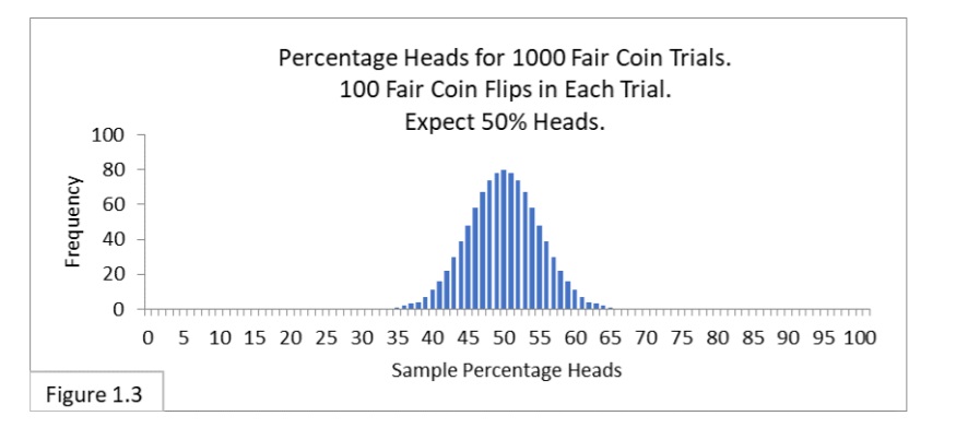
Notice that the sampling distribution in Figure 1.3 looks just like the sampling distribution in Figure 1.1 (reproduced below).
They only differ in the text-labeling that’s used to reflect the specific context (surveying vs. coin flipping).
Figure 1.4 shows the 95% interval of 40%-to-60% heads.
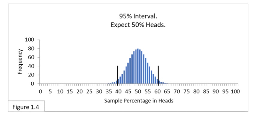
Notice that Figure 1.4 looks just like Figure 1.2 (reproduced below).

If someone gave us a coin and asked us to judge whether it is a fair coin, we could flip it 100 times, and if we get fewer than 40 (40%) heads or more than 60 (60%) heads, we would say we didn’t think the coin was fair. If we got anywhere between 40% and 60% heads, we would say we can’t rule out that the coin is fair. The reason these various Figures look alike is because they embody the same fundamental phenomenon.
- They both involve randomness: random selection of respondents; randomness inherent in coin flips. Because of this, the items of interest—percent in favor and percent of heads—are called random variables. And
- They both concern outcomes that have only two possible values: in favor vs. not in favor; heads vs. tails.
Such things are called binomial random variables since there are only two possible values, and their sampling distributions are of a type called binomial distributions. Phenomena that share these two characteristics are analogous and can be analyzed in the same way: e.g., the percentage of people with a particular health condition, the percentage of defective items in a shipment, the percentage of students who passed an exam, the percentage of people who approve of the job the president is doing.
Intro to Statistics Part II: Sampling Distribution Dynamics
We had decided to gather 100 opinions. Frankly, no deep thought went into that decision, 100 just seemed like a good sizable number. But, all things considered, the 40%-to-60% boundary lines are quite wide apart, hindering their usefulness: even with a sample percent-in-favor of 60% we can’t infer that a majority of Flowing Wells residents are in favor of the new public health policy! Professional pollsters most often survey about 1000 people. Why is that? Let’s see why.
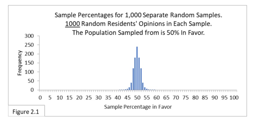
Figure 2.1 shows the sampling distribution when randomly sampling 1000 people from a 50%-in-favor population. Notice how much narrower the sampling distribution is compared to our previous case of sampling 100 people. Why is that? Because as the size of our sample increases, the closer we expect the sample percentage values to be to the actual (but unknown) population percentage value. This is the law of large numbers.
More evidence reduces our uncertainty and should get us closer to the truth. Later on, we’ll see a simple formula that reflects the level of uncertainty due to sample size and its effect on the width of the sampling distribution.
Now let’s see how our 40%-to-60% boundary lines look when superimposed on the new, narrower sampling distribution. Figure 2.2 shows that.
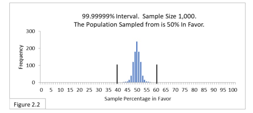
The 40%-to-60% boundary lines have been transformed from a 95% interval into a 99.99999% interval! 99.99999% of the sample percentage values we expect to get when sampling 1000 from a 50%-in-favor population are now within the 40%-to 60% boundary lines!
Let’s fit a new 95% interval. Figure 2.3 shows the 95% interval superimposed on the new sampling distribution.
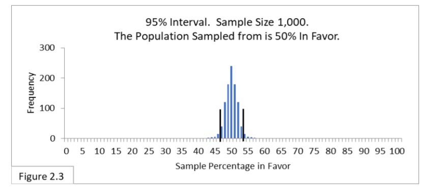
Since the sampling distribution has become narrower, so has the 95% interval. With a sample size of 1000 the boundary lines are now 47%-to-53%. The 47%-to-53% boundary lines can also be expressed as 50% ± 3% (50% plus or minus 3%). Pollsters then refer to the 3% as the margin of error of the poll. (You may have noticed statements in the media such as “in the most recent poll the president’s job approval rating is 49% with a margin of error of plus or minus 3 percentage points at the 95% confidence level.”)
With the new 95% interval, the 55%, 60%, and 70% sample percentage values we’ve been considering are all outside the interval. All of them allow us to say it seems likely that a majority of the Flowing Wells population is in favor of the newly proposed public health policy. With sample size 100, we couldn’t say 55% or 60% were significantly different, statistically, from 50%. With sample size 1000 we can. That’s what increasing the sample size does for us. With the increased sample size, we’ve increased the power of our analysis.
This is why professional pollsters often survey 1000 people. It improves the power of the analysis over smaller sample sizes such as 100. So, you might ask, why not survey 10,000 to improve power even more? Because that would be more expensive. For most purposes, pollsters find sample sizes of about 1000 provide a good balance between power and expense. If more power is needed and the additional expense can be justified, larger sample sizes are used.
Intro to Statistics: Coin Flipping Analogy II
In the next coin flipping experiment, we’ll perform 1,000 trials (samples) of 1000 flips each (sample size). Figure 2.4 shows the sampling distribution for 1000 fair coin flips per trial.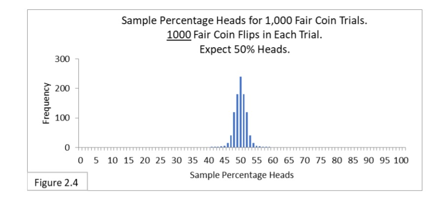
Notice that the sampling distribution in Figure 2.4 looks just like the sampling distribution in Figure 2.1 (reproduced below).
Figure 2.5 shows the 95% interval of 47%-to-53% heads with 1000 flips per trial.
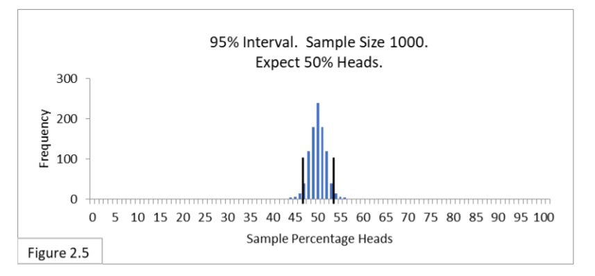
Notice that Figure 2.5 looks just like Figure 2.3 (reproduced below).

If someone gave us a coin and asked us to judge whether it is a fair coin, we could flip it 1000 times, and, if we get fewer than 470 (47%) heads or more than 530 (53%) heads, we will say we think the coin is unfair. If we get anywhere between 47% and 53% heads, we will say we think the coin is fair. (Actually, as we’ll delve into later, we’ll be more circumspect and say that we can’t rule out that the coin is fair rather than stick our neck out and say we think the coin is fair.)
Sampling Distributions of Other Populations
Let’s suppose that the Flowing Wells population is only 30% in favor of the new public health policy. We’ll experiment and randomly sample 100 residents, and again we’ll amass 1,000 random samples. Figure 2.6 shows what to expect.
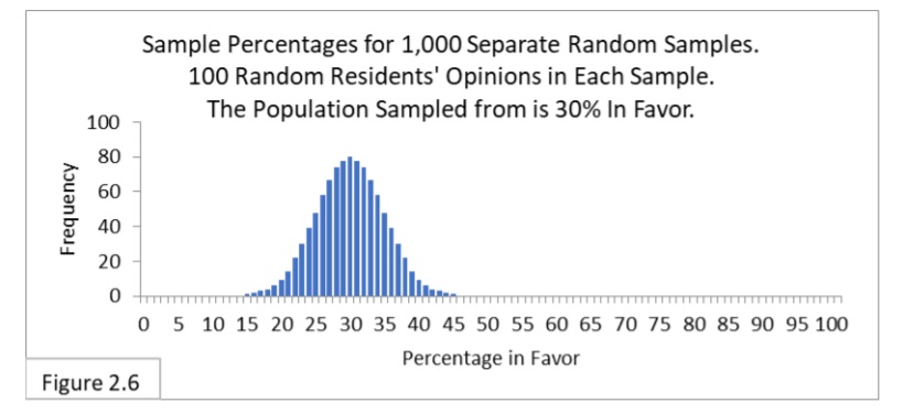
The sampling distribution, as expected, is centered on 30%. It is a “bell shaped” sampling distribution like we’ve been seeing all along (more on this later). Next, let’s look at the 95% confidence interval. That’s shown in Figure 2.7.
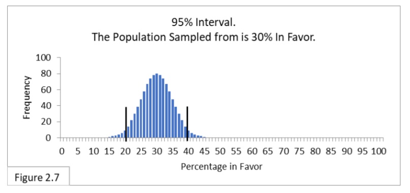
This 95% interval has boundary lines of 21% and 39%. When randomly sampling 100 from a population that is 30%-in-favor, we expect 95% of the sample percent in-favor statistic values we get to be within this interval. This 95% interval for a sample size of 100 and a population that is 30%-in-favor is 18 wide (39-21).
Earlier (Figure 1.2, reproduced below) the 95% interval for a sample size of 100 and a population that is 50%-in-favor is 20 wide (60-40).
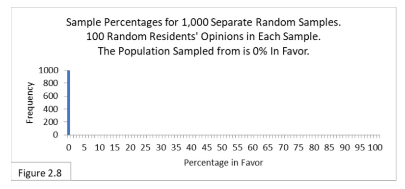
Why is the interval in Figure 2.7 narrower than the interval in Figure 1.2? It has to do with uncertainty. Imagine there are two contestants facing off in a judo match. Who’s going to win? If they are evenly matched, each with a 50% chance of winning, you would be wholly uncertain who the winner will be. If the first contestant has a 70% chance of winning and the second has a 30% chance, you would be less uncertain who the winner will be. If the first contestant has a 100% chance of winning and the second has a 0% chance, you would not be uncertain at all. Likewise, if you were sampling from a population that is 0%-in-favor or 100%-infavor, there is no uncertainty in what your sample percentage values will be—they’ll all be 0% or 100%. Figure 2.8 shows the sampling distribution for a population that is 0%-in-favor. There’s no uncertainty about sample percentage values when sampling from a population that is 0%-in-favor.
The width of the 95% interval reflects the level of uncertainty of our sample statistic values. Populations that are 50%-in-favor are the most uncertain. As the population percentage moves toward 100% or 0%, uncertainty decreases. As uncertainty decreases, the width of the sampling distribution and its 95% interval decreases. Next, we’ll see a simple formula that reflects the level of uncertainty due to the population percentage and sample size and their effects on the width of the sampling distribution.
Part Two: Sampling Distribution Dynamics
Author: J.E. Kotteman.
References
J.E. Kotteman. Statistical Analysis Illustrated – Foundations . Published via Copyleft. You are free to copy and distribute this content.