Descriptive Statistics: Charts, Graphs and Plots > Types of Graphs
Common Types of Graphs
Contents (click to skip to the section):
- Bar Graph
- Segmented Bar Graph
- Column Graph
- Box and Whiskers Graph (also called a Box Plot)
- Frequency Graph (Frequency Table)
- Cumulative Frequency Table
- Frequency Polygon
- Histogram
- Line Graph
- Timeplot
- Relative Frequency Histogram
- Pie Chart
- Scatter Plot
- Stemplot
- More Examples of Different Graphs
- Funnel Chart (Opens in New Window)
1. Types of Graphs: Bar Graphs
A bar graph is a type of chart that has bars showing different categories and the amounts in each category.
See: Bar Graph Examples
2. Segmented Bar Graph

This type of graph is a type of bar chart that is stacked, and where the bars show 100 percent of the discrete value.
See: Segmented Bar Chart, What is it?
3. Column Graph
Microsoft Excel calls a bar graph with vertical bars a column graph and a bar graph with horizontal bars a bar graph.
See: Column Chart in Excel 2013
4. Types of Graphs: Box and Whiskers (Boxplots)
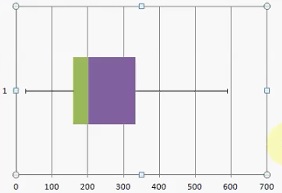
This type of graph, sometimes called a boxplot, is useful for showing the five number summary.
See: Box and Whiskers Chart
5. Types of Graphs: Frequency Distributions
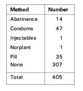
Although technically not what most people would call a graph, it is a basic way to show how data is spread out.
See: Frequency Distribution Table.
6. Cumulative Frequency Table
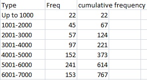
A table that shows how values accumulate.
See: Cumulative Frequency Distribution Table.
7. Frequency Polygon
This type of graph is almost identical to a histogram. Where histograms use rectangle, these graphs use dots, which are then joined together.
See: Frequency Polygon.
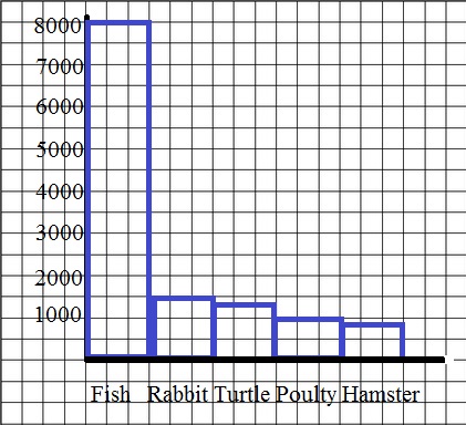
8. Types of Graphs: Histogram
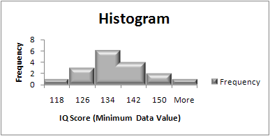
A way to display data counts with data organized into bins.
See: Histogram.
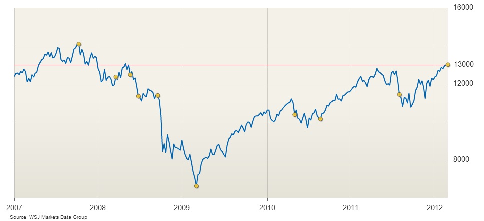
9. Types of Graphs: Line Graphs

A graph that shows a line; usually with an equation. Can be straight or curved lines.
See: Line Graph
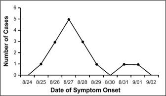
10. Timeplot
A time plot is similar to a line graph. However, it always plots time on the x-axis.
See: Timeplot.
11. Relative Frequency Histogram
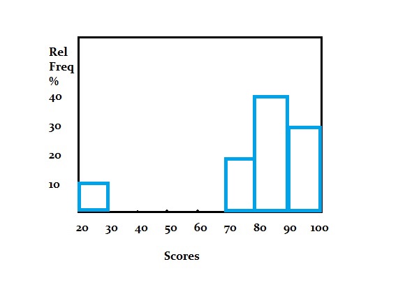
A relative frequency histogram shows relative frequencies.
See: Relative Frequency Histogram.
12. Types of Graphs: Pie Graphs
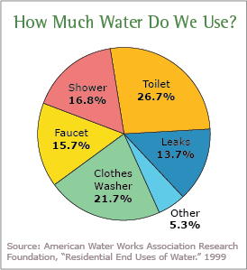
As the name suggested, these types of graph look like pies.
See: Pie Chart: What is it used for?
13. Types of Graphs: Scatter Graphs

These charts use dots to plot data points. the dots are “scattered” across the page.
See: Scatter plot.
145. Types of Graphs: Stemplots
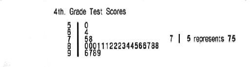
Stemplots help you to visualize all of the individual elements of a data set.
See: Stemplot: What is it?