Basic Statistics> > Elementary Statistics: What is it?
Elementary Statistics: What is it?
Signed up for a stats class? Wondering what kind of course you’re about to take? Most of the tools you’ll be using are ones you’ve already learned in basic math classes.
What is Statistics?
Stats deals with data. For example:
- Polls in elections use stats to guess who will win an election.
- Drug makers use stats to predict when side effects might happen.
- Sports uses stats to guess how a player will perform.
- You use stats to predict how much is going to be in your paycheck.
Topics included in stats are ones you might have studied before:
Descriptive stats: Mean, mode, median
Charts: Box plots, tables and graphs
Elementary Statistics: Topics
Elementary stats builds on these basics. Topics covered are:
- Descriptive Statistics. Describe data, like mean and interquartile range.
- Probability. The chance of something happening, like: winning an election; Finding a parking space; It raining on a certain day.
- Probability distributions. You’ll be studying data and graphs. Some you may be familiar with, like the normal distribution (the bell curve).
- Planning and analyzing experiments. Where you’ll be able to decide if results of studies are valid or not.
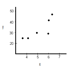
- Regression analysis and correlation coefficients. You’ll be working with graphs like scatter plots to fit data to equations. You’ll also find future trends.
- Tables. You’ll be using lots of these in elementary statistics, like the z-table and t-table. Tables tell you a lot about probabilities of data distributions.
What isn’t usually needed in an elementary statistics class is calculus (the study of rates of change). However, if you take a “probability and statistics” class, you may need calculus, especially if you’re in engineering, physics, data science or a similar field.
You’ll be using a calculator for your class. The TI83 graphing calculator is the one most people use, although you may also be able to use a TI89. Elementary stats is less about knowing formulas. It’s more about knowing how to use your calculator. In fact, you’ll be given a formula sheet for most exams. The TI83 is allowed on the AP exam! So relax, you won’t be expected to memorize formulas.
How To Understand Elementary Statistics: Or Not!
My favorite statistic, and one of the simplest ones, is that 50 percent of us are below average; It also works with 50 percent are above average. It makes sense if you think about it. An average is calculated according to a set of given data. The “average” is that middle point: The point where half of the data is above and half of the data is below. This phrase works for just about anything and makes for some alarming statistics, especially in newspaper reporting. For example:
- Schools failing! 50 percent of students are below average reading level.
- Fifty percent of cancer patients have below average outcomes
The same logic also works for education as a whole. Just recently I read in the Huffington post that Maryland came in first in education and South Dakota came in last. I imagine if you live in one of the bottom performing states, you’re thinking that your public education is in shreds. After all, your state performed below average compared to the other states! But a closer look at the rankings revealed most states (except for South Dakota) ranked between a B and a C. Only one state (South Dakota) received a D. Every other state did OK. They were at least “average” or “above average.” There were no “As” or “Fs.”
Some Really Silly Statistics
You may be wondering why you should bother to learn stats at all. You might be thinking that, outside of class, you won’t use it in real life. While that could be true…you could probably get by your whole life without ever understanding what a standard deviation is…not knowing means you’re more likely to be hoodwinked by the media, the government, and anyone else out there who manipulates statistics on a regular basis. Misleading statistics are rampant. Read the article on misleading statistics to get an idea of how we’re bombarded with misleading statistics on a regular basis.
How To Understand Elementary Statistics: The Key
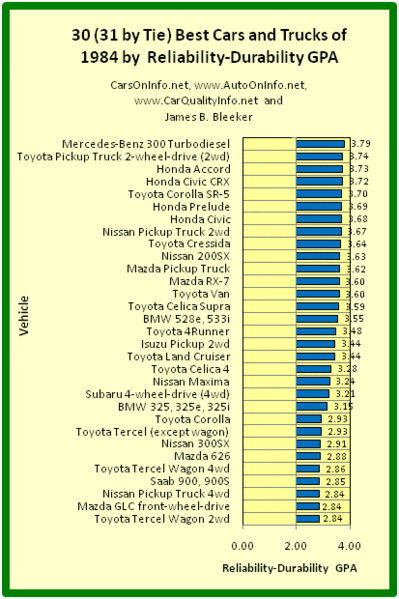
This is a key to understanding statistics. The top 50% or bottom 50% is meaningless without an understanding of the data that went into the stats. Averages (or means, or IQRs or any other measure of spread) are tools to understanding phenomenon. But it doesn’t actually mean anything on its own. Take the listing of cars shown below. Isn’t it possible that all of the cars performed spectacularly? That the average was incredibly high? The actual chart becomes meaningless without the actual data behind the chart.
References
Gonick, L. (1993). The Cartoon Guide to Statistics. HarperPerennial.
Vogt, W.P. (2005). Dictionary of Statistics & Methodology: A Nontechnical Guide for the Social Sciences. SAGE.
Comments are closed.