Contents:
See also: Parallel Boxplots
What is a Boxplot?

Can’t see the video? Click here to watch it on YouTube.
A boxplot, also called a box and whisker plot, is a graph that shows the dispersion and central tendency of a dataset using a five number summary. The dispersion — a measure of how spread out a data set is — includes quartiles and the interquartile range. Central tendency on a boxplot is represented by the median, which is the middle value of a dataset. 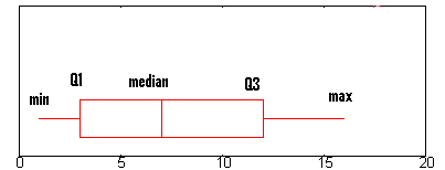
The box and whisker plot gives us a visual of how data is distributed. The “box” represents the interquartile range, indicating where the middle fifty percent of the data lies. On either end of the box, you’ll find the first (lower) quartile (the 25% mark) and the third (upper) quartile (the 75% mark).
A boxplot typically includes five pieces of information, often called the “five-number summary”:
- The minimum: the smallest number in the dataset, depicted at the extreme left of the chart. It is the end of the lower “whisker” is there are no outliers. If the are outliers (as shown in the above image), then the minimum is the outlier furthest to the left.
- First quartile (Q1): the left edge of the box.
- The median: a line somewhere inside the box that divides the box into two parts. In the above example, the line is green, but it can be any color.
- Third quartile (Q3): far right edge of the box.
- The maximum: the largest number in the dataset, shown at the far right of the chart.
Though box plots are not often used in everyday life, they serve as a handy tool for obtaining a quick summary of data. Back to Top
How to Read a Box Plot: Steps
A boxplot is a way to show a five number summary in a chart. The main part of the chart (the “box”) shows where the middle portion of the data is: the interquartile range. At the ends of the box, you” find the first quartile (the 25% mark) and the third quartile (the 75% mark). The far left of the chart (at the end of the left “whisker”) is the minimum (the smallest number in the set) and the far right is the maximum (the largest number in the set). Finally, the median is represented by a vertical bar in the center of the box. Box plots aren’t used that much in real life. However, they can be a useful tool for getting a quick summary of data.
Example question: Decipher this boxplot and find the min, median, max and Q1/Q3: 
- Find the minimum. The minimum is the far left hand side of the graph, at the tip of the left whisker. For this graph, the left whisker end is at approximately 0.75.
- Find Q1, the first quartile. Q1 is represented by the far left hand side of the box. In this case, about 2.5.
- Find the median. The median is represented by the vertical bar. In this boxplot, it can be found at about 6.5.
- Find Q3, the third quartile. Q3 is the far right hand edge of the box, at about 12 in this graph.
- Find the maximum. The maximum is the end of the “whiskers”: in this graph, at approximately 16.
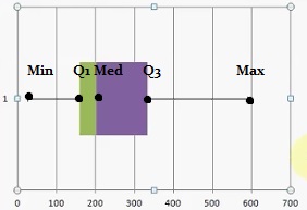
Example 2
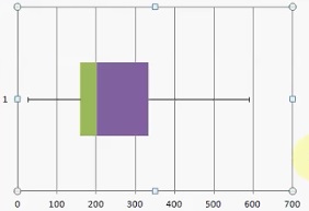 Here’s another example. Read the above boxplot:
- The five-number summary gives us an overview of the data but lacks the precision of some other charts. For example, while histograms are harder to compare, they can carry more information, such as classes or categories, and work well with large, unruly datasets that other plots can’t handle. However, both histograms and boxplots, mask details such as the type of probability distribution that might fit the data. Therefore, boxplots are typically not recommended for assessing the fit of data to a specific distribution.
- If your data is skewed, parallel boxplots might not be the best tool. That’s because the medians of the two data sets may be in the same place, but the distributions of the data sets may be very different.
- If the distribution is bimodal (two peaks) or multimodal (more than two peaks), a boxplot will return only one “box” for all peaks, which can be misleading.
Boxplot history
Kenneth W. Haemer, former presentation research manager at AT&T, was the first to refer to this type of chart a “range-bar” in 1948. a Haemer’s chart was a simple bar extending from the minimum to maximum value. [2]. In 1952, Mary Eleanor Spear released her book “Charting Statistics,” [3] which introduced the interquartile range into the chart — essentially creating the modern boxplot.
In 1969, John Tukey presented the box-and-whisker plot in his book “Exploratory Data Analysis,” which overshadowed Spear’s work [3]. Despite striking similarities with Spear’s work, Tukey did not credit Spears (or anyone else), thus was credited at the time with “inventing” the box plot [4].
Today, boxplots are among the most frequently used tools for data visualization. They have many applications across an array of fields, such as statistics, engineering, medicine, and business.
References
- Haemer, Kenneth W. “Range-Bar Charts.” The American Statistician, vol. 2, no. 2, 1948, pp. 23. JSTOR, doi:10.2307/2682234
- Spear, Mary Eleanor (1952). Charting Statistics. McGraw Hill. p. 166.
- Mary Eleanor Spear’s Importance to the History of Statistical Visualization
- Friendly, Michael. A Brief History of Data Visualization. 21 Mar. 2006, www.datavis.ca/papers/hbook.pdf
- Identify the minimum. The minimum is located on the far-left side of the graph, at the the end of the lower whisker. For this example, the minimum ≈ 20. Check for outliers! If there is a circle, asterisk or cross at the far left of your boxplot, then that is the minimum — and not the end of the whisker! This boxplot does not have any circles, so we can move on.
- Locate Q1, the first quartile. Q1 is represented by the far-left side of the box. Q1 ≈ 160.
- Determine the median. The median is represented by the vertical line in the box. Note that it isn’t always in the center of the box. This box is colored so you can clearly see where the line is in the box: it separates the green and brown portion: Median ≈ 200.
- Find Q3, the third quartile. Q3 is on the far-right edge of the box. Q3 ≈ 330.
- Identify the maximum. The maximum is at the end of the “whiskers”. For this example, the max ≈ 590.
 Exception: If your data set has outliers (values that are very high or very low and fall far outside the other values of the data set), the box and whiskers chart may not show the minimum or maximum value. Instead, the ends of the whiskers represent one and a half times the interquartile range (1.5*IQR). Make sure to check with your instructor on this point, because they may or may not include this type of boxplot on homework or exam questions. All done. That’s how to read a box plot!
Note on Outliers:
If your data has outliers (values that are fall very far outside the other values of the data set), the boxplot will probably not show the minimum or maximum value. Instead, the ends of the whiskers will extend to the smallest and largest data points that are within 1.5 times the IQR from Q1 (the first quartile) and Q3 (the third quartile). In the above image, Q1 is at about 75 and Q3 is about 650, but there are three outliers outside of this range. Check out our YouTube channel for hundreds of basic statistics videos. Back to Top
How to Make a Box and Whiskers Chart
Excel

Can’t see the video?
Click here to watch it on YouTube.
Excel does not have a box and whiskers “Insert Graph” function, so you have to build one using stacked bar charts. This is a little more time-consuming than inserting a simple graph, but it you will end up with a great looking box and whiskers graph. Note: This is an advanced Excel technique, so if you are new to Excel you may want to watch the video, which has more information and visuals for each step to make a box and whiskers chart in Excel.
How to Make a Box and Whiskers Chart in Excel: Steps
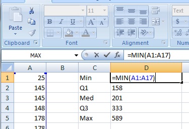
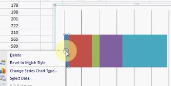
Example problem: Make a box and whiskers chart in Excel for the following data set: 25, 145, 145, 148, 178, 178, 198, 201, 222, 210, 565, 589, 485, 333, 358, 158, 257.
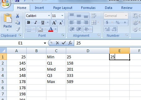
- Type your data into one column in an Excel worksheet. For this example, type your data into cells A1:A11.
- Click an empty cell type “MIN, Q1, MED, Q3 and MAX” in a single column. In the next column over, type formulas for MIN, Q1, MED and MAX. The formulas are:
- =MIN(A1:A17)
- =QUARTILE(A1:A17,1)
- =MED(A1:A17)
- =QUARTILE(A1:A17,3)
- =MAX(A1:A17)

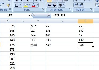
- In the next column over, type your Min (in this case, 25) into the cell next to the Min you calculated.

- Subtract each value in the previous column from the next value. In other words, subtract the Min from Q1, the Q1 from the Med, the Med from Q3 and Q3 from the Max.

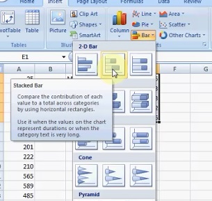
- Highlight the column of differences you calculated in Step 4, then click “Insert,” then click “Bar” and then click “Stacked Bar.”

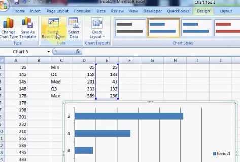
- Click the graph and then click the “Switch Row/Column” button.

- Select the left-hand blue box, right-click and then click “Format Data Series.”

- Click “Fill,” then click the “No Fill” radio button and then click “Close.”
- Add the whisker to the left-hand side using the following method:
- Click the left-hand red box.
- Select the “Layout” tab, then click “Error Bars“. Next, click “More Error Bar Options.”
- Click “Error Bars with Standard Error.”
- Select the “Layout” tab again, then click “Error Bars” and then click “More Error Bar Options.”
- Click “Mins” and then type the difference between Q1 and the Min into the “Fixed Value” box. For this sample problem, that value is 133.
- Click “Close.”
- Remove the red color (fill) using the technique outlined in Steps 7 and 8 above.
- Add the whisker to the right-hand side of the box and whiskers chart Excel using the following method:
- Click the purple box.
- Select the “Layout” tab, then click “Error Bars” → “More Error Bar Options.”
- Click “Error Bars with Standard Error.”
- Select the “Layout” tab again, then click “Error Bars” → “More Error Bar Options.”
- Click “Plus” and then type the difference between Q3 and the Max into the “Fixed Value” box. For this sample problem, that value is 256.
- Click “Close.”
- Remove the light-blue color (fill) using the technique outlined in Steps 7 and 8 above.

- (Optional) Delete the “Series” information from the right: Click the name and then press the “Delete” key. Tip: If you don’t see an error bar show up, that’s likely because you need to change the line color to “Black” from the More Error Bar Options window.
That’s it: You’ve created a box and whiskers chart in Excel!
Check out our YouTube channel for more Excel help and tips!
TI 83 box plot
Let’s say you have a list of IQ scores for a gifted classroom in a particular elementary school. The IQ scores are: 118, 123, 124, 125, 127, 128, 129, 130, 130, 133, 136, 138, 141, 142, 149, 150, 154.
That list doesn’t tell you much about anything. However, with a TI 83 box plot, the data can come to life. You may find this article helpful if you’ve never entered a list into the calculator before: Entering lists on a TI 83.
- Press STAT, then ENTER, to edit list L1.
- Enter the data from the problem into the list (one value on each line, don’t enter the commas): 118, 123, 124, 125, 127, 128, 129, 130, 130, 133, 136, 138, 141, 142, 149, 150, 154.
- Press 2nd Y=, to access the Stat Plot menu.
- Press ENTER ENTER to turn on Plot1.
- Arrow down to Type, which has 6 icons to the right of it. Highlight the bottom middle icon, which looks like a syringe with two plungers, and press ENTER to select it.
- Make sure the XList entry reads “L1“. If it doesn’t, arrow down to it, Press Clear 2nd 1.
- Press Graph. You should see your Box plot.
Tip: If when you press Graph, you see the message “Err: Stat”, or you just don’t see a box plot like you expect to, then press Window, and try different settings. Especially try changing the Xscl (X Scale) item to a larger value.
TI-89
Example problem: Create a box and whiskers chart with the following data: 100, 340, 400, 350, and 400.
- Create a new folder called “Box.” From the HOME screen, press F4 and scroll down to NewFold (option B). Press ENTER.
- Press 2nd Alpha ( – x to spell B O X and press ENTER.
- Press APPS, then scroll down to Stats/List Editor. Press ENTER twice.
- Press the down arrow key to get to the first line of the list. Enter your data into list1. Follow each entry with a comma: 100, 340, 400, 350, 400.
- Press F2 then 1 to enter Plot Setup.
- Press F1, right arrow, and 5 to select mod box plot.
- Arrow down to Mark and select box.
- Arrow down and enter B O X (using the alphanumeric keypad) in the x. Press ENTER.
That’s it!
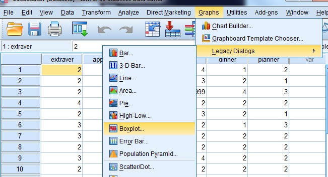
SPSS
SPSS allows you to create two types of boxplots: simple and clustered. Which type of boxplot you choose depends upon how many variables you want to plot. Choose the simple chart option when you want to create a plot of one variable, and choose the clustered boxplot option if you want to create a comparison of variable types. SPSS boxplots can be created in the Chart Builder or in the Legacy Dialogs menu.
Box plot in SPSS: Steps
Watch the video to see how to make a boxplot in SPSS using the Chart Builder, or read the steps below for a slightly different way to make a boxplot in SPSS, by using the legacy dialog.

Can’t see the video? Click here to watch it on YouTube.
- Open an existing worksheet with your data or type your data into a new worksheet.
- Click “Graphs,” then click “Legacy Dialogs” and then click “Boxplot.”

- Click the type of chart you want to display, either Simple or Clustered, then click a radio button for either summaries of groups or separate variables.
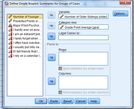
- Click “Define” to open the “Define Simple Boxplot” dialog box.
- Click a variable in the left window that you want to see medians or IQRs for. This is the analytical variable, the one that will be displayed on the y-axis. Click the top arrow to move the variable to the “Variable” window.
- Click a second variable in the left window that you want to display on the x-axis (the categorical variable), then click the second arrow down, to the left of Category Axis.

- Click “OK” to display the boxplot.

Minitab Box Plot
- Type your data into columns in a Minitab worksheet. Typically, you’ll want to type in two columns of data, one categorical and one quantitative (numerical).
- Click “Graph” on the toolbar and then click “Boxplot.”
- Choose a type of boxplot. If your data is in the form of column of quantitative data and one column of categorical variables (the most common scenario) then choose “One y” “With groups”.
- Click a variable name for your quantitative/numerical data and then click “Select” to move the item to the Graph Variables box.
- Click a variable name for your categorical data and then click “Select” to move that item to the Categorical Variables box.
- Click “OK” to create a boxplot.
That’s it!
Tips: Mouse over one of the boxes to display a window showing the median, Q1, Q3 and the IQR. You can also click on a number to bring up the Edit Scale box to specify labels, scales and other attributes for the boxplot.
Parallel boxplots
Parallel boxplots, also known as parallel box-and-whisker plots, allow a comparison of two or more sets of five-number summaries. For more straightforward comparison, these summaries are plotted on the same graph — a parallel boxplot — with one boxplot for each dataset. The plots can be arranged either stacked (parallel) or side-by-side. The choice of presentation depends on what best suits your data.
Parallel boxplots are useful for comparing multiple samples, which can be challenging with histograms or similar graphs. For example, if one data set has a very wide variability (e.g., a larger range) it can be a challenge to plot it on a histogram with other, smaller, datasets (the graph will end up as a poor comparison, with one squished and one elongated histogram).
Key features of parallel boxplots include:
- The box’s length signifies the data spread or sample variability.
- The line across the box represents the median or center. Alongside the box’s position within the whiskers, this line can also indicate whether the sample is skewed or symmetric.
However, parallel boxplots come with certain limitations:
- The five-number summary gives us an overview of the data but lacks the precision of some other charts. For example, while histograms are harder to compare, they can carry more information, such as classes or categories, and work well with large, unruly datasets that other plots can’t handle. However, both histograms and boxplots, mask details such as the type of probability distribution that might fit the data. Therefore, boxplots are typically not recommended for assessing the fit of data to a specific distribution.
- If your data is skewed, parallel boxplots might not be the best tool. That’s because the medians of the two data sets may be in the same place, but the distributions of the data sets may be very different.
- If the distribution is bimodal (two peaks) or multimodal (more than two peaks), a boxplot will return only one “box” for all peaks, which can be misleading.
Boxplot history
Kenneth W. Haemer, former presentation research manager at AT&T, was the first to refer to this type of chart a “range-bar” in 1948. a Haemer’s chart was a simple bar extending from the minimum to maximum value. [2]. In 1952, Mary Eleanor Spear released her book “Charting Statistics,” [3] which introduced the interquartile range into the chart — essentially creating the modern boxplot.
In 1969, John Tukey presented the box-and-whisker plot in his book “Exploratory Data Analysis,” which overshadowed Spear’s work [3]. Despite striking similarities with Spear’s work, Tukey did not credit Spears (or anyone else), thus was credited at the time with “inventing” the box plot [4].
Today, boxplots are among the most frequently used tools for data visualization. They have many applications across an array of fields, such as statistics, engineering, medicine, and business.
References
- Haemer, Kenneth W. “Range-Bar Charts.” The American Statistician, vol. 2, no. 2, 1948, pp. 23. JSTOR, doi:10.2307/2682234
- Spear, Mary Eleanor (1952). Charting Statistics. McGraw Hill. p. 166.
- Mary Eleanor Spear’s Importance to the History of Statistical Visualization
- Friendly, Michael. A Brief History of Data Visualization. 21 Mar. 2006, www.datavis.ca/papers/hbook.pdf