A peak of a distribution is a “bump” or high point in a graph. In statistics, the peaks are more formally called modes; The data count is higher in these areas than in any other parts of the graph. In calculus, the peaks are often called local maximums or global maximums.
- A unimodal distribution has one peak. For example, the normal distribution has one distinctive peak in the middle of the graph:
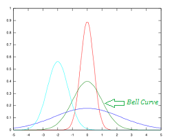
Several unimodal distributions plotted on the same graph. The green “bell curve” is the normal distribution.
- A bimodal distribution has two peaks.
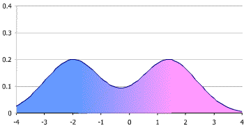
Bimodal distribution. - A multimodal distribution has three or more peaks.

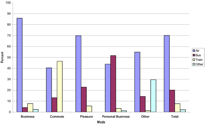
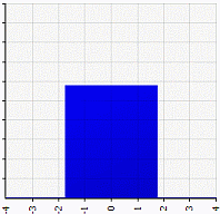
Multimodal distribution with many modes, or peaks. Image credit: USDOT - If a data set has no clear peaks (i.e. the whole graph looks flat on top), it’s called a “uniform distribution.”

A uniform distribution.
What Does The Peak of a Distribution Tell You?
A peak of a distribution indicates you have a high number of data points in that area of the graph. The exact interpretation depends on what your graph is used for. For example, if you were to graph rainy days in Florida, you’d likely have a peak (or several peaks) in the middle of rainy season (May to October).
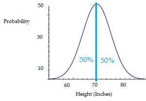
The following graph shows men’s heights in the shape of a normal distribution. The peak here is the average height and represents the area where a height is most likely to be found. The further you move away from the peak, the less likely you are to have men of that particular height.
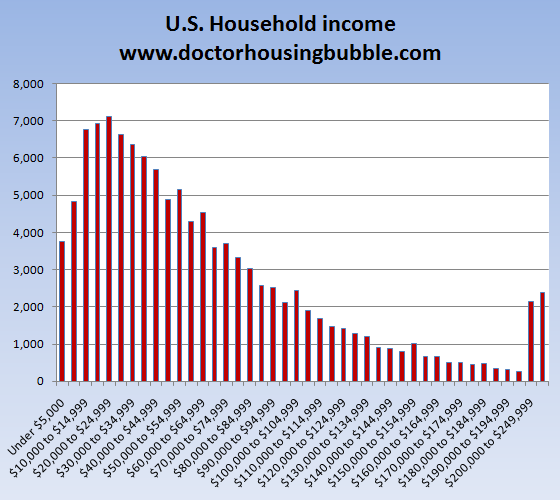
This following graph shows an income distribution. The high point represents the income level with the most respondents. In other words, more people claimed to earn $20-25,000 than at any other income level.
Next: Shapes of Distributions.
References
Agresti A. (1990) Categorical Data Analysis. John Wiley and Sons, New York.
Gonick, L. (1993). The Cartoon Guide to Statistics. HarperPerennial.