Statistics Definitions > Statistical Process Control
Contents:
What is Statistical Process Control?
Statistical Process Control (SPC) is a way to figure out how a process or system should behave. A model for “normal” system behavior is created with set limits. This allows variations from the norm to be identified. All systems have variation, but SPC helps you to identify when these variations are unacceptable or unpredictable.
Two types of variation happen in a system:
- Common cause variation: random variation that is a natural part of any system. If common cause variation is the only variation in the system, then that system is in control.
- Special (Assignable) cause variation: variation due to a specific, non-random cause. If special cause variation exists, then the system is out of control.
Many different tools can help you to investigate and monitor process control. They include:
- Control charts: the usual tool to identify out-of-control processes.
- Cause and Effect Diagrams: usually created after you have identified a problem with a control chart or other tool. These diagrams help you find a cause for the out-of-control behavior.
- Check sheets: documents used to collect real time data on location.
- Defect Concentration Diagrams: a graph that shows all defects. A cluster of similar defects in the same part of the graph might indicate assignable cause.
- Histograms: give you an easy-to-understand snapshot of variation in a set of data.
- Pareto Diagrams: A vertical bar chart with categories listed in order of magnitude, from left to right.
- Scatter plots: show relationships between two variables in an easy-to-understand format.
Control Charts: Overview
Control Chart Uses
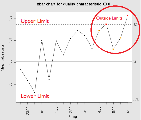
Control charts (sometimes called Stewhart charts) are typically used to keep an eye on the quality of a process (for example, a manufacturing line in a factory). The two basic types are:
- Univariate control chart: a display of one quality measurement.
- Multivariate control chart: a display of several quality measurements.
Control charts differ by the type of data that you’re working with. For example, you could create:
- An x̄ chart for central tendency.
- An R or s chart for variability.
- A p̄ chart for a proportion.
- A c chart for counts (i.e. counts of defective items).
Specification Limits and Control Limits in Statistical Process Control
Specification limits are the amount of variation you would normally find in a process. For a simple example, let’s say your manufacturing line was producing 500 millimeter toothpicks. It’s unlikely that the toothpicks would measure exactly 500 millimeters. You might think they are acceptable if they are in the range of 490 to 510 millimeters. These measurements are the lower and upper specification limits.
Control limits also have upper and lower boundaries, but they are not related to specification limits at all. Control limits are boundaries for the expected variation in the process. They are probabilities that tell you if your process is working in statistical control.
Control limits are defined by the amount of risk you are willing to accept. In the United Kingdom, control limits are usually stated as a probability. For example, an upper 0.002 limit means 2 out of one thousand. In the United States, they are commonly defined as 3 standard deviations from the mean (“three sigma”), which is approximately equivalent to a 1 out of one thousand probability (i.e. 0.001).
Limitations of Control Charts
Just because all of your points fall within the control limits doesn’t mean that your process is working just fine. For example, if your plot is non-random, it may be an indication that there’s something wrong. Therefore, control charts are typically used as an indicator for out-of-norm, rather than an indicator that everything is working fine.
Next: P Chart / P Control Chart
See also: