Sinusoidal regression finds a trigonometric model that gives the curve of best fit. The idea is the same as finding the line of best fit in linear regression. However, instead of finding a straight line, this time you’ll find a sinusoidal curve.
Data that fits a sinusoidal regression curve tends to fluctuate over time in undulating or wavelike curves. For example, temperatures from year to year tend to undulate in a sinusoidal pattern. Sinusoidal waves are also commonly seen in signal processing and time series analysis.
Creating a scatter plot is always a good idea before you perform any kind of regression, because you’ll usually get a result even if your data is wholly inappropriate for the type of regression you’re running. For example, if your data points fit a straight line, a sinusoidal regression will give you a result, but the regression equation will be completely useless for forecasting.
Watch the video for an overview of the sinusoidal regression in Desmos and the TI 83.
Can’t see the video? Click here to watch it on YouTube.
Sinusoidal Regression Example
This example uses this Desmo.com dataset of weather for a fictitious location.
Step 1: Create a scatter plot. You can change the data entry points in the left hand table by typing the entries in (just like you would in a spreadsheet):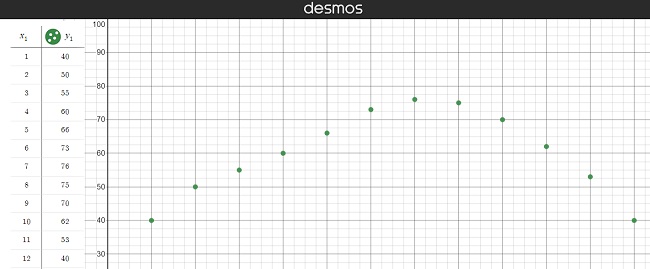
We can see that a sinusoidal curve, or wave, would be a good fit for this data, so we can continue.
Step 2: Choose either a sine function or a cosine function. The term “sunusoidal” refers to both types, so you need to choose one or the other.
- If your scatter plot (from Step 1) shows a peak at x = 0, choose the cosine function.
- If your scatter plot is offset, with the peak closer to 1, choose the sine function.
Note that this is just a starting point; The main difference between sine and cosine is that the sine graph is the cosine graph shifted to the right on the x-axis by π/2units [1]. You can try to fit one, or both—there’s a lot of leeway and you can’t really make a wrong choice, as you’ll see in the next steps.
The example in the Desmos dataset is the SIN function. The regression statistics will update automatically when you type new data into the table.
Step 3: Plug your results into the equation
y = a * sin(bx + c) + d.
For this example, we’re given the following results:
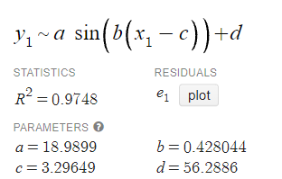
Plugging those in, we get (rounded to two decimal places):
y = 18.99 * sin(0.43x + 3.30) + 56.29.
Here, the different parts of the equation are:
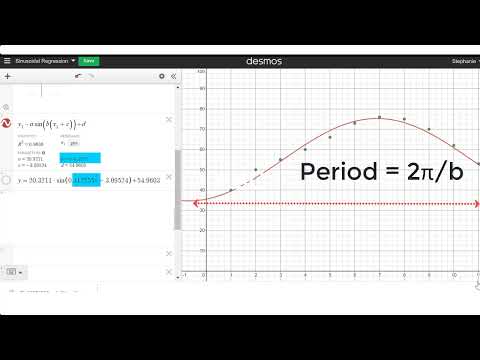
- a = amplitude
- 2π/b is the period
- c = phase shift
- d = vertical shift.
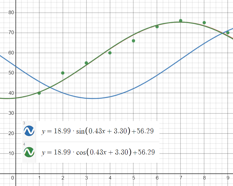
Step 4: Check that your regression equation fits the curve by typing the function into Desmos. Typing in y = 18.99 * sin(0.43x + 3.30) + 56.29 gives you an offset curve. We know that cos is offset by π/2, so changing sin to cos gives the correct fit: y = 18.99 * cos(0.43x + 3.30) + 56.29.
TI-83 Sinusoidal Regression
If you have a TI-83 calculator, you can perform sinusoidal regression with the SinReg function in the STATS menu. The basic steps are below (or view the video on YouTube):
- Press STAT.
- Make sure EDIT is highlighted in the top row, then press ENTER.
- Type your x-values into L1, then type your y-values into L2.
- From the HOME screen, press STAT again.
- Use the cursor to highlight CALC at the top of the screen.
- Arrow down to C:SinReg, then press ENTER twice.
- Follow Step 3 above to plug your results into the equation.
References
[1]Hallman, A. Explorations with Sine and Cosine. Retrieved October 4, 2021 from: http://jwilson.coe.uga.edu/EMAT6680Fa07/Hallman/Assigment%201/assignment1-allyson.html