Statistics Definitions > Rank Histogram
What is a Rank Histogram?
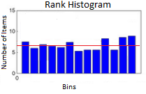
 Rank histograms (sometimes called verification rank histograms or Talagrand diagrams) are a way to show how reliable an ensemble forecast is compared to a set of newly observed data. In other words, they show the bias for the model. If an ensemble forecast is accurate, the rank histogram — a graph of observed data — will be flat (represented by the red line in the image to the left). Deviations from a uniform distribution(i.e. histogram blocks that are above or below the red line) mean that the model isn’t completely accurate. These types of diagrams are not commonly used outside of ensemble forecasting.
How Talagrand Diagrams are Constructed
The Talagrand is basically a histogram. Usually, you would use observed data to make the histogram, using the actual data points to define the bins(class intervals). The difference with this type of histogram is that you use the forecast data to create the bins, and then you use observed (new) data to fill those bins. Meteorologist Peter Houtekamer suggests the following steps for creating a rank histogram:
Step 1: Place forecasts in order. For this example, let’s say the forecast values are: {0.25, 0.7, 1.49, 2.17, 4.2}.
Step 2: Define bins based on the list of forecast values from Step 1. There are 6 bins for this list of data:
- Values below 0.25 (the lowest value),
- Values between 0.25 and 0.7,
- Values between 0.7 and 1.49,
- Values between 1.49 and 2.17,
- Values between 2.17 and 4.2,
- Values above 4.2 (the highest value).
Step 3: Place observations in the appropriate bin. Ideally, a large number of observations should be taken over multiple days from different locations.
Step 4: Make a histogram using the new data. Houtekamer states that this histogram should be a uniform distribution, since each bin should represent an equally likely scenarios.
References:
Houtekamer,P. (n.d.). Ensemble forecasts. Retrieved 1/14/2017 from: http://collaboration.cmc.ec.gc.ca/cmc/cmoi/product_guide/docs/lib/ens_en.pdf