Contents:
Definition
Correlation is used to test relationships between quantitative variables or categorical variables. In other words, it’s a measure of how things are related. The study of how variables are correlated is called correlation analysis.
Some examples of data that have a high correlation:
- Your caloric intake and your weight.
- Your eye color and your relatives’ eye colors.
- The amount of time your study and your GPA.
Some examples of data that have a low correlation (or none at all):
- Your sexual preference and the type of cereal you eat.
- A dog’s name and the type of dog biscuit they prefer.
- The cost of a car wash and how long it takes to buy a soda inside the station.
Correlations are useful because if you can find out what relationship variables have, you can make predictions about future behavior. Knowing what the future holds is very important in the social sciences like government and healthcare. Businesses also use these statistics for budgets and business plans.
The Correlation Coefficient
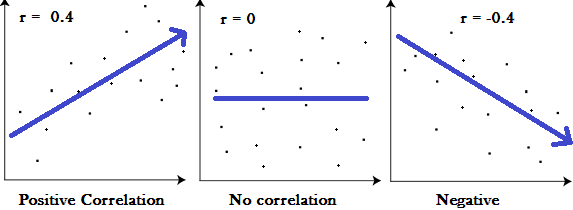
A correlation coefficient is a way to put a value to the relationship. Correlation coefficients have a value of between -1 and 1. A “0” means there is no relationship between the variables at all, while -1 or 1 means that there is a perfect negative or positive correlation (negative or positive correlation here refers to the type of graph the relationship will produce).

Types
The most common correlation coefficient is the Pearson Correlation Coefficient. It’s used to test for linear relationships between data. In AP stats or elementary stats, the Pearson is likely the only one you’ll be working with. However, you may come across others, depending upon the type of data you are working with. For example, Goodman and Kruskal’s lambda coefficient is a fairly common coefficient. It can be symmetric, where you do not have to specify which variable is dependent, and asymmetric where the dependent variable is specified.
Correlation in Excel
Watch the video for the steps:
 Finding Pearson’s correlation coefficients by hand is ugly and involves a lot of lengthy math. However, Excel can make those calculations for you in a fraction of a second. You have two options in Excel (2013 and later): The CORREL function or the Data Analysis Toolpak.
If you’re familiar with entering functions in Excel you could enter the CORREL command:
=CORREL(array 1, array 2)
For example, =CORREL(A2:A6,B2:B6)
However, the Data Analysis Toolpak is much easier overall, because you don’t have to remember (or hunt for) an array of functions; They are all just listed in the Data Analysis list. If Data Analysis isn’t showing to the far right of the data tab, make sure you have loaded the Data Analysis Toolpak. The Data Analysis Toolpak is an optional add-in to Excel which gives you access to many functions, including:
- Correlation,
- Linear Regression,
- Histograms,
- T tests,
- Z tests
- ANOVA one way and two way tests.
Step 1: Type your data into a worksheet in Excel. The best format is two columns. Place your x-values in column A and your y-values in column B.
Step 2: Click the “Data” tab and then click “Data Analysis.”
Step 3: Click “Correlation” and then click “OK.”
Step 4: Type the location for your x-y variables in the Input
Range box. Or, use your cursor to highlight the area where your variables are located.
Step 5: Click either the “columns” or “rows” option to let Excel know how your data is laid out. In most cases, you’ll click “columns” as that’s the standard way to lay out data in Excel.
Step 6: Check the “Labels in first row” if you have column headers.
Step 7: Click the “Output Range” text box and then select an area on the worksheet where you want your output to go.
That’s it!
Check out our YouTube channel for more Excel tips and help!
References
Agresti A. (1990) Categorical Data Analysis. John Wiley and Sons, New York.
Dodge, Y. (2008). The Concise Encyclopedia of Statistics. Springer.
Vogt, W.P. (2005). Dictionary of Statistics & Methodology: A Nontechnical Guide for the Social Sciences. SAGE.
Wheelan, C. (2014). Naked Statistics. W. W. Norton & Company