Statistics Definitions > Receiver Operating Characteristic (ROC) Curve
What is a Receiver Operating Characteristic (ROC) Curve?
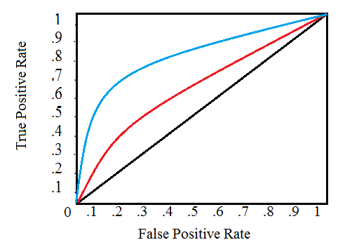
A Receiver Operating Characteristic (ROC) Curve is a way to compare diagnostic tests. It is a plot of the true positive rate against the false positive rate.*
A ROC plot shows:
- The relationship between sensitivity and specificity. For example, a decrease in sensitivity results in an increase in specificity.
- Test accuracy; the closer the graph is to the top and left-hand borders, the more accurate the test. Likewise, the closer the graph to the diagonal, the less accurate the test. A perfect test would go straight from zero up to the top-left corner and then straight across the horizontal.
- The likelihood ratio; given by the derivative at any particular cutpoint.
Test accuracy is also shown as the area under the curve (which you can calculate using integral calculus). The greater the area under the curve, the more accurate the test. A perfect test has an area under the ROC curve (AUROCC) of 1. The diagonal line in a ROC curve represents perfect chance. In other words, a test that follows the diagonal has no better odds of detecting something than a random flip of a coin. The area under the diagonal is .5 (half of the area of the graph). Therefore, a useless test (one that has no better odds than chance alone) has a AUROCC of .5.
See also: ROC Curve explained in one picture.
Origin of the Term
The term “Receiver Operating Characteristic” has its roots in World War II. ROC curves were originally developed by the British as part of the “Chain Home” radar system. ROC analysis was used to analyze radar data to differentiate between enemy aircraft and signal noise (e.g. flocks of geese). As the sensitivity of the receiver increased, so did the number of false positives (in other words, specificity went down).
Note: The plot actually shows sensitivity vs (1 − specificity), and is therefore sometimes called a sensitivity vs (1 − specificity) plot. The logic behind it is this: if a test has zero diagnostic capability, it would be equally likely to produce a false positive or a true positive, which is the same as:
Sensitivity = 1 – specificity.
Next: C-Statistic (Area under a ROC Curve)
Reference:
Lusted, L. Signal Detectability and Medical Decision-Making. Science 26 Mar 1971:Science 26 Mar 1971. Available here.