IBM SPSS Statistics is a software package for statistics. Originally geared towards the social science, the software is now a powerful statistics package widely used in a variety of business and science applications. SPSS contains many different options for how to make a histogram in SPSS, including the legacy chart builder. As well as the basic histogram, you can create bihistograms, with two or more side-by-side histograms of data levels.
How to Make a Histogram in SPSS
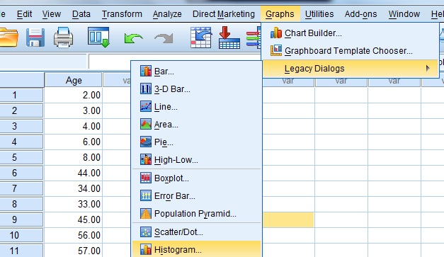
Step 1: Click “Graphs,” then choose “Legacy Dialogs” and click “Histogram—”.
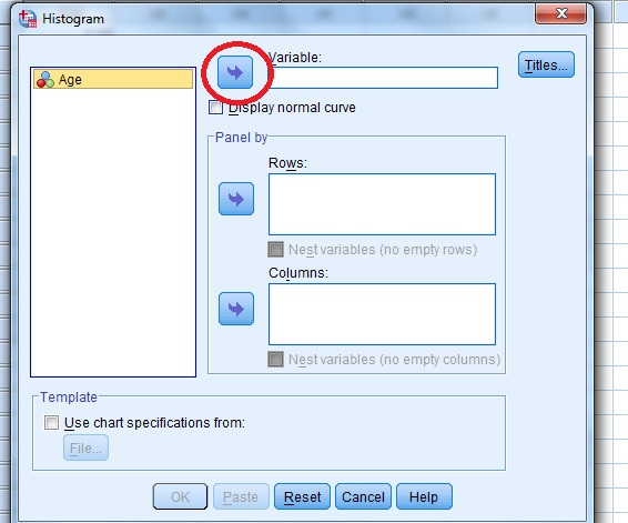
Step 2: Choose a variable from the left dialog box and then click the center arrow to move your selection to the “Variable” box.
Which variable you choose depends on your data, but in general you’ll want to choose the dependent variable. For example, let’s say your dataset shows calories consumed vs. weight. You may want to see a histogram of weight gained (10lb, 20lb, 30lb,…), so you would put “weight” into the variable box. If you make the wrong choice, go back to the dialog box and move the variable out of the Variable box (using the reverse arrow). You can then choose another variable.
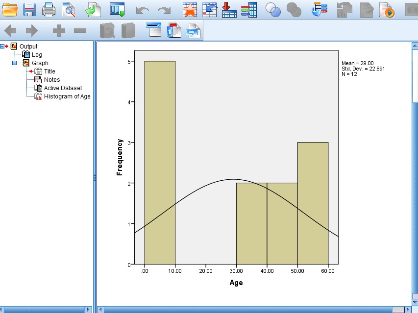
Step 3: Click “OK.” SPSS may take a moment to run the graph utility, especially with older versions of the software or if you are using a laptop without a lot of working memory. You may see a blank screen with the words “Running Graph” at the bottom right while SPSS performs the necessary calculations.
Tips on changing the look of the graph:
- To edit scales, height, width and other features of the SPSS histogram, double-click on the graph in the Output Viewer (that’s the window that pops up with the graph), and then double-click on the graph element you want to change.
- If you want to see how your data compares to a normal distribution, check the “Display Normal Curve” check box.
- Histograms using this method work with one set of variables, so don’t try to select more than one variable at a time. If you need more than one histogram for a set of different variables, repeat the steps above. SPSS will open a new window with each histogram. You can also make a bihistogram (see below) to plot the histograms side-by-side.
How to Make a Histogram in SPSS Part 2: Bihistogram
- Click “Graphs” from the menu, then click “Chart Builder.”
- Choose histogram from the gallery at the bottom left. Icons will appear with a series of different histograms.
- Click and drag the back to back icon (the fourth from the left) into the chart preview area.
- Select your variables as you would any other chart. (If you’re unfamiliar with choosing variables, check out How to Make a Pie Chart in SPSS).