Misleading Graphs in Real Life: Overview
Misleading graphs are sometimes deliberately misleading and sometimes it’s just a case of people not understanding the data behind the graph they create. The “classic” types of misleading graphs include cases where:
- The Vertical scale is too big or too small, or skips numbers, or doesn’t start at zero.
- The graph isn’t labeled properly.
- Data is left out.
But some real life misleading graphs go above and beyond the classic types. Some are intended to mislead, others are intended to shock. And in some cases, well-meaning individuals just got it all plain wrong. These are some of my favorite recent-history misleading graphs from real life.
Watch the video for a few examples:
Misleading Graphs: The Missing Baseline.
The Times leaves the rest behind…or does it?
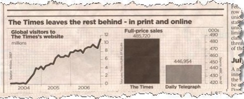
You might be thinking that the graph on the right shows The Times makes double the sales of The Daily Telegraph. But take a closer look at the scale and you’ll see although The Times does make more sales, it’s only beating the competition by about 10%.
USA Today
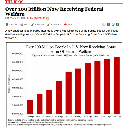
USA today is notorious for fussy graphs that have too much information and mislead. This graph makes our welfare problem look like it’s spiraling out of control. But note where the y-axis starts…at 94 million!
This one has the correct figures, but that BIG HEADLINE makes you think that 5.3% of children get spinal cord injuries…a pretty scary statistic for parents:
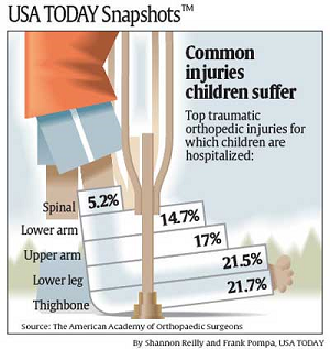
For the record, the real figure is about .0000003% (based on 2000 injuries per year out of a population of around 74,000,000).
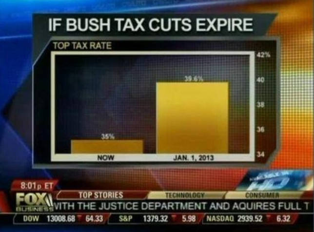
Fox News Misleading Graphs.
Fox News showed this chart of what would happen if the Bush tax cuts expired. Disastrous, right? Again, check the scale (it starts at 34). All is not what it seems.
Not to keep on bashing on Fox News, but their name came up time and time again when searching for misleading graphs from real life. Here’s another, designed to show that after a small drop in unemployment it went up and up in the Obama administration.
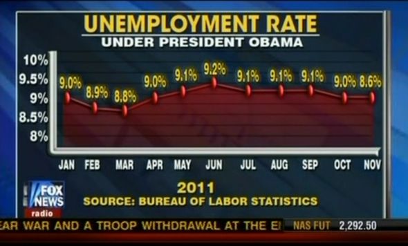
Note that the value for November (8.6) has not been plotted correctly. It’s placed at the 9.0 position. That’s not the only problem with this graph. It’s been plotted to look like there’s exponential growth when in fact, the overall employment trend is pretty stable at around 9%.
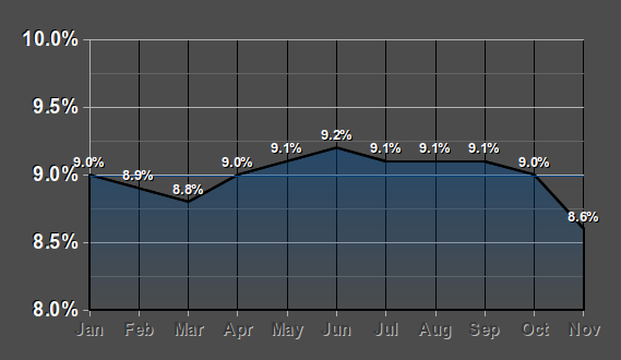
Here’s what the graph should look like if it had been plotted correctly. See the difference?
Those d%$n Liberals!
A final example of this type of misleading graph. Terry Schiavo was removed from life support after a years-long court battle. CNN used a graph similar to the one below to show who agreed with the decision to remove the feeding tube.
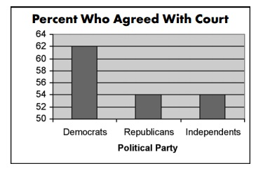
A fist look at this graph makes it look like three times as many democrats supported the decision. But on closer inspection, note the scale on the vertical axis. Only slightly more democrats supported than republicans (62% vs. 54%).
What is the problem with these particular misleading graphs from real life? In general, graphs should show a baseline. A baseline is zero on the vertical scale. Graphs that have a missing baseline and start at some arbitrary number (34 on the Fox News image) tend to be very misleading. When you look at a graph and try to figure out if it’s a true representation of what’s really going on, check that baseline.
Misleading Graphs: Incomplete Data.
If you really want to make a shocking statement, make sure you only include part of the data. Take this first example of a misleading graph that proves global warming is real.
Global Warming out of Control!
What’s wrong with this picture? It only shows the first half of the year, so of course temperatures are rising dramatically.
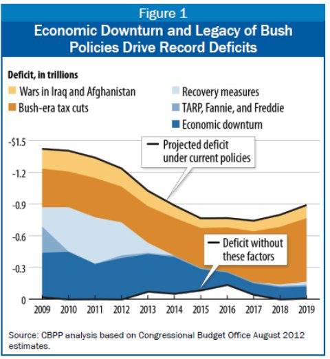
Deficit an Ongoing Problem!
Here’s another example of incomplete data. This graph makes it look like the deficit has always been high, because the graph starts in 2009. This might lead you to think that the deficit has been an ongoing problem. It hasn’t: The deficit was just 1.2 percent of GDP in 2007, when the housing market collapsed.
Our Cream Beats the Itch!
I’m not sure what to say about this graph for the anti-itch cream, Lanacane.
![lanacane[1]](https://www.statisticshowto.com/wp-content/uploads/2014/01/lanacane1.jpg)
It looks like lanacane works better than regular anti-itch cream, right? Note the lack of labels. What is this graph actually telling us? Pretty much nothing at all other than their statisticians are very good at making not-very-good graphs.
Misleading Graphs: Just Reading it Plain Wrong
Global Warming Stopped!
Here’s another global warming picture, from the British tabloid the Mail on Sunday. The newspaper used it to claim that global warming had stopped.
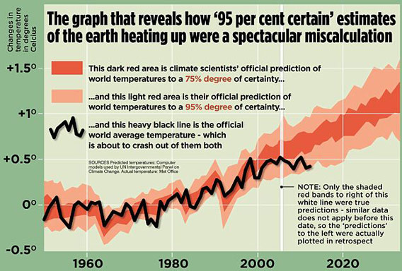
When we read newspapers, we often think the people writing the articles are experts. In fact, the journalist who wrote the article to go with this picture (David Rose) just didn’t understand what the graph was telling him. He made two errors:
- The graph is showing air temperatures. This is a very poor measure of global warming as much of the heat ends up in the oceans.
- This is a very short term graph. You can’t make good predictions based on a little data. If you win the first scratch-off lottery ticket you buy, it doesn’t mean that your chances of winning are 100%. You would have to buy (and scratch-off) dozens or even hundreds of tickets to truly see a trend. A better graph for global warming would show the trend since the industrial revolution.
College not Worth Your Time and Money!
How about this chart that “proves” that college education just isn’t worth the money any more?
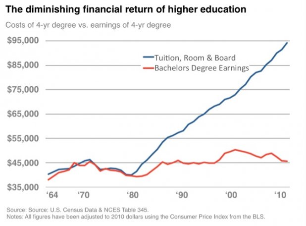
The scale on this chart is fine. What Business Insider deduced from the chart is not. Have we “…lost the ubiquitous positive financial return on education”? No. David Blake read the chart without taking into account a key fact that wasn’t on the chart: the cost of not going to college has diminished even more. Than means, your prospects as a high school graduate are a lot worse than your prospects as a college graduate.
Another key piece of information is on the chart itself. Note the average yearly income a college grad can expect is about $45,000 in 2010. That’s per year. Over an average working lifetime (say, 43 years assuming retirement at age 65), that gives you an income of $45,000 * 43 = $1,935,000. Subtract that expensive college education ($95,000) and your net earnings are $1,840,000. Compare that to your average high school grad. They can expect to earn $1,300,000 over their lifetime (Source: The U.S. Department of Education). That’s quite a difference!
The moral of the tale? Be cautious when trying to read a chart about a topic you aren’t an expert in!
Wii is Floundering!
Everyone can be an expert in gaming systems, right? After all, what’s there to know? How to put a disk into the console? How to hold a controller? How to fire a weapon? This graph from 2009 showed how a dismal 6% of Wii owners actually used their Wii:
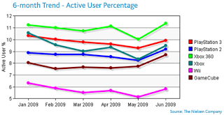
Lee Evans, in his Downwards Compatible article “Adventures in Misleading Graphs” put it best:
Take a look at the top number on the graph. Only 11% of 360 owners actively use their 360 and only 10% of PS3 owners actively use their PS3. Now, let’s do a little math.
There are 50 million Wii owners. 6% of that number is 3 million.
There are 30 million 360 owners. 11% of that number is 3.3 million.
There are 20 million PS3 owners. 10% of that number is 2 million.
In other words, almost the same amount across the board use their system regularly. The gap in percentages is not that great, but the graph (and the way people are reading it) makes it look like “OMG A HUEGE GAP!”
Misleading Graphs: Numbers that Don’t add up
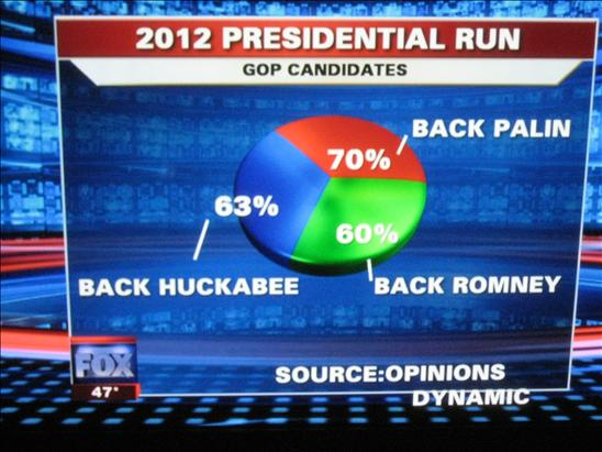
Palin for Pres!
Apparently 70% of people backed Palin in the 2012 presidential run. But wait! The Fox News statisticians have been at it again. A pie chart should add up to 100%. Not this one:
Misleading Graphs: Two Y-Axes
Job and health insurance losses accelerating!
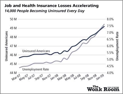
At first glance, it looks clear that statement is true. But take a look at the graph and you’ll see two y-axes. This special type of data manipulation goes beyond the classic methods to deceive. What’s actually going on here (skipping the math part) is that if you extract the data from this confuddling mess of a graph you get:
- Lack of insurance is increasing very slightly (from ~15 percent to ~16 percent).
- Unemployment increases more rapidly (from ~4.5 percent to 7.5 percent).
And the Winner in the Misleading Graphs category is…
The award for in the misleading graphs in real life category goes to (drum roll please…) Fox News for this gem:
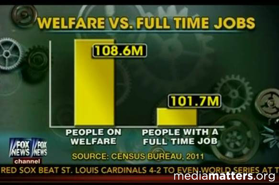
What’s the real data behind this shocking graph? Are there really more people on welfare than those who have full time jobs? As Media Matters points out:
“Fox’s 108.6 million figure for the number of “people on welfare” comes from a Census Bureau’s account…of participation in means-tested programs, which include “anyone residing in a household in which one or more people received benefits” in the fourth quarter of 2011, thus including individuals who did not themselves receive government benefits. On the other hand, the “people with a full time job” figure Fox used included only individuals who worked, not individuals residing in a household where at least one person works.”
In other words, if you live with your Mom, Dad, brother Joe and cousin Sam, and Sam was (briefly) on some kind of welfare program, that counted against you and everyone in your household.
References
Huff, D. (1993). How to Lie With Statistics. W. W. Norton & Company
Gonick, L. (1993). The Cartoon Guide to Statistics. HarperPerennial.