Probability Distributions > Relative Frequency Distribution
What is a Relative frequency distribution?
A relative frequency distribution is a type of frequency distribution.
The first image here is a frequency distribution table. A frequency distribution table shows how often something happens. In this particular table, the counts are how many people use certain types of contraception.
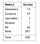
With a relative frequency distribution, we don’t want to know the counts. We want to know the percentages. In other words, what percentage of people used a particular form of contraception?
This relative frequency distribution table shows how people’s heights are distributed.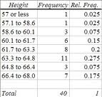
- Count the total number of items. In this chart the total is 40.
- Divide the count (the frequency) by the total number. For example, 1/40 = .025 or 3/40 = .075.
This information can also be turned into a frequency distribution chart. This chart shows the relative frequency distribution table and the frequency distribution chart for the information. How to we know it’s a frequency chart and not a relative frequency chart? Look at the vertical axis: it lists “frequency” and has the counts:
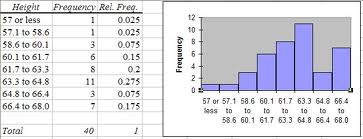
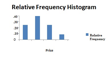
This next chart is a relative frequency histogram. You know it’s a relative frequency distribution for two reasons:
- It’s labeled as relative frequency (which all good charts should be!).
- The vertical axis has percentages (as decimals, .1, .2, 3 …)instead of counts (1, 2, 3…).
How to Make a Relative Frequency Table
Making a relative frequency table is a two step process.
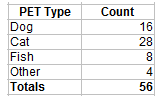
Step 1: Make a table with the category names and counts.
Step 2: Add a second column called “relative frequency”. I shortened it to rel. freq. here for space.
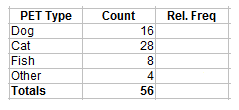
Step 3: Figure out your first relative frequency by dividing the count by the total. For the category of dogs we have 16 out of 56, so 16/56=0.29.
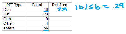
Step 4: Complete the rest of the table by figuring out the remaining relative frequencies.
Cats = 28 / 56 = .5
Fish = 8 / 56 = .14
Other = 4 / 56 = 0.07
Don’t forget to put the total at the bottom of the rel. freq. column: .29 + .5 + .14 +.07 = 1.
Note: The usual way to complete the table is with decimals or percents. However, it’s still technically correct to just leave the ratios (i.e. 28/56) in the column (that way you don’t have to do the math!).
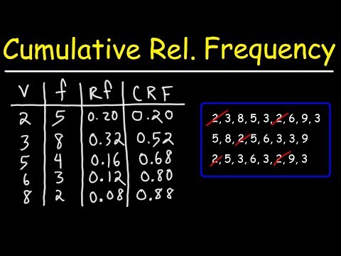
Cumulative Relative Frequency
To find the cumulative relative frequency, follow the steps above to create a relative frequency distribution table. As a final step, add up the relative frequencies in another column. Here’s the column to the right is labeled “cum. rel. freq.”)
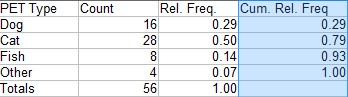
The first entry in the column is the same as the first entry in the rel.freq column (.29).
Next, I added the first and second entries to get 0.29 + 0.50 = 0.79.
Next, I added the first, second and third entries to get 0.29 + 0.50 + 0.14 = 0.93.
Finally, I added the first, second, third and fourth entries to get 0.29 + 0.50 + 0.14 + 0.07 = 1.
References
Agresti A. (1990) Categorical Data Analysis. John Wiley and Sons, New York.
Klein, G. (2013). The Cartoon Introduction to Statistics. Hill & Wamg.
Levine, D. (2014). Even You Can Learn Statistics and Analytics: An Easy to Understand Guide to Statistics and Analytics 3rd Edition. Pearson FT Press