 A Youden Plot is a type of scatter plot used primarily in plotting results from multiple laboratories on the same graph. It is meant to uncover bias in measurement. Youden Plots are used in medical analysis and quality control, and allow you to see quickly and easily:
- If labs are equivalent,
- Which particular labs are outliers,
- Whether inconsistencies are primarily between labs (reproducibility problems) or within a lab (repeatability problems).
The Youden Plot and the analysis it involves is also called a two-sample diagram, two-sample plan, or two-sample collaborative testing.
Setting Up a Youden Plot
If Youden plot two-sample collaborative testing is to be performed, the same material is sent to all labs involved; typically the labs will make one run on two different products, or two runs on the same product.
A basic XY graph is set up, with the x-axis and y-axis each representing one of the reported values. For instance, if the laboratories each performed run 1 and run 2 on a single sample, the x-axis might be designated as run 1 and the y-axis as run 2.
When this is setup the data from the labs are plotted on this graph as a scatter plot. Each point will represent one laboratory.
Two median lines are drawn, parallel to the x and y axis respectively. Excluding outliers, the horizontal line should have an equal number of points above and below it; the vertical line should have an equal number of points to the left and right. The point where these lines meet we call the Manhattan median. Then quadrants are assigned, based on this Manhattan median: clockwise from upper left, these will be (- +),(+ +),(+ -),(- -). After this a third, 45 degree reference line can be drawn through the Manhattan median.
Understanding the Youden Plot
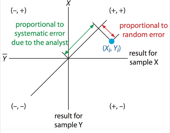
If random errors are much larger than systematic errors, the points should cluster in an approximate circle around the Manhattan median. If systematic errors are larger than random errors, we’d expect to see clustering around the 45 degree line, forming an elliptical pattern with most readings in the (+ +) and (- -) quadrants.
For any point, the length of a line projection traveling from that point to the 45 degree line, perpendicular to the 45 degree line, is proportional to random error. The distance from the Manhattan median to the point where that projection meets the 45 degree line is proportional to systematic error due to the analyst.
Reading the Youden Plot
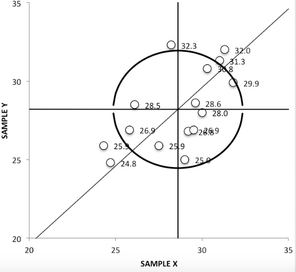
To make this concrete, let’s look at the first image above. It happens to be the record of an analysis on polyunsaturated fatty acids in fat and oils, run in 16 different labs (15 are shown on the graph; one is a far outlier). Two almost identical samples were tested at each lab, sample X and sample Y. The horizontal line drawn at 28.2 g/100g is the average value for sample Y, and the vertical line, which is at 28.6, is the average value for sample X.
The five labs whose values are recorded outside the 95 percent circle evidently have a high rate of systematic errors. There is actually a sixth which had values of 8.20 and 26.3; this isn’t even on the visible portion graph and can be marked down as an outlier.
The general shape of all points on this graph is more an ellipse around the 45 degree line than a circle. We can conclude that, among all labs, systematic errors are larger than random errors. Points which are far from the axis (where the two average lines meet) represent labs that have particularly high systematic errors; those which are far from the 45 degree line have large random errors.
We expect results with high systematic errors to be repeatable within the lab but not reproducible in another lab, and we expect results with high random errors to be unrepeatable in the lab (to whatever extent the error exists).
We can conclude that the labs whose points are outside the 95% circle are providing biased results. Based just on these results, the labs likeliest to be accurate are those near the axis of our graph. We note that two sets of two labs within the circle have results that are very near to each other, and that there are five more, all within the circle, which have results almost equidistant from the axis but also fairly distant from each other.
References
Everitt, B. S.; Skrondal, A. (2010), The Cambridge Dictionary of Statistics, Cambridge University Press.
Kotz, S.; et al., eds. (2006), Encyclopedia of Statistical Sciences, Wiley.
Martín, Velázquez & Asuero (2017). Youden Two-Sample Method, Quality Control and Assurance – An Ancient Greek Term Re-Mastered, Dr Kounis (Ed.), InTech, DOI: 10.5772/66397.
Retrieved from https://www.intechopen.com/books/quality-control-and-assurance-an-ancient-greek-term-re-mastered/youden-two-sample-method on March 17, 2018
MedCalc Statistical Software Manual: Youden Plot
Retrieved from https://www.medcalc.org/manual/youdenplot.php on March 17, 2018
IST/SEMATECH e-Handbook of Statistical Methods, 1.3.3.31. Youden Plot
Retrieved from https://www.itl.nist.gov/div898/handbook/eda/section3/youdplot.htm on March 17, 2018
Images of Youden Plots are from https://www.intechopen.com, and licensed for use under a Creative Commons Attribution 3.0 Unported License.