What is a Segmented Bar Chart?
Segmented Bar charts are one of the most popular charts used in Statistics. They are a type of stacked bar chart. In order to understand this chart, first you’ll need to understand the idea of bar charts and stacked bar charts .
Bar graphs represent comparisons among categories by using horizontal or vertical bars. A bar chart has two axes. One of them shows a discrete value (i.e. numbers) while the other one compares the values with different bars in different categories.
Stacked Bar Chart
The stacked bar chart has become quite popular; it is used for grouping or categorizing the parts of a whole. The bars in this chart are categorized into stacking order to represent different values. One axis will show the discrete values and the other one will provide the variable bars in a stacking order. Different colors will show distinctive parts of the whole bar.
Segmented Bar Charts and Stacked Bar Charts
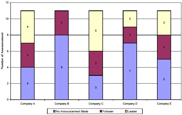
A segmented Bar chart is one kind of stacked bar chart, but each bar will show 100% of the discrete value. For example, there are a total of 40 students in your classroom. Out of them, 25 students like Basketball, 30 students like Volleyball, and 20 students like Badminton. There are 25 boys and 15 girls in the class. The data along the vertical side of the box represents sports while the horizontal represents a certain percentage for each sport. Each bar will show the preference of each sport according to the number of boys and girls and the bars will be separated by stacked order, representing one group for the boys and the other for the girls.

Notice how the bars are separated by the number of boys and girls. They are also colored in a distinctive manner to recognize each category.
But, be careful when you’re dealing with segmented bar charts as they should represent 100% on each of the bars or else it’s going to be a regular stacked bar chart.
Segmented Bar Chart in Excel
To make a segmented bar chart in Excel:
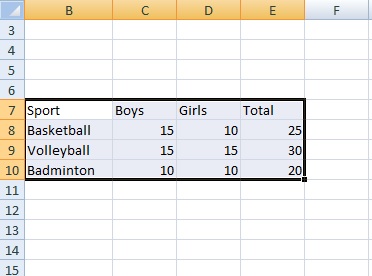
Step 1: Type your data into Excel like this example:
Step 2: Click the Insert tab, then click Column in the “Charts” section.
Step 3: Select the third icon (in the 2D section).
References
Gonick, L. (1993). The Cartoon Guide to Statistics. HarperPerennial.
Vogt, W.P. (2005). Dictionary of Statistics & Methodology: A Nontechnical Guide for the Social Sciences. SAGE.
Lindstrom, D. (2010). Schaum’s Easy Outline of Statistics, Second Edition (Schaum’s Easy Outlines) 2nd Edition. McGraw-Hill Education