The term “waterfall plot” is used to refer to several very different types of graphs and charts in different disciplines.
In many fields, a waterfall plot is considered to refer to a three-dimensional graph where spectral data is arranged as a function of noise or speed. These waterfall plots look like mountainous landscapes and are useful in comparing a number of two-dimensional plots.
In medical research, particularly oncology, a waterfall plot is a special type of bar chart which allows you to see, at a glance, such details as the response of a number of patients to treatment, the growth of tumors in cancer patients, or the effectiveness of drugs given various criteria. These plots look like ordered bar graphs, where some bars may venture into negative y territory.
There are also ‘waterfall charts’, sometimes also referred to as waterfall plots, which are two dimensional plots that show the cumulative effects of sequential events. These plots are also known as flying bricks charts or Mario charts; they look like bar charts where many of the bars, rather than sitting nicely on the x axis, are flying in midair.
Three dimensional Waterfall Plots
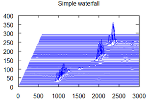
Three dimensional waterfall plots let us see a two dimensional phenomena such as spectrum or RPM maps is changing over time. Typically, the vertical access will show time, the horizontal will show order or frequency, and the third axis will show amplitude and power.
Since the two dimensional curves (usually spectra) are staggered across the screen, ‘closer’ curves will be in front of those behind, and the whole display looks like a series of side by side mountain landscapes.
Its three dimensional nature makes this type of waterfall plot primarily useful for computer-generated applications. It does, however, provide easy to read visual information about important changes in spectra that can be invaluable in research.
Waterfall Plots in Medical Research
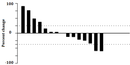
Waterfall plots in oncology are a relatively new way of presenting data from research projects. It’s basically a bar graph, where each bar typically represents a patient; they are usually ordered from worst results to best.
The horizontal axis is generally chosen to be a baseline measure, and the bars may go either above or below the baseline. The y axis is generally used to quantify response to treatment; for instance, it might represent the percent of growth or reduction in a tumor while a patient is undergoing radiology. Negative bars would show reduction; positive bars would be patients whose cancer is still progressing or non responders.
Sometimes the bars are color-coded with other information relevant to the study—for instance, the bars representing smoking patients might be colored yellow while non smokers were colored red; or the age ranges of patients (0-5, 5-10, 10-20, 20-30, 30-40, and so on) might each be assigned a different color. This allows even more information to be available at a glance.
Waterfall Charts for Sequential Events
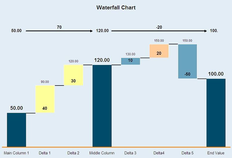
Mostly used in finance, these charts usually show an initial value and how that value is affected by a series of ± values. Whole columns represent the first and final values.
References
Agresti A. (1990) Categorical Data Analysis. John Wiley and Sons, New York.
DataVizProject (n.d.) Waterfall Plot. Retrieved January 7, 2018 from http://datavizproject.com/data-type/waterfall-plot/
Gillespie, Theresa. (2012) Understanding Waterfall Plots. J Adv Pract Oncol. Mar-Apr; 3(2): 106–111. Retrieved January 7, 2018 from: https://www.ncbi.nlm.nih.gov/pmc/articles/PMC4093310/
Laguna, I. et al. (2012). KRASness and PIK3CAness in patients with advanced colorectal cancer: outcome after treatment with early-phase trials with targeted pathway inhibitors.
National Instruments (2015). Waterfall and Cascade Plot. Retrieved January 7, 2018 from: http://www.ni.com/example/30607/en/.
Shao et al.(2014) Use and Misuse of Waterfall Plots. JNCI: Journal of the National Cancer Institute, Volume 106 Issue 12. Retrieved January 7, 2018 from: https://doi.org/10.1093/jnci/dju331