Statistics Definitions > Line Graph
Contents:
What is a line graph?
A line graph shows how values change. For example, you could plot how your child grows over time. Line graphs can also be used to show how functions change. A function is just an equation that gives you a unique output for every input. For example, y = – 4/5x + 3 is a function because you’ll get a unique value for y when you put in any number for x.

The most usual type of data you’ll find on a line graph is how something changes over time. A line graph that shows changes over time is sometimes called a Timeplot.
Line graphs have a horizontal axis (the x-axis) and a vertical axis (the y-axis). In most cases, time is plotted on the horizontal axis.
Why use one?
A line graph has characteristics that make it useful for some situations. You would use a line graph if:
- You have a function. Line graphs are good at showing specific data values, meaning that if you have one variable (x) you can easily find the other (y).
- You want to show trends. For example, how your investments change over time or how food prices have increased over time.
- You want to make predictions. A line graph can be extrapolated beyond the data at hand. They enable you to make predictions about the results of data.
Parts of a Line Graph.
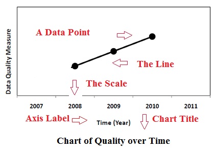
| Title | Tells you what the graph is about. |
| Axis Labels | Tells you what kind of data is on each axis. |
| Axis Scale | Shows you how much or how many of the data is on each axis. |
| Points | Give you a specific data point on the line graph with an x and y value. |
| Lines | Give you an estimate of the values between the points for discrete functions (discrete functions are made up of data points). In continuous functions, the line gives you actual data, as opposed to an estimate. |
How to Make a Line Graph
Line graphs are very easy to graph on graph paper.
First Step: Draw a line for your x axis and your y axis.
Second Step: add axis labels and an axis scale.
Third Step: After that, mark your data points.
Fourth Step: Next draw a line through the data points.
Fifth Step: Finally add a chart title.
- You can create a simple line graph at the NCES Kids’ Zone.
- If you have a function (an equation), try an online graphing calculator.
For a step by step example, see: How to Sketch a Graph on the Cartesian plane.
Problems with Line Graphs.
Line graphs can be misleading. For example, this graph shows sales data for 4 days. What’s wrong with it?
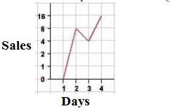
The graph is misleading because of the uneven scale on the y-axis. It makes it look like there was a huge jump in sales between day 1 and 2 (8), when in fact there was a bigger jump between 3 and 4 (11).
What about this real-life graph of temperatures in New Haven, CT? It clearly shows global warming is happening.
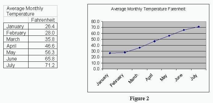
A closer look and you’ll see temperatures are only shown for the first half of the year. This is a common tactic for misleading viewers.
Should a Line Graph Start from the Origin?
A graph that starts at zero is easier to understand and read. However, unlike bar charts, there isn’t a set rule with line graphs that states you have to start at the origin. With that said, if you do decide to start at a number other than zero, be careful not to exaggerate meaningless small differences (see misleading graphs for some examples), like this one from Fox News:
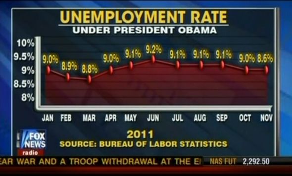
Following this, a jump of .2% might be very meaningful in some circumstances, like an increase in curable diseases. In sum, you can start the axes at wherever you choose; Just be careful not to mislead your reader.
How to Make a Line Graph in Excel
Watch the video for the steps: