- What is a Histogram?
- What is a Bihistogram?
- Make a Histogram:
See also: Excel Histogram
Watch the video to see how to make a histogram by hand:
What is a Histogram?
Histograms are similar to bar charts; they are a way to display counts of data. A bar graph charts actual counts against categories; The height of the bar indicates the number of items in that category. A histogram displays the same categorical variables in “bins”.
A bin shows how many data points are within a range (an interval). Normally, you choose the range that best fits your data. There are no set rules about how many bins you can have, but the rule of thumb is 5-20 bins. Any more than 20 bins and your graph will be hard to read. Fewer than 5 bins and your graph will have little (if any) meaning. Most graphs you’ll create in elementary statistics will have about 5 to 7 bins.
Another rule of thumb for bins is that if a value falls into two bins, place it in the upper bin. For example, if you are making a histogram of ages and your bins include 40-42 and 42-44, a participant who is 42 years old should be placed in the 42-44 bin.
What does the height of a bar in a histogram represent?
Unlike a bar chart, the area of a bar in a histogram represents the frequency, not the height. The frequency is calculated by multiplying the width of the bin by the height. The height of a bar in a histogram indicates frequency (counts) only if the bin widths are evenly spaced. For example, if you are plotting magnitudes of earthquakes and your bins are 3-5, 5-7 and 7-9, each bin is spaced two numbers apart and so the height of the bar would equal the frequency. However, histograms don’t always have even bins. When a histogram has uneven bins, the height does not equal the frequency.
Back to Top
The Bihistogram
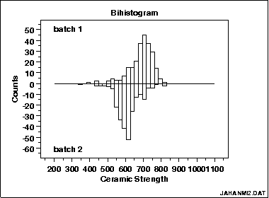
A bihistogram is a graph made from two histograms (“bi” = two) in opposite directions. One histogram is above the axis and one is below it. The histograms can be back-to-back on opposite sides of either the y-axis or the x-axis. Each half represents a different category.
The bihistogram is a visual alternative to an independent samples t-test. It can be more useful than the t-test because many features are visible on the same plot, including:
- Skewness.
- Location (Where on the horizontal axis the graph is centered).
- Scale (if the graph is stretched or squeezed. See: scale parameter.)
- Outliers.
Creating a Bihistogram
The bihistogram is rarely used compared to other statistical techniques, so most popular software doesn’t have the capability of creating one. Two programs that do have options are R and Dataplot. SPSS Also provides a means to lay histograms side by side, which effectively gives you a the same thing.
Bihistogram in R
There doesn’t seem to be a simple function in R for creating bihistograms, but StrictlyStat suggests overlaying two histograms on top of each other, for the same effect. For the code using either ggplot or base graphics, see this article the R-Bloggers site. You can also find an online calculator (that uses an R module) here at Wessa.net. I did try out the online calculator; be patient, as it can take several minutes for the graph to appear.
Dataplot
The command in Dataplot is BIHISTOGRAM
Make a histogram: Overview
A histogram is a way of graphing groups of numbers according to how often they appear. This article will show you how to make one by hand, but you’re much better off using technology, like making an Excel histogram. Choosing bins in statistics is usually a matter of an educated guess. When you make a histogram by hand, you’re stuck with your original bin settings. With Excel (or other software), you can change the bins after you’ve created the histogram, giving you the ability to play around with bin sizes until you have a chart you’re happy with. OK, enough of lecturing about technology. Sometimes you might have to make a histogram by hand, especially if you’re making a relative frequency histogram; Technology like TI-83s will only create regular frequency histograms. If you have to create a histogram by hand, here’s the easy way.
Make a Histogram: Steps
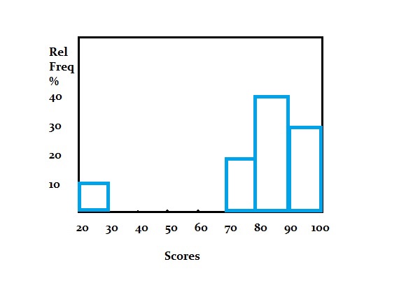
Sample question: Create a histogram for the following test scores: 99, 97, 94, 88, 84, 81, 80, 77, 71, 25.
Step 1: Draw and label your x and y axis. For this example, the x-axis would be labeled “score” and the y-axis would be labeled “relative frequency %.”
Step 2: Choose the number of bins (how to choose bin sizes in statistics) and label your graph. For this sample, question, groups of 10 (the x-axis values are the bins) are a good choice (it looks like you’ll have 5 bars of one or two items in the group).
Step 3: Divide 100 by the number of data points to get an idea of where to place your frequency “ticks”. We have 10 items in our data set, so it makes sense to count by 100/10 = 10% (one item would equal 10% of the total).
Step 4: Count how many items are in each bin and then sketch a rectangle on the graph that corresponds to the percentage of the total that bin fills. In this sample data set, the first bin (20-30) has 1 item, 70-80 has two items. If an item falls on a bin boundary (i.e. 80), place it in the next bin up (80 would go in 80-90).
That’s it!
Tips
Tip 1: If you’re unsure about how many bins to choose, consider making a rough chart online with this Shodor.org tool. Play around with the bins (change the interval size) until you get a chart that you like the look of.
Tip 2: Choosing where to place the frequency ticks is also somewhat of a judgment call and is rarely an exact science. For example, if you had 21 items, you could place your ticks at 5% although each item would be slightly less than 5%. Bear that in mind when you sketch the graph.
Warning: Choosing optimal bin sizes gets very complex with large data sets (see this article for an example of the ugly math). The larger your data set, the better off you are using technology.
Back to Top
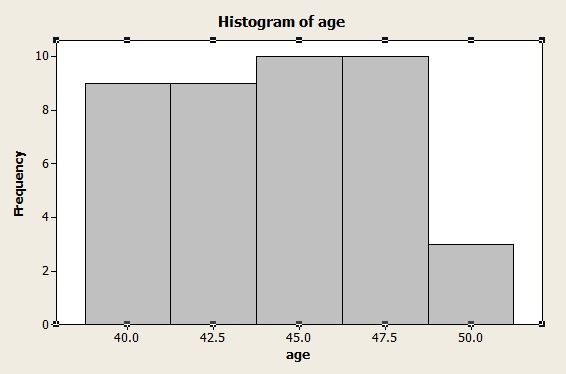
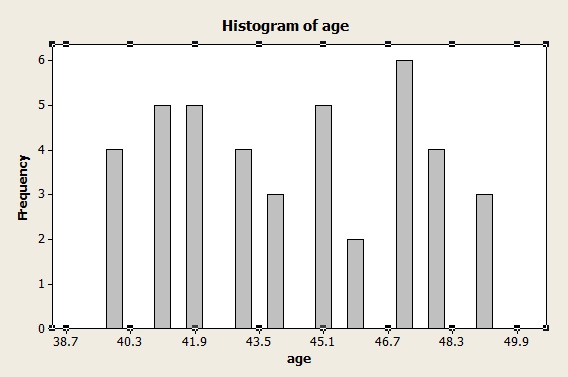
How to make a histogram in Minitab
Minitab is software package that is similar to Excel or other spreadsheet programs.
Watch this short video on how to make a histogram in Minitab:
How to make a histogram in Minitab: Steps
Step 1: Type your data into columns in Minitab. In most histogram cases, you’ll have two sets of variables in two columns.
Step 2: Click “Graph” and then click “Histogram.”
Step 3: Choose the type of histogram you want to make. In most cases for elementary statistics, a “Simple” histogram is usually the best option.
Step 4: Click “OK.”
Step 5: Choose the name of the variable you want to make a histogram for and then click the “Select” button to move that variable name to the Graph Variables box.
Step 6: Click “OK” to create the histogram in Minitab.
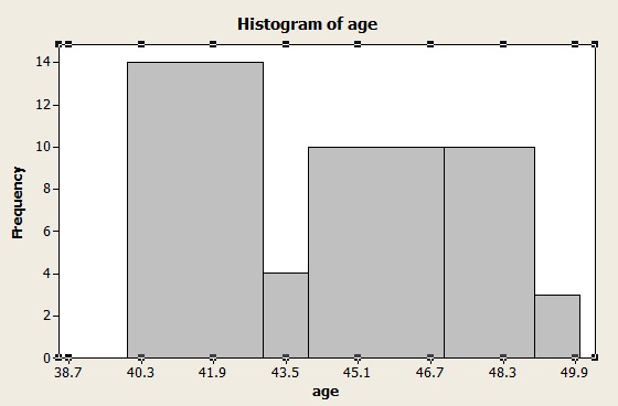
Step 7: (Optional)Change the number of bins (category widths) by clicking on one of the bin headings (numbers) at the base of a bar. This opens the Edit Scale box. Click “Binning” and then click the “Number of intervals” radio button. Change the number of bins and click “OK.”
Tip: When you type your data into Minitab, make sure to give your variables meaningful names in the first row (the column header). This makes it easier to choose the variable you want to plot in Step 5.
Histogram on the TI-83: Overview
Let’s say you have a list of the heights of New York City’s tallest buildings. Here’s how to put it into the TI 83 and turn it into a histogram in a jiffy.
Watch the video for the steps:
Histogram TI-83: Steps
Example problem: Make a histogram depicting the top 20 tallest buildings in New York City. The heights of the top 20 buildings (in feet) are: 1250, 1200, 1046, 1046, 952, 927, 915, 861, 850, 814, 813, 809, 808, 806, 792, 778, 757, 755, 752, and 750.
Step 1: Enter the data into a list. Press the STAT button and then press ENTER for the “Edit” option. Enter the first number (1250), and then press ENTER. Continue entering numbers, pressing the ENTER button after each entry.
Step 2: Press “2nd,” then “Y=” to choose “Stat Plot.”
Step 3:ENTER to choose plot “1.”
Step 4: Press ENTER again. This selects “On.”
Step 5:Hit the down arrow key (the arrow keys are at the top right), then press the right arrow key twice. Your cursor should be flashing over the histogram option, which is the top right option in the list.
Step 6: Arrow down to XList and enter the name of the list you entered your data in Step 1. If this is your first time building a list, you most likely entered the data in “L1,” which is the default list. If “L1” is not showing, press “2nd” then “1” to choose “L1.”
Step 7: Arrow down and then type “1” for “Freq.”
Step 8:Press the “graph” button. This will bring up a graph of the histogram on your screen. Press “Zoom” and then “Zoomstat” to view the histogram.
Tips
Tip #1: Press the TRACE button, and arrow back and forth from left to right. This will display the number of items in each category (n=), as well as the upper and lower class limits.
Tip # 2: To change the class width, press WINDOW and change the Xscl. For example, if you want a class width of 100 (probably the most suitable for the above data), change “Xscl” to “100.”
That’s how to create a Histogram on the TI-83!
Example 2
Draw a histogram for the following recent test scores in a statistics class: 45, 67, 68, 69, 74, 76, 75, 77, 79, 84, 86, 90.
Step 1: Press STAT, then ENTER to edit L1.
Step 2: Enter the data from the problem into the list. Press ENTER after each entry. For example, for the first two entries you would type:
4 5 ENTER
6 7 ENTER
Step 3: Press 2nd and then Y= to access the Stat Plot menu.
Step 4: Press ENTER twice to turn on Plot1.
Step 5:Arrow down to Type, which has 6 icons to the right of it. Highlight the top right icon, which looks like a histogram, and press ENTER to select it.
Step 6: Make sure the XList entry reads “L1“. If it doesn’t, arrow down to it, Press Clear, then 2nd, 1.
Step 7: Press Graph. You should see your Histogram.
Tips
Tip: If when you press Graph, you see the message “Err: Stat”, or you just don’t see a histogram like you expect to, then Press “Window,” and try different settings. Especially try changing the Xscl (X Scale) item to a larger value.
That’s it!
Back to Top
TI 89 Histogram
Once you have input the data for the TI 89 histogram and graphed it, the TI-89 will even count how many items are in each bar (or class).
TI 89 Histogram: Steps
Watch the video for the steps:
Example problem: Create a histogram for the following new car costs: 12,500; 22,400; 14,300; 32,200; 21,500; 19,980; 15,001; 22,001; 32,036; 35,124; 29,001; 25,006; 27,001; and 18,500.
Step 1: Press APPS and scroll to the Stats/List Editor. Press ENTER.
Step 2: Press F1 then 8 to clear the list editor of data.
Step 3: Enter “cars” as the list name by pressing 2nd ALPHA )=23 ENTER.
Step 4: Enter your data:
12500 ENTER
22400 ENTER
14300 ENTER
32200 ENTER
21500 ENTER
19980 ENTER
15001 ENTER
22001 ENTER
32036 ENTER
35124 ENTER
29001 ENTER
25006 ENTER
27001 ENTER
18500 ENTER
Step 5: Press F2 ENTER and F1 to go into Plot Setup (Define Plot).
Step 6: Press the right scroll arrow to bring up a menu for Plot Type. Press 4 for Histogram.
Step 7: Scroll down to “x” Press 2nd – (the minus key) to bring up Var-Link. Scroll down to “cars” and press ENTER.
Step 8: Scroll down to Hist. Bucket Width and enter 5000 ENTER. This is your class width.
Step 9: Press ENTER F5. Note: If you press ENTER too many times and end up at the home screen, just press the diamond key and then F3 (for graph).
Step 10: Press 3 for the trace function. Use the left and right scroll keys to move from one bar to another. (This will tell you how many items are in each class (n = x)).
Tips
Tip #1: If your TI 89 histogram doesn’t show (or only part of the graph shows), you may need to change the window. Press the diamond key then F2 to check your window settings. For the above graph, your settings should be approximately 10000 < x < 40000 and 0 < y < 8. Set the xscl and yscl to 1. Press F2 then 9 to return to the graph.
Tip #2: Make sure the alpha lock is turned on by checking for a little black box with “a” in it on the bottom left of your screen.
Back to Top
References
Beyer, W. H. CRC Standard Mathematical Tables, 31st ed. Boca Raton, FL: CRC Press, pp. 536 and 571, 2002.
Gonick, L. (1993). The Cartoon Guide to Statistics. HarperPerennial.
Klein, G. (2013). The Cartoon Introduction to Statistics. Hill & Wamg.
Vogt, W.P. (2005). Dictionary of Statistics & Methodology: A Nontechnical Guide for the Social Sciences. SAGE.