A frequency polygon is very similar to a histogram. In fact, they are almost identical except that frequency polygons can be used to compare sets of data or to display a cumulative frequency distribution. In addition, histograms tend to be rectangles while a frequency polygon resembles a line graph.
How to Make a Frequency Polygon
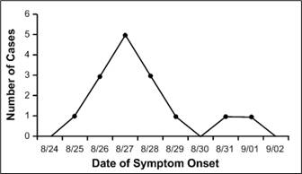
Image: Number of Cases of Botulism by Date of Onset of Symptoms, Texas Church Supper Outbreak, 2001. Image: CDC.
The following data was used to graph the above frequency polygon. Dates with number of cases:
- 8/25:1
- 8/26:3
- 8/27:5
- 8/28:3
- 8/29:1
- 8/30:0
- 8/31:1
- 9/01:1
Step 1: Choose a bin size (class interval). See: What is a bin in statistics? For this frequency polygon, the CDC chose to organize bins by dates (8/25-9/01) with one date in each interval.
Step 2: Draw an x-axis to represent the data values. The x-axis for this chart is labeled “Date of symptom Onset.”
Step 3: Place a tick mark in the center of each bin and label each bin with the middle value for the bin. Tick marks are usual, but this frequency polygon does not use them. However, the values (the dates in this case) are in the center of the bins.
Step 4: Draw a y-axis and mark the frequency of each bin with a single dot at the corresponding height.
Step 5: Connect the dots from left to right.
Tip: Convention is that you include one bin below your lowest value and one bin above your highest value. Notice that there are two intervals (i.e. two dates) either side of the first and last case where there are no cases. The graph touches the x-axis at these points.