Descriptive Statistics > Forest Plot / Blobbogram
What is a Forest Plot / Blobbogram?
 [CC BY-SA 3.0 (https://creativecommons.org/licenses/by-sa/3.0) or GFDL (http://www.gnu.org/copyleft/fdl.html)], via Wikimedia Commons")
A blobbogram (sometimes called a forest plot) is a graph that compares several clinical or scientific studies studying the same thing. Originally developed for meta-analysis of randomized controlled trials, the forest plot is now also used for a variety of observational studies. It’s called a forest plot because of the forest of lines it produces (Lewis & Clarke, 2001).
Forest plots are a fairly recent invention and have only been around for a couple of decades. They play an important role in identifying beneficial drugs, procedures or other interventions that can save lives. These charts allow us to look at all of the available information, not just cherry-pick the results we like the look of (Goldacre, 2014).
Parts of a Forest Plot / Blobbogram
- A vertical line in the center. This is the line of no effect (or equality).
- If the blobbogram is a relative risk ratio, an effect size, or a mean difference, the line of no effect is at zero.
- For ratios (e.g. the odds ratio) the line is at 1.
- A horizontal line or bar representing each study. The width of the line or bar represents the confidence interval, usually the 95% interval (see: 95% confidence interval explained). This is the range where the true value is likely to fall. The diamond/point/square in the center of the line is a point estimate of the true value. The bigger the shape, the larger the sample size. The diamond/point/square is the most likely value out of the range of possible values; values towards the end of the line are less likely.
- An outline of a diamond at the base of the graph (in earlier graphs, this was a circle). This usually represents a weighted average for all studies but it can also be an odds ratio. This should be clearly labeled as either statistic. In the image above, it’s an odds ratio (OR). The lateral tips of the diamond represent the confidence interval.
- An adjacent table (on the left of the above blobbogram) provides more information about the study. The table can include:
- Study author and date. This is usually in chronological order.
- Mean scores and standard deviations.
- Total number of participants in each study.
Notation
Notation you may see on a Forest Plot / Blobbogram:
- CI = Confidence interval: this is a range of values where the author believes the true value lies. For example, if you see a risk ratio of 1.02(0.85, 1.22), then the author has calculated a risk value of 1.02. However, statistics isn’t an exact science; the actual value may lie anywhere between 0.85 and 1.22. See: What is a Confidence Interval?.
- ES = Effect size: The effect size is how large an effect of something is. For example, medication A is better than medication B at treating depression. But how much better is it? Medication B could be ten times better, or it could be slightly better. This variability (twice as much? ten times as much?) is what is called an effect size.
- N = Sample Size. For example, N = 99 indicates 99 items in the sample. Smaller samples will have longer horizontal lines, because there is more uncertainty built in with small trial. In other words, the confidence interval is greater with small samples.
- OR = Odds Ratio: An odds ratio (OR) is a measure of association between a certain property A and a second property B in a population. Specifically, it tells you how the presence or absence of property A has an effect on the presence or absence of property B. The OR is also used to calculate if a particular exposure (like air pollution) is a risk factor for a particular outcome (such as lung cancer), and to compare the various risk factors for that outcome.
Example of an Informative Horizontal Line
The horizontal line is perhaps the most important part of the graph. When a line representing a study crosses the vertical line, it represents no difference. If all of the horizontal lines cross the vertical line, it’s a sign that all of the studies were in agreement. What’s really of interest is if a horizontal line doesn’t cross the vertical — that’s an indication there were statistically significant differences between studies.
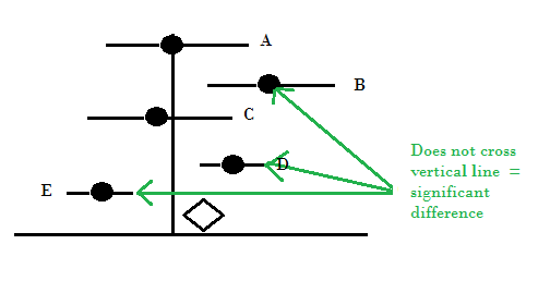
The line is a representation of mean difference (a statistic that measures the absolute value of two results) or standardized mean difference. This is sometimes called a “weighted mean difference,” but this is a bit of a misnomer as no weighting is actually involved in the calculations. The length of the line indicates the confidence interval: longer lines mean more uncertainty. Optional tick marks represent the 95% and 99% confidence intervals.
References
Goldacre, B. (2014). Bad Pharma: How Drug Companies Mislead Doctors and Harm Patients. Macmillan.
Lewis, S. & Clarke, M. (June 2001). “Forest plots: trying to see the wood and the trees“. BMJ. 322 (7300): 1479–1480