Contents:
- What is a Normal Probability Plot?
- Make one by hand
- Excel instructions
- Normal probability plots in Minitab
What is a Normal Probability Plot?
When you have a set of data that you think might have a normal distribution (i.e., a bell curve), a graph of your data can help you decide whether or not your data is normal. Making a histogram of your data can help you decide whether or not a set of data is normal, but a normal probability plot is more specialized: it graphs z-scores (normal scores) against your data set.
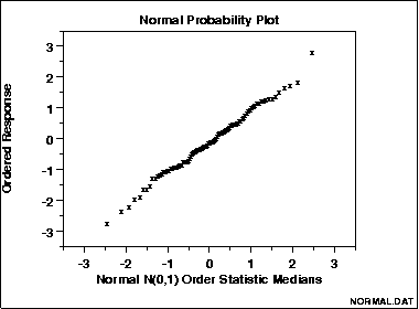
A straight, diagonal line means that you have normally distributed data. If the line is skewed to the left or right, it means that you do not have normally distributed data.
What is a Normal Probability Plot used for?
It can be easy to see with a histogram how data fits the norm, or skews from the norm.
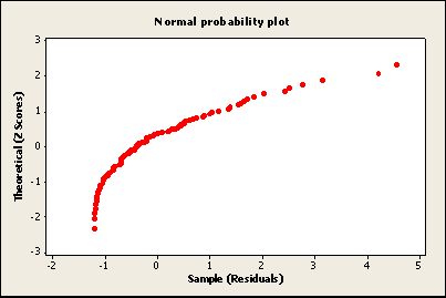
With a normal probability plot, it can be easier to see individual data items that don’t quite fit a normal distribution. In the image below, the upper right data item is clearly out of line with the rest of the data, meaning that it doesn’t fit with a normal distribution.

How to Draw a Normal Probability Plot
By Hand
Note: you may want to watch the Excel video below as it explains many of these steps in more detail:
- Arrange your x-values in ascending order (smallest to largest).
- Calculate fi = (i – 0.375)/(n + 0.25), where i is the position of the data value in the ordered list and n is the number of observations.
- Find the z-score for each fi
- Plot your x-values on the horizontal axis and the corresponding z-score
on the vertical axis.
Normal probability plots aren’t normally drawn by hand, because the normal scores used for the plot can’t be looked up in a table. That’s why technology like Minitab or SPSS is a good idea to make these types of graphs.
You can also use Excel to create a plot. Watch the video for the steps:
Note: It’s best to make a histogram of your data to make sure it’s normally distributed before you make a normal probability plot. That’s because it’s easier to see a bell curve on a histogram that it is to gauge whether or not your data is normally distributed on a straight line (or almost straight line).
Normal probability plot in Minitab
Watch the video below to learn how to create a normal probability plot in Minitab:
Step 1: Type your data into columns in a Minitab worksheet. Give your variables meaningful names in the first (blank) row (this makes it easier to build the plot when you select a variable name in Step 4).
Step 2: Click “Graph” on the toolbar and then click “Probability plot.”
Step 3: Click the “Single” probability plot image. This is the option you’re likely to use 99% of the time in elementary statistics.
Step 4: Choose a variable name and then click “Select” to move the variable name to the Graph Variables box. If you didn’t name your variables in Step 1, the variable names will be listed as column identifiers (C1, C2 etc.).
Step 5: Click “OK.” Minitab will create a normal probability graph in a new window.
Tip: Make a histogram in minitab to see how well your data fits a normal distribution. Often a normal probability plot will appear to be fairly straight, but it might not be a great match to a bell curve. Checking the histogram first will allow you to see if your data fits a bell curve before you make assumptions about your data using the normal probability plot.
References
Beyer, W. H. CRC Standard Mathematical Tables, 31st ed. Boca Raton, FL: CRC Press, pp. 536 and 571, 2002.
Gonick, L. (1993). The Cartoon Guide to Statistics. HarperPerennial.
Vogt, W.P. (2005). Dictionary of Statistics & Methodology: A Nontechnical Guide for the Social Sciences. SAGE.
Wheelan, C. (2014). Naked Statistics. W. W. Norton & Company