Statistics Definitions > Contour Plots
What are Contour Plots?
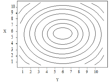
Contour plots (sometimes called Level Plots) are a way to show a three-dimensional surface on a two-dimensional plane. It graphs two predictor variables X Y on the y-axis and a response variable Z as contours. These contours are sometimes called z-slices or iso-response values.
This type of graph is widely used in cartography, where contour lines on a topological map indicate elevations that are the same. Many other disciples use contour graphs including: astrology, meteorology, and physics. Contour lines commonly show altitude (like height of a geographical features), but they can also be used to show density, brightness, or electric potential.
A contour plot is appropriate if you want to see how some value Z changes as a function of two inputs, X and Y:
z = f(x, y).
Types
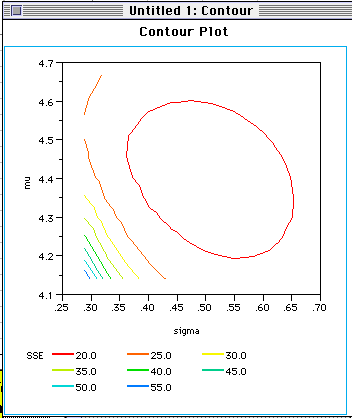
The most common form is the rectangular contour plot, which is (as the name suggests) shaped like a rectangle.
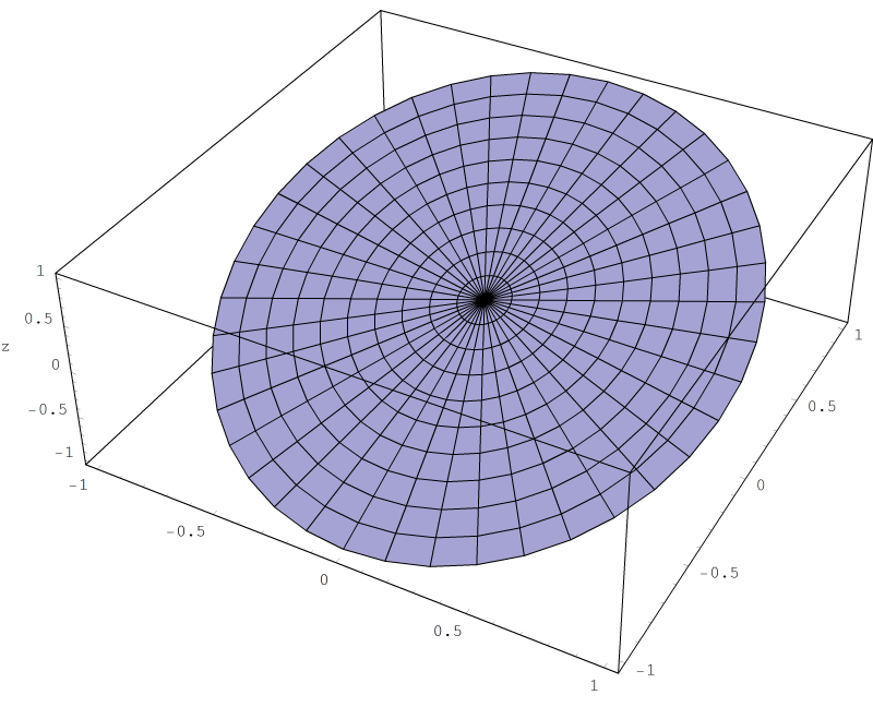
Polar contour plots are circular.
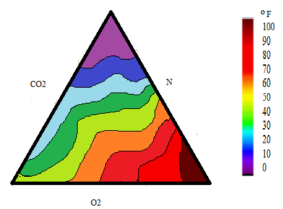
Ternary plots are triangular and show a relationship between three explanatory variables and a response variable. Most commonly, the third explanatory variable is a height value for an XYZ value in ternary space.
Making a Contour Plot
The response variables are extremely complicated to calculate by hand, so they are usually generated by specialized software. SPSS cannot generate these plots, but there are several packages that can, including:
- MATLAB: has several functions including contourf (for a filled 2-D plot) and contour3 (for a 3D plot).
- R: can create a plot with the “filled.contour” command. See this R Documentation for details.
- Excel: can create a very basic chart called a surface chart.
- JMP: click Graph and then Contour Plot. Has a ton of options for levels, data points, colors etc.