Make a Frequency Chart: Overview
If you are asked to determine a frequency in statistics, it doesn’t just mean that you should just count out the number of times something happens. It usually involves you having to make a frequency chart to display a list of frequencies.
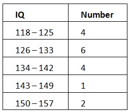
- A frequency is the number of times a data value occurs. For example, if four people have an IQ of between 118 and 125, then an IQ of 118 to 125 has a frequency of 4. Frequency is often represented by the letter f.
- A frequency chart is made by arranging data values in ascending order of magnitude along with their frequencies.
Make a Frequency Chart: Steps
Step 1: Draw a chart for your data. For this example, you’ve been given a list of twenty blood types for emergency surgery patients:
- A, O, A, B, B, AB, B, B, O, A, O, O, O, AB, B, AB, AB, A, O, A.
Write “frequency (#)” and “percent (%)” on the top row. Write your list of items in the first column. In this example, we have four distinct blood types: A, B, AB, and O.

Step 2: Count the number of times each item appears in your data.
In this example, we have:
- A appears 5 times.
- B appears 5 times.
- O appears 6 times.
- AB appears 4 times.
Write those in the “number” column (#). This is your frequency.
Step 3:Use the formula % = (f / n) × 100 to fill in the next column. In this example:
- n = total amount of items in your data = 20.
- f = frequency (the number of times the item appears).
“A” appears
5 times . So we have:
(5 / 20) × 100 = 25%
Fill in the rest of the frequency column, changing the ‘f’ for each blood type.

That’s it!
Check out our YouTube channel for elementary statistics!
References
Beyer, W. H. CRC Standard Mathematical Tables, 31st ed. Boca Raton, FL: CRC Press, pp. 536 and 571, 2002.
Agresti A. (1990) Categorical Data Analysis. John Wiley and Sons, New York.
Everitt, B. S.; Skrondal, A. (2010), The Cambridge Dictionary of Statistics, Cambridge University Press.
Lindstrom, D. (2010). Schaum’s Easy Outline of Statistics, Second Edition (Schaum’s Easy Outlines) 2nd Edition. McGraw-Hill Education