- What is a Scatter Plot?
- Scatter Graphs and Correlation
- What is a 3D Scatter Plot?
- What is a Bubble Chart?
- How to Make a Scatter Plot:
What is a Scatter Plot?
Scatter plots (also called scatter graphs) are similar to line graphs. A line graph uses a line on an X-Y axis to plot a continuous function, while a scatter plot uses dots to represent individual pieces of data. In statistics, these plots are useful to see if two variables are related to each other. For example, a scatter chart can suggest a linear relationship (i.e. a straight line).

Scatter plots are also called scatter graphs, scatter charts, scatter diagrams and scattergrams.
Correlation in Scatter Plots
The relationship between variables is called correlation. Correlation is just another word for “relationship.” For example, how much you weigh is related (correlated) to how much you eat. There are two type of correlation: positive correlation and negative correlation. If data points make a line from the origin from low x and y values to high x and y values the data points are positively correlated, like in the above graph. If the graph starts off with high y-values and continues to low y-values then the graph is negatively correlated.
You can think of positive correlation as something that produces a positive result. For example, the more you exercise, the better your cardiovascular health. “Positive” doesn’t necessarily mean “good”! More smoking leads to more chance of cancer and the more you drive, the more likely you are to be in a car accident.
3D Scatter Plot
A 3D scatter plot is a scatter plot with three axes. For example, the following 3D scatter plot shows student scores in three subjects: Reading (y-axis), Writing (x-axis) and Math (z-axis).
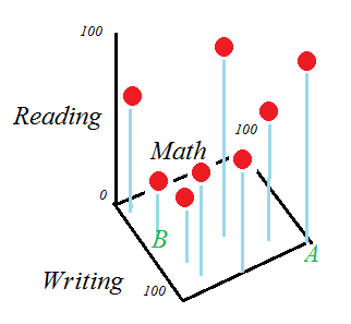
Student A scored 100 in Writing and Math and 90 in reading, and student B scored 50 in writing, 30 in reading and 15 in math. 3D plots are fairly easy to make for a few points, but once you start to get into larger sets of data, you’ll want to use technology. Unfortunately, Excel doesn’t have an option to create these chart. Statistical programs commonly available through colleges and universities (like SAS) can create them. There are quite a few free options available, but I recommend:
- Plotly is an easy way to create a 3D chart online.
- Gnuplot: downloadable program. Easy to use compared to other programs.
- R: Also a download. Has a fairly steep learning curve, but handles most statistical computations. If you want a general stst package (As opposed to one that will just create charts), this is the best option.
What is a Bubble Chart?
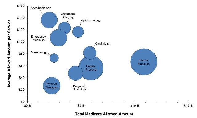
A bubble chart is a way to show how variables relate to each other. It is similar to a scatter chart, only instead of dots there are different sized bubbles.
Bubble charts are a good choice if your data has 3 series/characteristics with an associated value; in other words, you need:
- a category with values for your x-axis,
- a category with values for your y-axis, and
- a category with values for sizing your bubbles.
They are often used for financial purposes and for use with Cartesian plane quadrants.
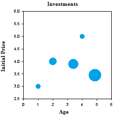
Types of Bubble Chart
In its most basic form, larger bubbles indicate larger values. The placement of the bubble on the x-axis and y-axis give you information about what the bubble represents. This chart shows length of investment (x-axis), price at time of purchase (y-axis) and the relative size of the investment today.
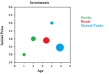
Color coded bubble plots use color to sort the bubbles into categories. For example, I might want to sort my investment chart into stocks, bonds, and mutual funds:
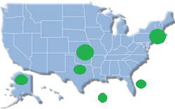
A cartogram is a bubble plot of a map, where the x-axis and y-axis are longitude and latitude. The size of the bubble could indicate population, number of oil rigs, natural weather events, or some other type of geographical data.
The charts are sometimes referred to by dimensions:
- Two-dimensional charts have x-values and y-values only. They are equivalent to a scatter plot.
- Three-dimensional charts have the x-y axes and bubble size.
- Four-dimensional charts have x-y axes, bubble size and color.
How to Make a Scatter plot: Overview
A scatter plot gives you a visual idea of what is happening with your data. Scatter plots are similar to line graphs. The only difference is a line graph has a continuous line while a scatter plot has a series of dots. Scatter plots in statistics create the foundation for simple linear regression, where we take scatter plots and try to create a usable model using functions. In fact, all regression is doing is trying to draw a line through all of those dots.
Back to Top
Make a Scatter plot by Hand
There are just three steps to creating a scatter plot by hand.
Make a Scatter plot: Steps
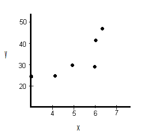
Example question: create a scatter plot for the following data:
| x | y |
|---|---|
| 3 | 25 |
| 4.1 | 25 |
| 5 | 30 |
| 6 | 29 |
| 6.1 | 42 |
| 6.3 | 46 |
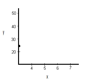
Step 1: Draw a graph. Label the x- and y- axis. Choose a range that includes the maximums and minimums from the given data. For example, our x-values go from 3 to 6.3, so a range from 3 to 7 would be appropriate.

Step 2: Draw the first point on the graph. Our first point is (3,25).
Step 3:. Draw the remaining points on the graph.
That’s it!
Back to Top
How to Construct a Scatter Plot in Excel
In this section, I’ll cover how to make a scatter plot in Excel plus some advanced options like formatting your chart, adding labels, and adding a trendline (the linear regression equation).
Steps
Step 1: Type your data into two columns (scroll down to the second example for some screenshots).
Step 2: Click “Insert,” then click “Scatter.”
Step 3: Choose a type of plot. For example, click the first icon (scatter with only markers).
Formatting
Delete the Legend.
Step 1: Right click on the legend, then press “delete.”
Clean up the White Space
Sometimes your markers will be clustered at the top or bottom right of the graph. Here’s how to get rid of that white space by formatting the horizontal and vertical axes.
Step 1: Click the “Layout” tab, then click “Axes.”
Step 2: Click “Primary Horizontal,” then click “More Primary Horizontal Options.”
Step 3: Click the “Fixed Value” radio button and then type in a value for where you want your horizontal axis to start. Click “Close.”
Step 4: Repeat Steps 1 to 3, choosing “Vertical” instead of horizontal.
Adding Chart Labels
Excel usually adds labels you don’t want, or leaves out axis labels you do want. To delete unwanted labels, you can click and delete. Here’s how to add a label:
Step 1: Click the “Layout” tab.
Step 2: Click “Axis” titles and then click “Primary Horizontal Axis Title.”
Step 3: Choose a position. for example, you may want the title below the axis.
Step 4: Click the text and type in your new label.
Step 5: Repeat Steps 1 to 4, choosing “vertical” for the vertical axis.
Tip: If you don’t like the vertical arrangement of the axis title, right click, then choose “format axis title.” Click “alignment” and then pick a text direction (i.e. horizontal).
Adding a Trendline
Step 1: Click the “Layout” tab.
Step 2: Click “Trendline” and then click “More trendline Options.”
Step 3: Click the “Show equation on chart box” and then click “Close.”
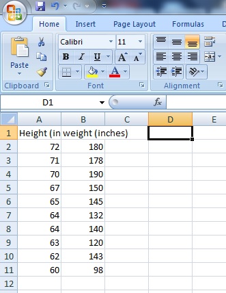
Example 2: Create a scatter plot in Microsoft Excel plotting the following data from a study investigating the relationship between height and weight of pre-diabetic patients:
Height (inches): 72, 71,70,67,65,64,64,63,62,60
Weight (lb): 180, 178,190,150,145,132,170,120,143,98
Step 1: Type your data into a spreadsheet. For the scatter plot to work correctly, your data must be entered into two columns. The example below shows data entered for height (column A) and weight (column B).
Step 2: Highlight your data. To highlight your data, left click at the top left of your data and then drag the mouse to the bottom right.
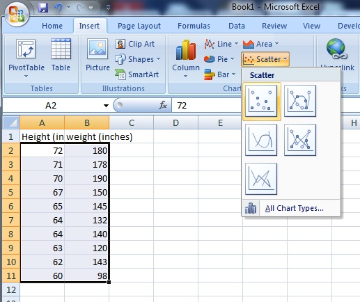
Step 3: Click the “Insert” button on the ribbon, then click “Scatter,” then click “Scatter with only markers.” Microsoft Excel will create a scatter plot from your data and display the graph next to your data in the spreadsheet.

Tip: If you want to change the data (and therefore your graph), there’s no need to redo the whole procedure. When you type new data into either column, Microsoft Excel will automatically calculate the change and instantly display the new graph.
MATLAB Instructions
Use the SCATTER(X,Y,S,C) command.
- Vectors X and Y must be the same size.
- S is the area of each bubble (in squared points). S can be a vector or a scalar. If scalar, all markers will be the same size.
- C is the maker color.
Scatter plot in Minitab
Step 1: Enter your data into two columns. One column should be the x-variable (the independent variable) and the second column should be the y-variable (the dependent variable). Make sure you put a header for your data in the first row in each column — it will make the creation of the scatter plot easier in Step 4 and Step 5.
Step 2: Click “Graph” on the toolbar and then click “Scatter plot.”
Step 3: Click “Simple” Scatter plot. In most cases, this is the option you’ll use for scatter plots in elementary statistics. You can choose one of the others (such as the scatter plot with lines), but you’ll rarely need to use them.
Step 4: Click your y-variable name in the left window, then click “Select” to move that y-variable into the y-variable box.
Step 5: Click your x-variable name in the left window, then click “Select” to move that x-variable into the x-variable box.
Step 6: Click “OK” to create the scatter plot in Minitab. The graph will appear in a separate window.
Tip: If you want to change the ticks (the spacing for the x-axis or y-axis), double-click one of the numbers to open the Edit Scale box, where you can change a variety of options for your scatter plot, including ticks.
Back to Top
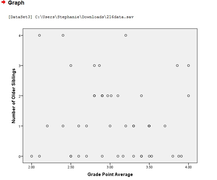
How to Make an SPSS Scatter Plot
IBM SPSS Statistics has several different options for scatter plots: Simple Scatter, Matrix Scatter, Simple Dot, Overlay Scatter and 3D Scatter. Which type of scatter plot you choose depends mostly upon how many variables you want to plot:
- A Simple Scatter Plot plots one variable against another.
- A Matrix Scatter Plot plots all possible combinations of two or more numeric variables against each other
- A Simple Dot Plot plots one categorical variable or one continuous variable.
- An Overlay Scatterplot plots two or more pairs of variables.
- 3D Scatterplots are 3-Dimensional plots of three numeric variables.
How to Make an SPSS Scatter Plot with the Legacy Dialog menu
Step 1: Click “Graphs,” then mouse over “Legacy Dialogs” then click “Scatter/Dot”.
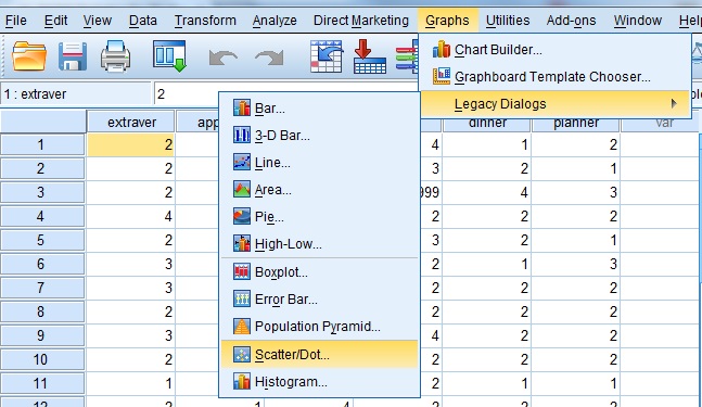
Step 2: Choose a type of Scatter Plot. For this example, click “Simple Scatter.”
Step 3: Click the “Define” button to open the “Simple Scatterplot” window.
Step 4: Click on the variable you want to display on the Y-axis and then click the arrow to the left of the “Y-Axis” selection box.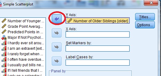
Step 4: Click on the variable you want to display on the X-axis and then click the arrow to the left of the “X-Axis” selection box. Click “OK” to produce the scatterplot.
That’s it!
Tip: You don’t have to select value labels by, but if you do, the value labels are used as point labels for the scatter plot. If you don’t select a variable to label cases by, outliers and extremes can be labeled with case numbers.
Back to Top
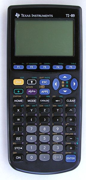
Scatter Plot on the TI-89: Overview
Making a scatter plot on the TI-89 involves three phases: Accessing the data matrix editor, inputting your X and Y values and then graphing the data.
Scatter Plot on the TI-89: Steps:
Example problem: make a scatter plot for the following data: (1,6), (2,8), (3,9), (4,11), and (5,14).
Accessing the Data Matrix Editor
Step 1: Press APPS, then scroll to the “Data/Matrix” editor, press ENTER and then select “new.”
Step 2: Scroll down to “Variable” and type in desired name. For example, type “scatterone”. Note: you don’t have to press the ALPHA key to access the alpha keypad. Just type!
Step 3: Press ENTER ENTER.
Inputting X and Y Values
Step 1: Enter your X values under the “c1” column. Press ENTER after each entry.
For our list, you would need to press:
1 ENTER
2 ENTER
3 ENTER
4 ENTER
5 ENTER
Step 2: Enter your Y values under the “c2” column (use the arrow keys to scroll to the top of the column). Press ENTER after each entry.
For our list, you would need to press:
6 ENTER
8 ENTER
9 ENTER
11 ENTER
14 ENTER
Graphing the Data
Step 1: Press F2 for Plot Setup.
Step 2: Press F1.
Step 3: Select “scatter” next to “plot type”
Step 4: Select “box” next to “mark type”
Step 5: Scroll to the “x” box and then press ALPHA ) 1 to enter “c1”.
Step 6: Scroll to the “y” box and then press ALPHA ) 2 to enter “c2”.
Step 7: Press ENTER ENTER.
Step 8: Press the diamond key F3 to view your scatter plot.
Step 9: Press F2 and then press 9 so that the scatter plot will be drawn in the correct window for the data.
That’s it!
Check out our YouTube channel for more tips and help!
Back to Top
TI 83 Scatter Plot
TI 83 Scatter Plot: Overview
Making a scatter plot on a TI-83 graphing calculator is a breeze with the easy to use LIST menu. In order to graph a TI 83 scatter plot, you’ll need a set of bivariate data. Bivariate data is data that you can plot on an XY axis: you’ll need a list of “x” values (for example, weight) and a list of “y” values (for example, height). The XY values can be in two separate lists, or they can be written as XY coordinates (x,y). Once you have those, it’s as easy as typing the lists into the calculator, and choosing your graph.
TI 83 Scatter Plot: Steps
Sample problem: Create a TI 83 scatter plot for the following coordinates (2, 3), (4, 4), (6, 9), (8, 11), and (10, 12).
Step 1: Press STAT, then press ENTER to enter the lists screen. If you already have data in L1 or L2, clear the data: move to cursor onto L1, press CLEAR and then ENTER. Repeat for L2.
Step 2: Enter your x-variables, one at a time. Follow each number by pressing the ENTER key. For our list, you would enter:
2 ENTER
4 ENTER
6 ENTER
8 ENTER
10 ENTER
Step 3: Use the arrow keys to scroll across to the next column, L2.
Step 4: Enter your y-variables, one at a time. Follow each number by pressing the enter key. For our list, you would enter:
3 ENTER
4 ENTER
9 ENTER
11 ENTER
12 ENTER
Step 5: Press 2nd, then press STATPLOT (the Y= key).
Step 6: Press ENTER to enter StatPlots for Plot1.
Step 7: Press ENTER to turn Plot1 “ON.”
Step 8: Arrow down to the next line (“Type”) and highlight the scatter plot (the first image). Press ENTER.
Step 9: Arrow down to “Xlist.” If “L1” isn’t showing, press 2nd and 1. Arrow down to “Ylist.” If “L2” isn’t showing, press 2nd and 2.
Step 10: Press ZOOM then 9. This should bring up a scatter plot on your screen.
Tip: Hit TRACE and press the right and left arrow buttons to move from point to point, displaying the XY values for those points.
That’s how to make a TI 83 Scatter Plot!
Lost your guidebook? Download a new one here from the TI website.
Check out our Youtube channel for more stats help and tips!
References
Beyer, W. H. CRC Standard Mathematical Tables, 31st ed. Boca Raton, FL: CRC Press, pp. 536 and 571, 2002.
Agresti A. (1990) Categorical Data Analysis. John Wiley and Sons, New York.
Kotz, S.; et al., eds. (2006), Encyclopedia of Statistical Sciences, Wiley.
Vogt, W.P. (2005). Dictionary of Statistics & Methodology: A Nontechnical Guide for the Social Sciences. SAGE.